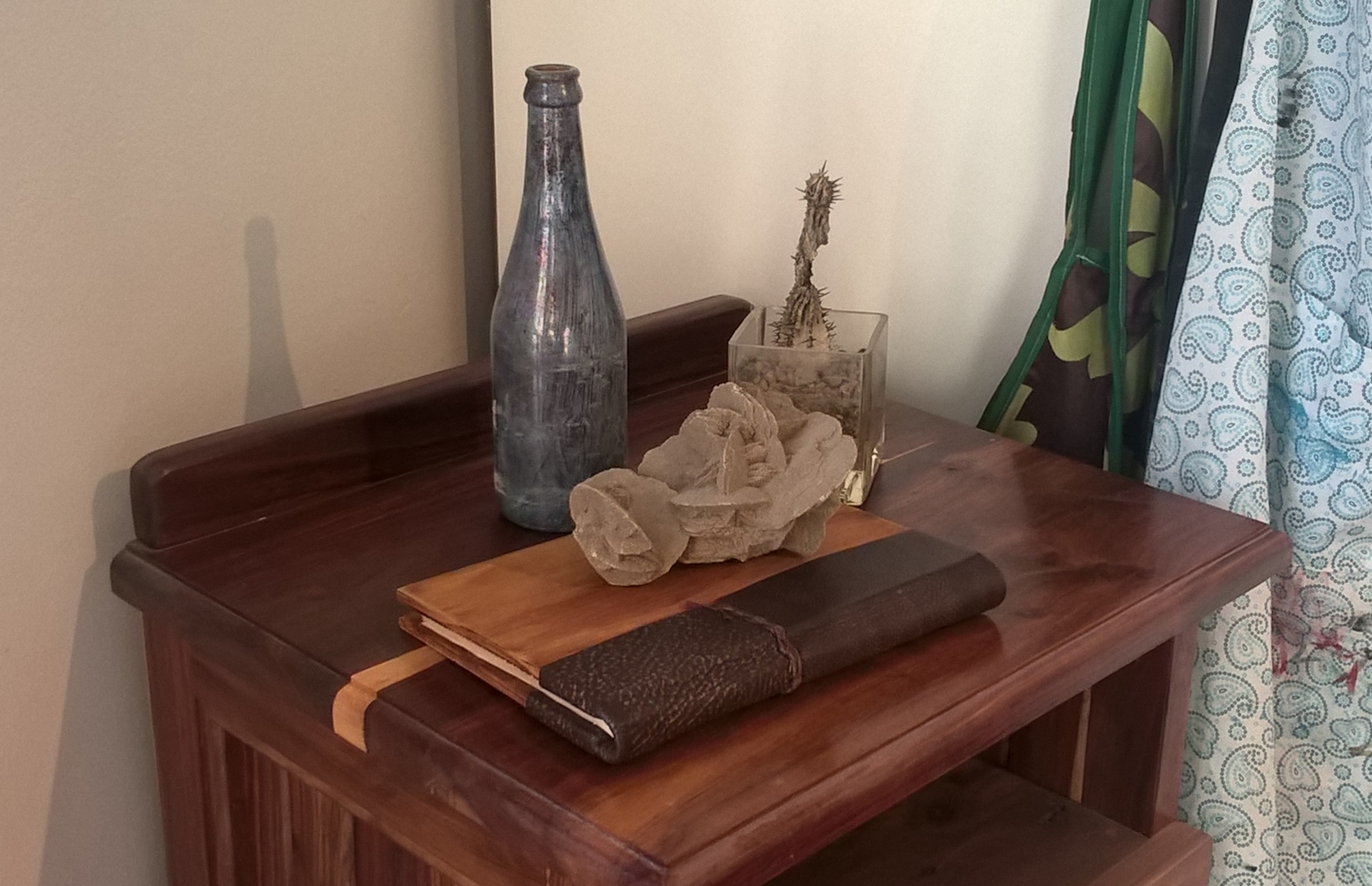
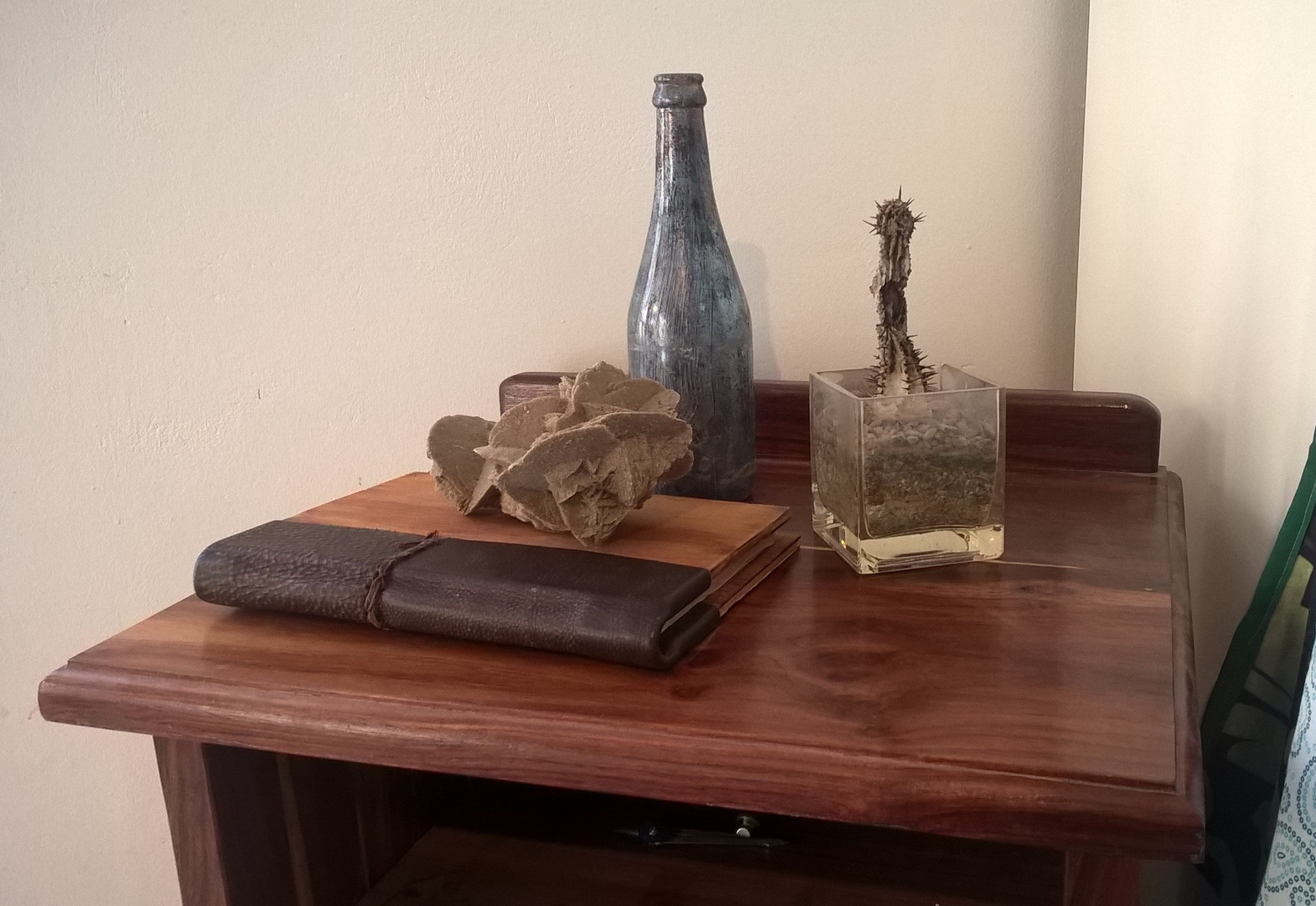
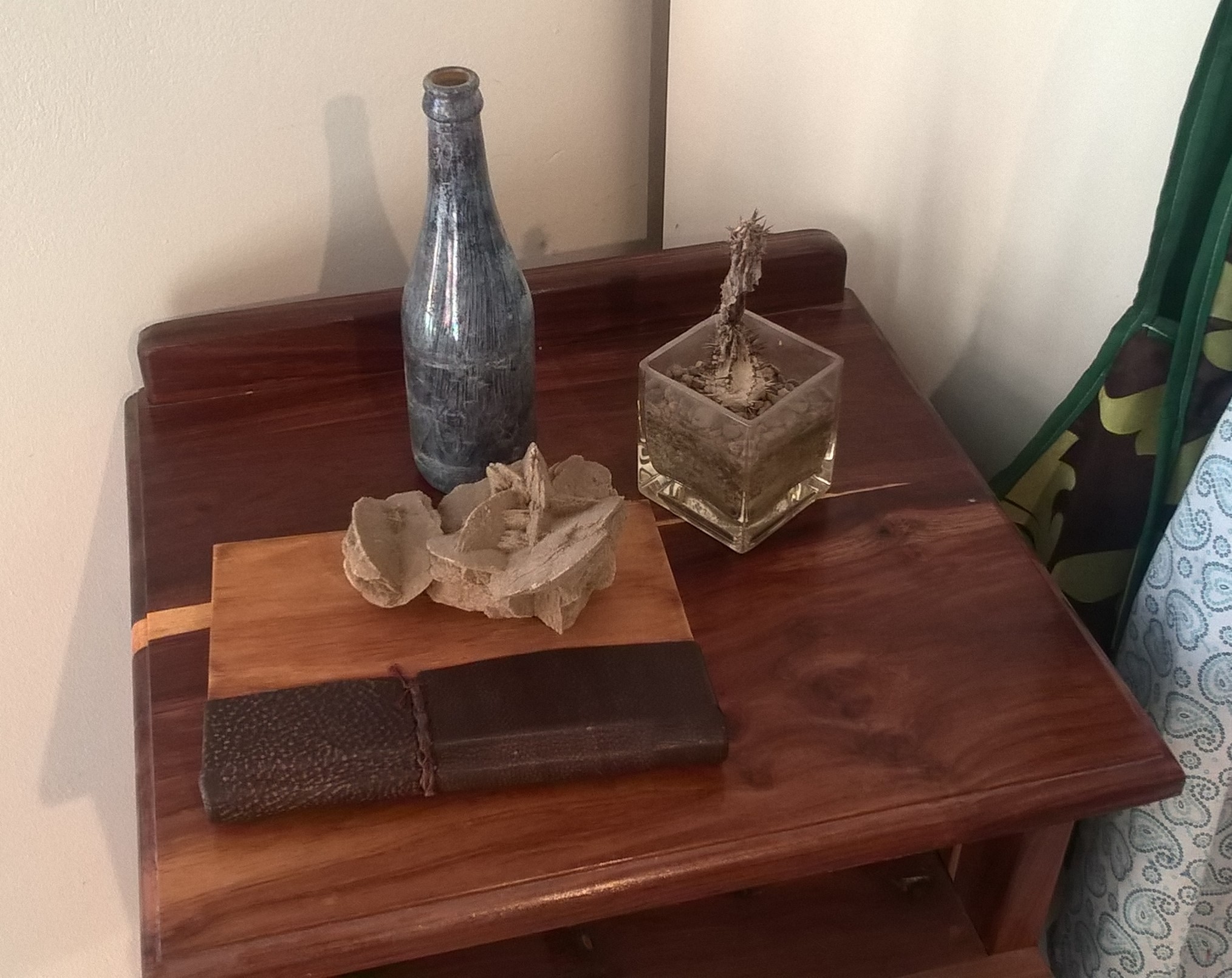
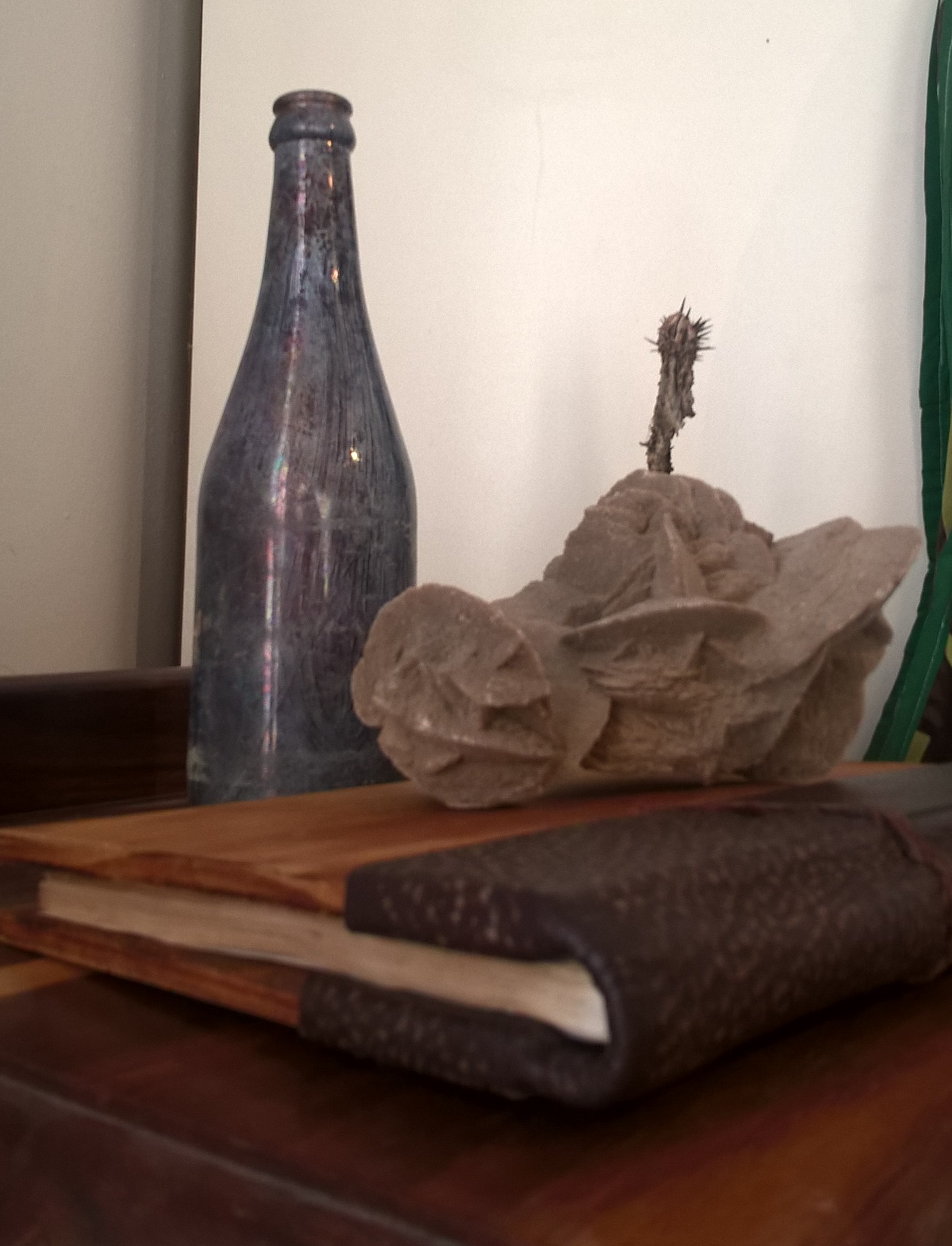
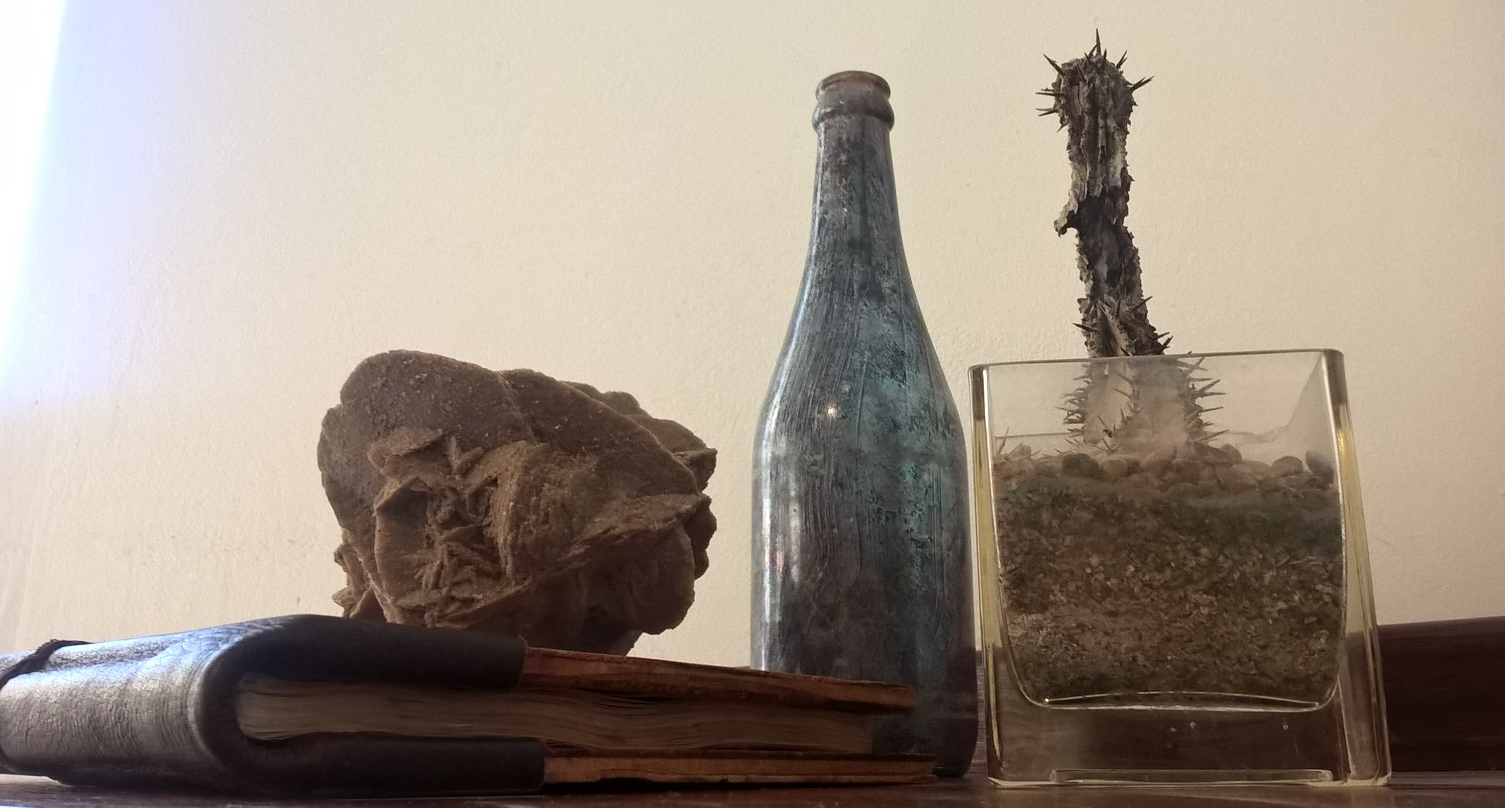
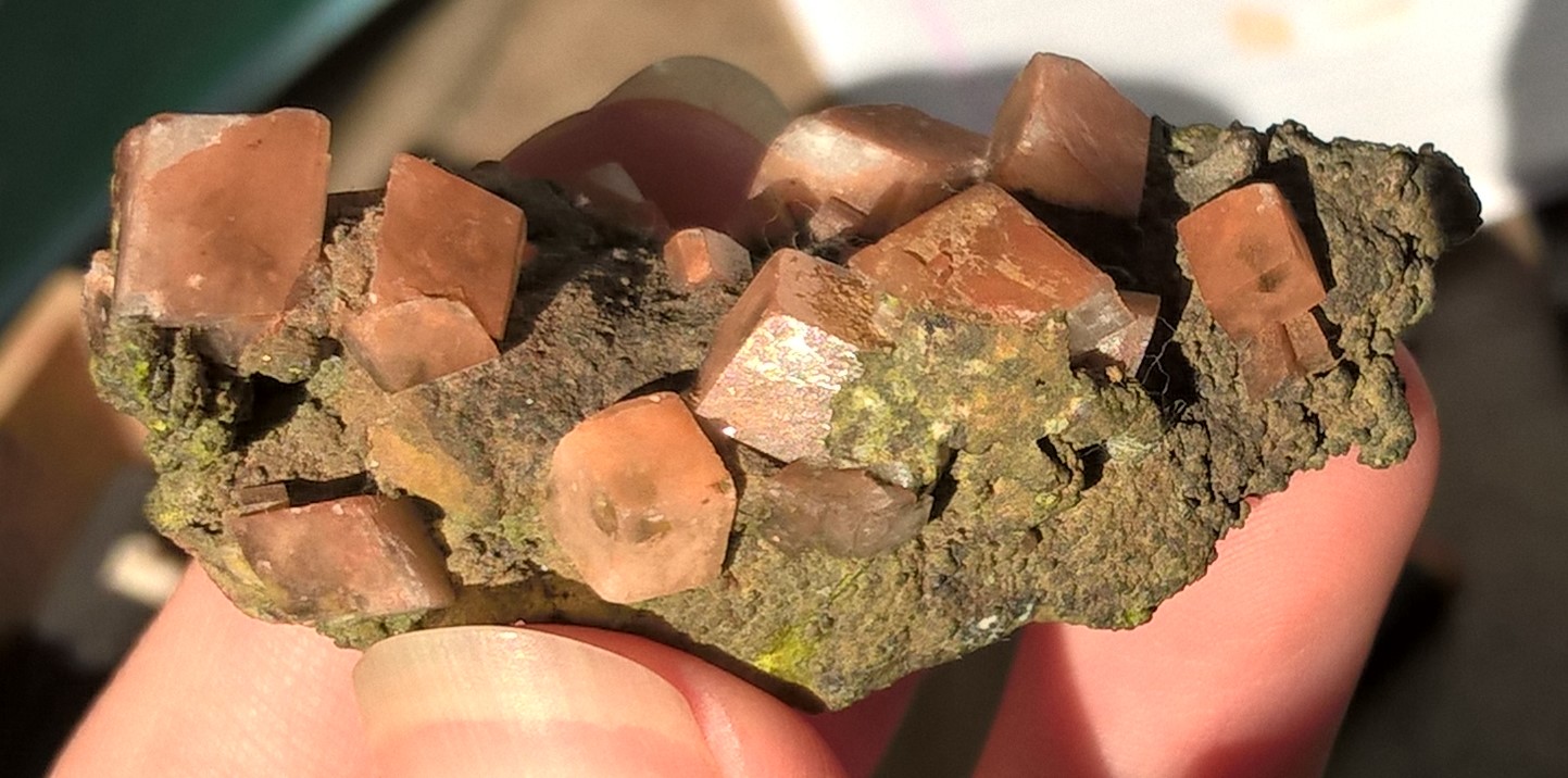
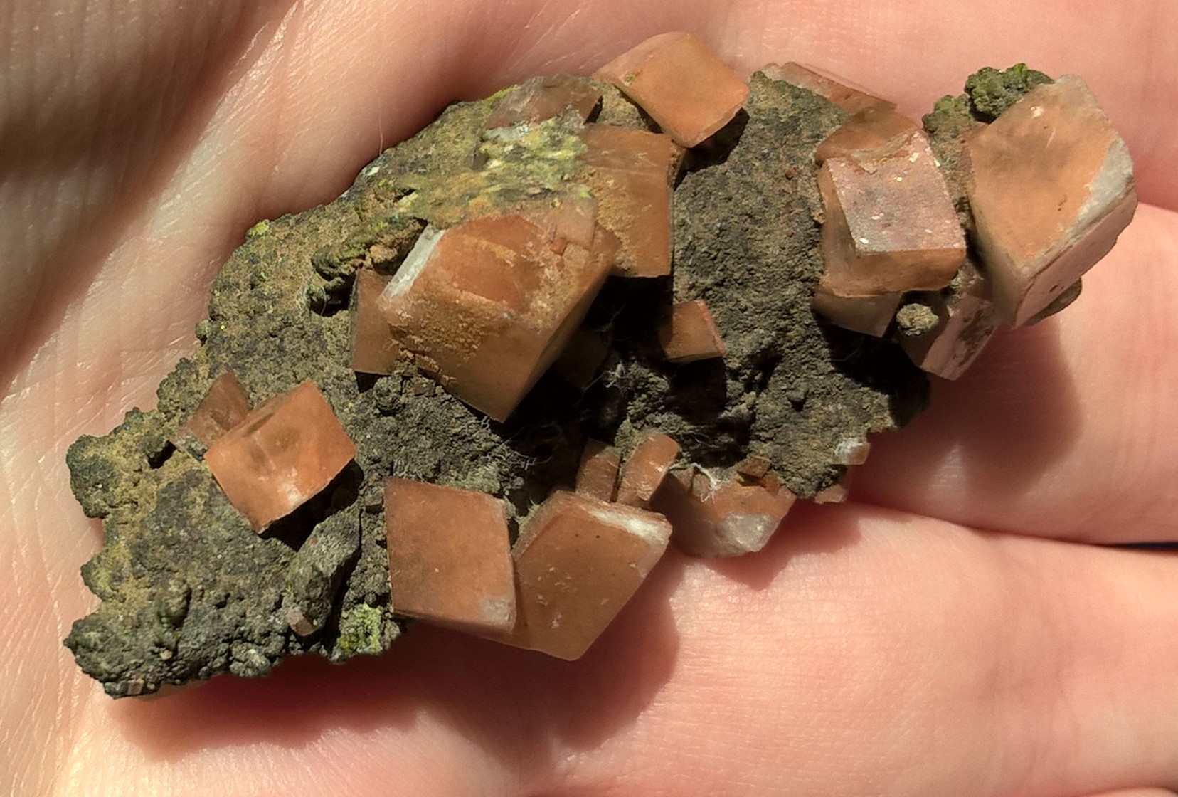
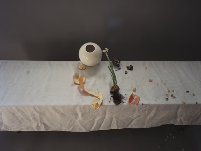
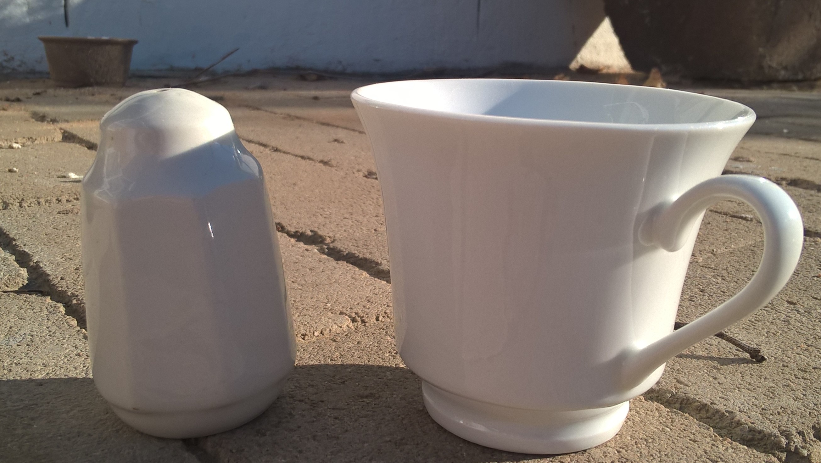
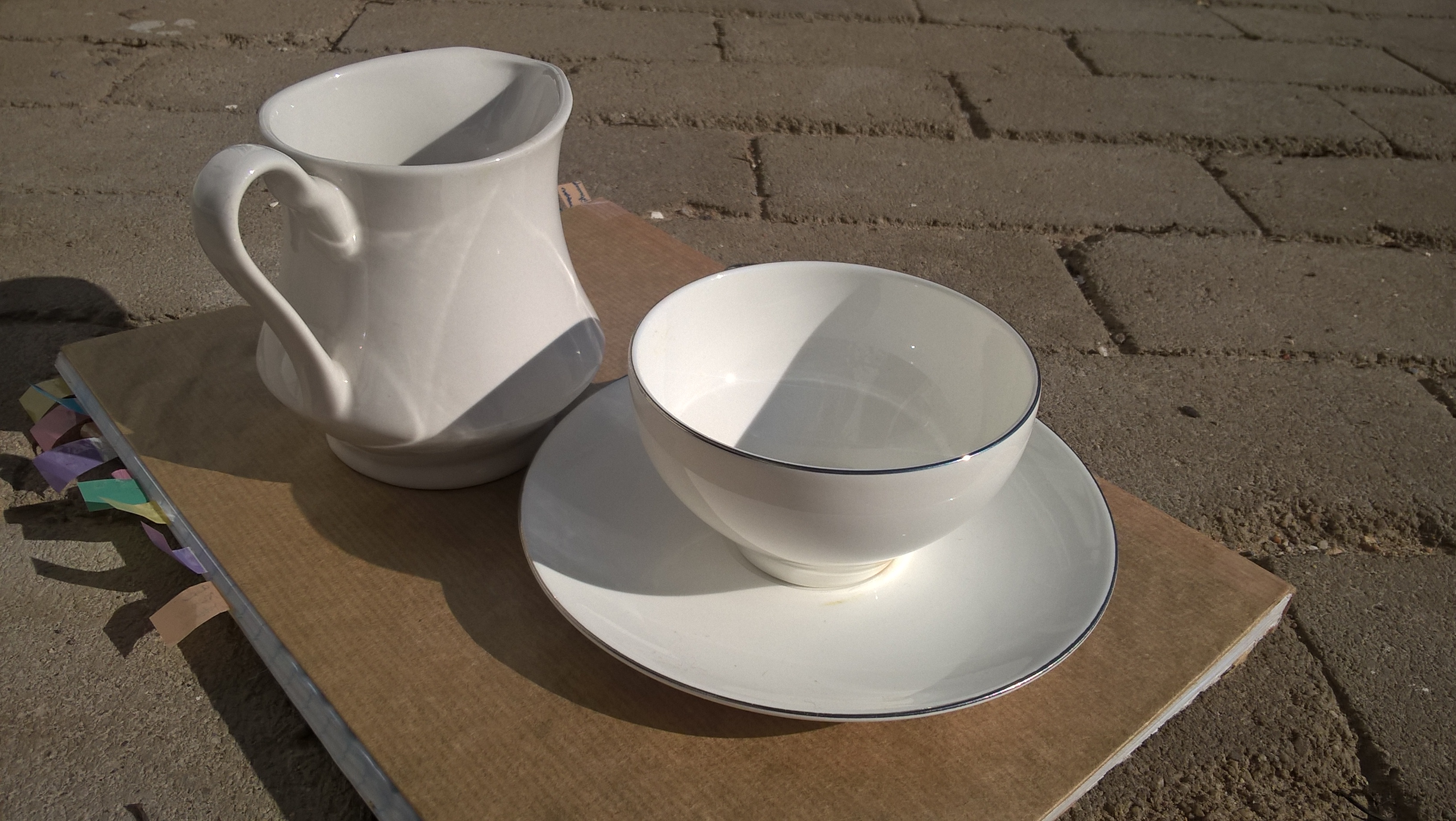
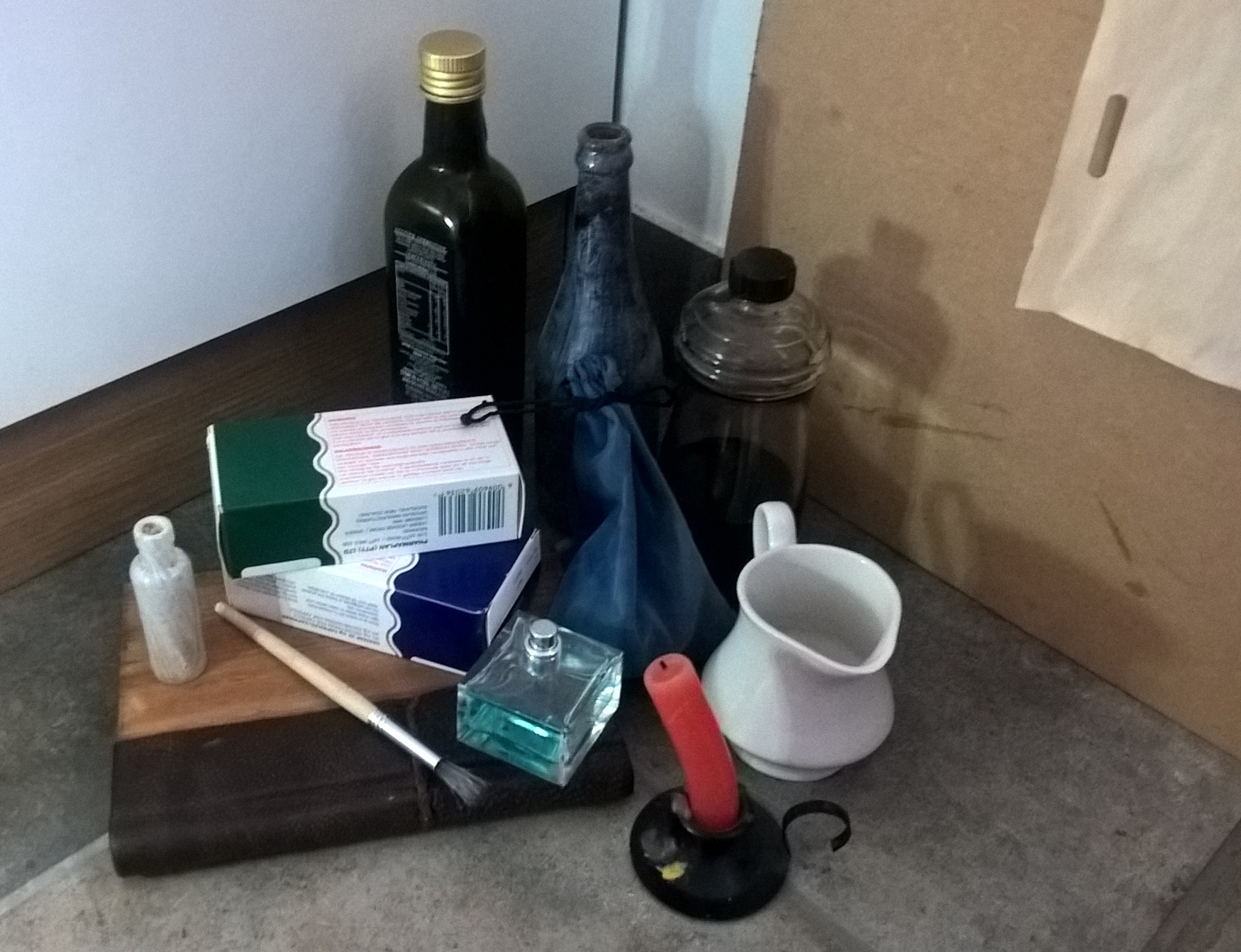
The objects I collected for my still life have the common theme of the desert/Africa. I gave my still life two light sources,one being natural light coming from the window and the other from the lights in my room. I then took pictures from different angles.
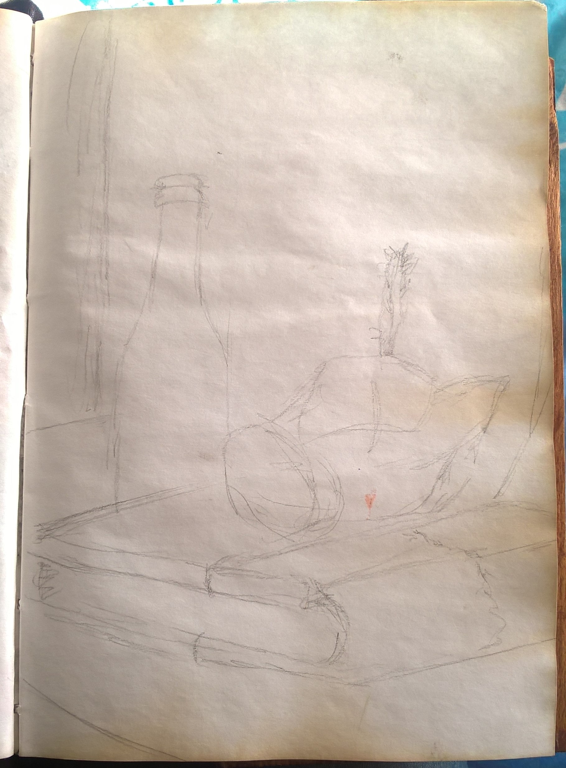
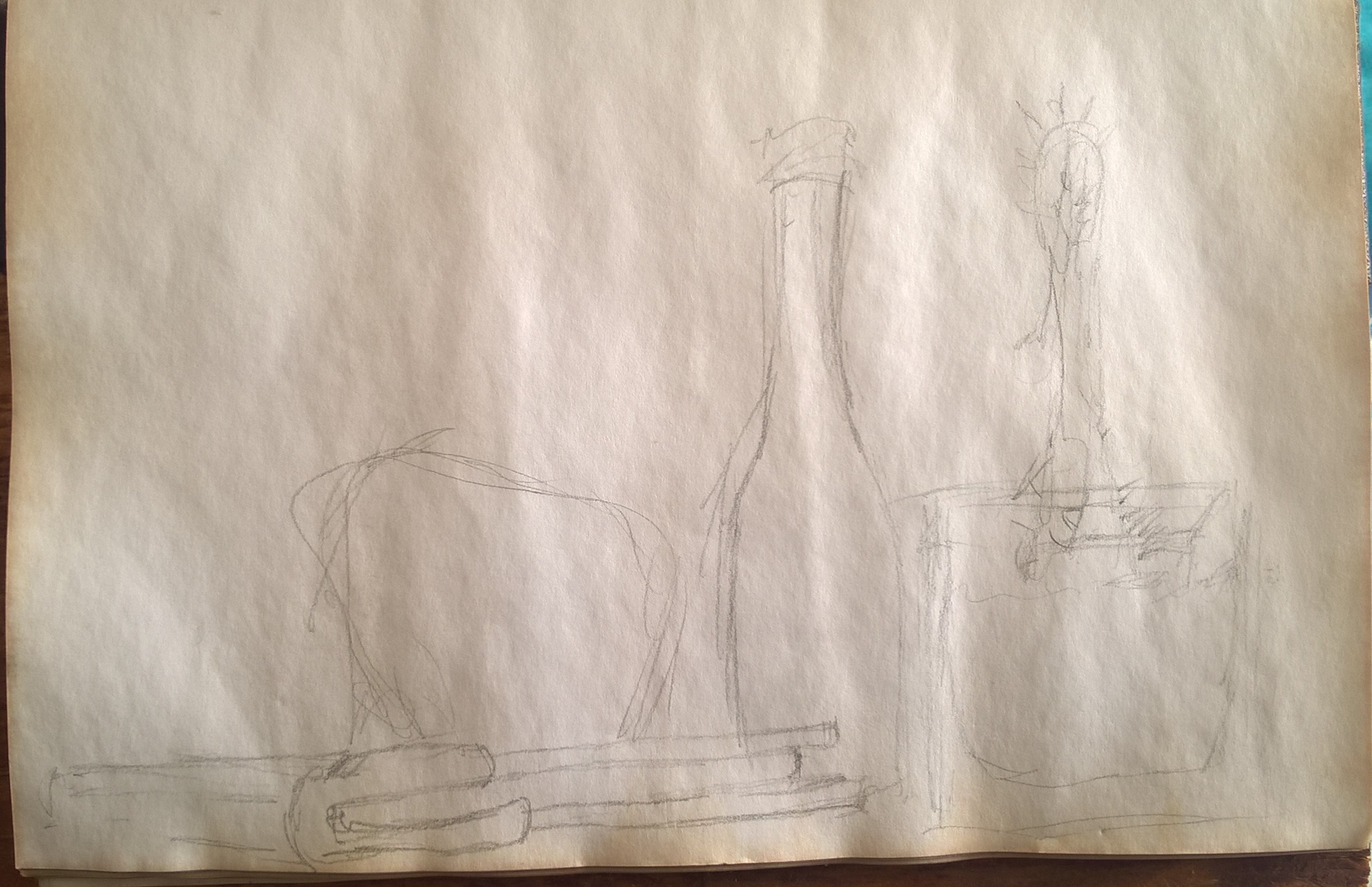
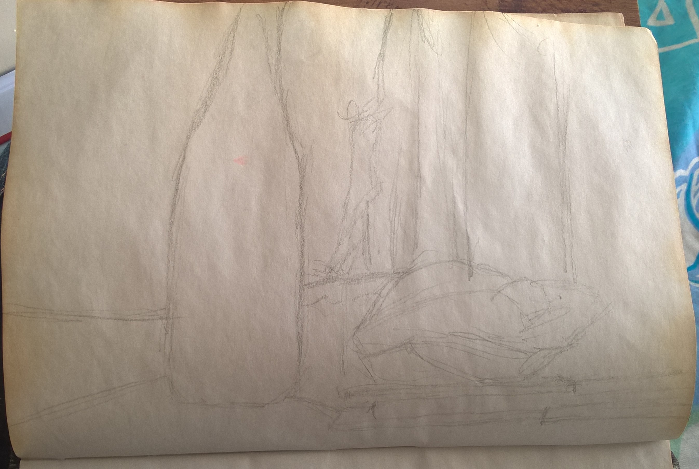
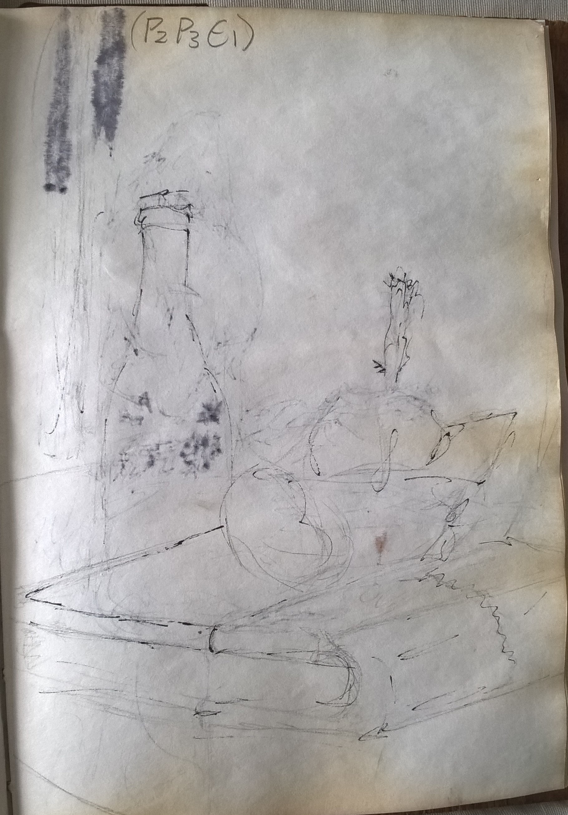
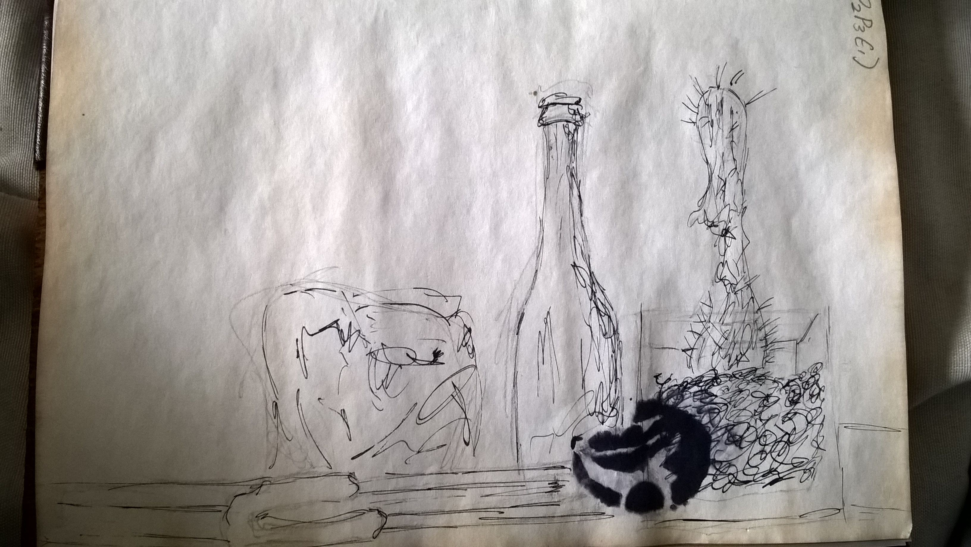
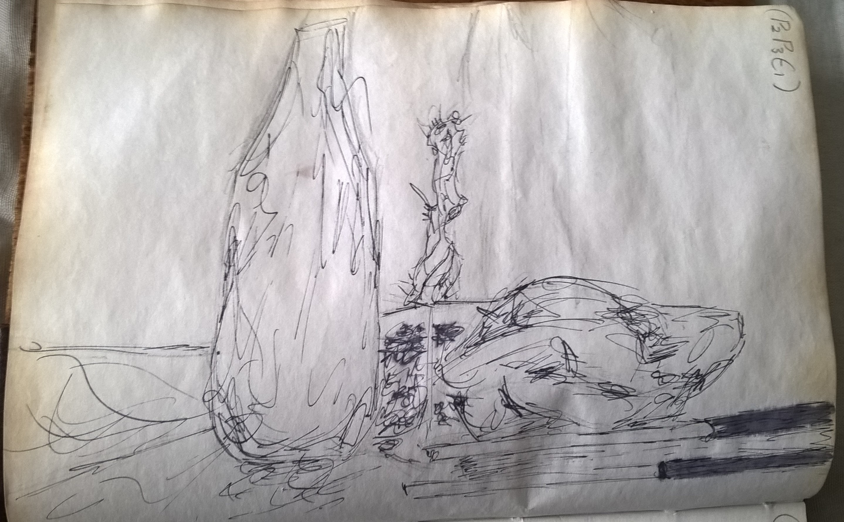
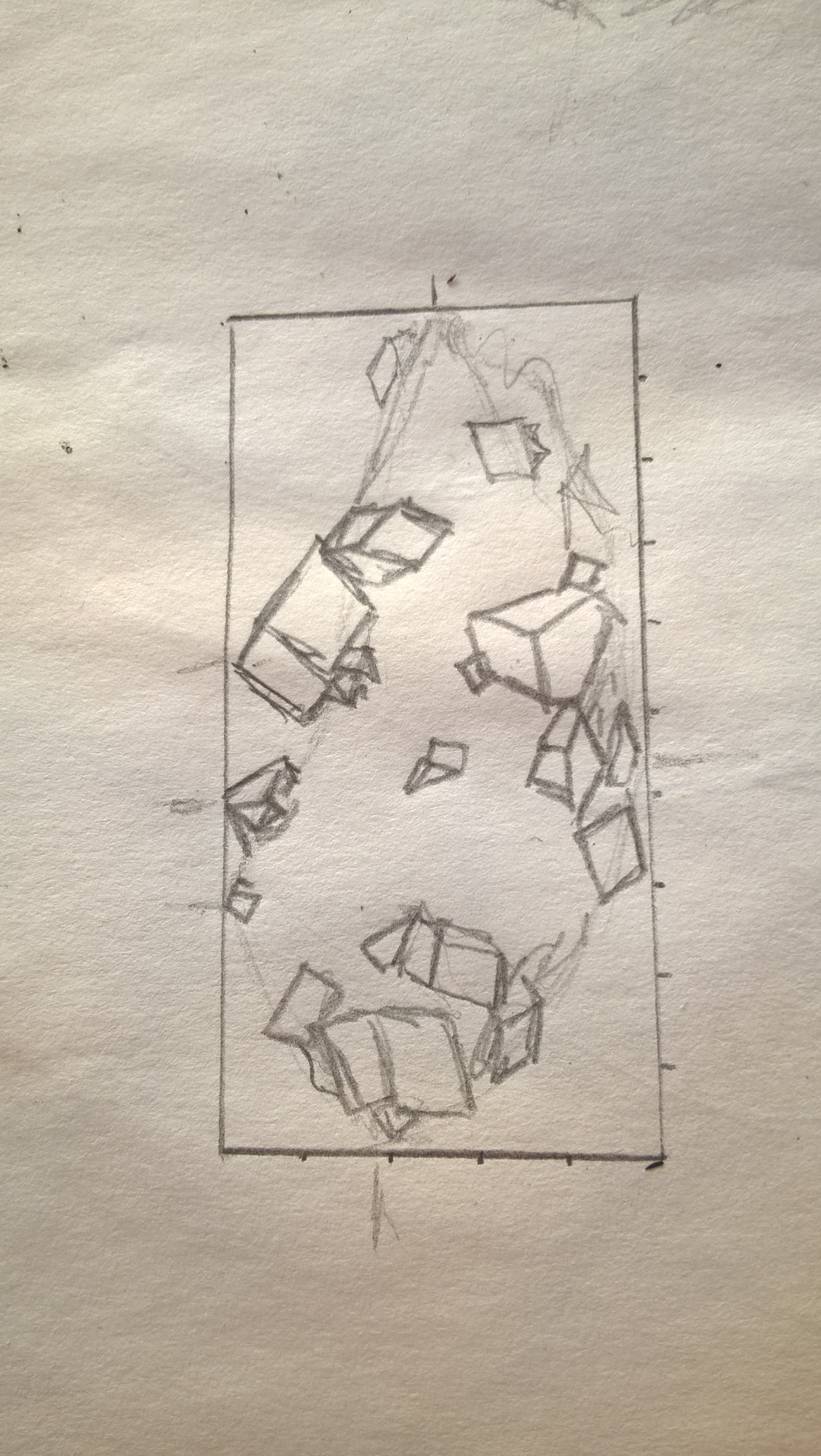
Next I made sketches using the pictures as references until I found an angle that I liked.
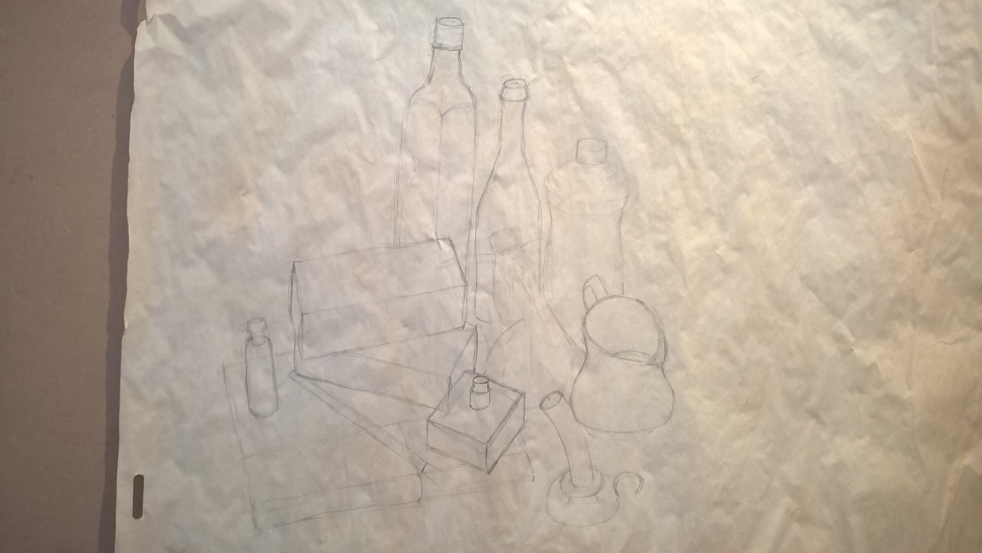
i
ii
iii
I decided that the best line work would be done with my dip pen and used my smallest nib in order to catch more detail. I went over the sketches with my dip pen to see how it would look and it it would work the way i wanted it to. In in sketch iii I tried going over the ink with a wet brush to try make larger dark areas but I was not happy with the result and the ink went through the page as seen in sketch ii.
(side note: the sponge I use in my ink pot fell onto my page and that’s why sketch ii has a black patch)
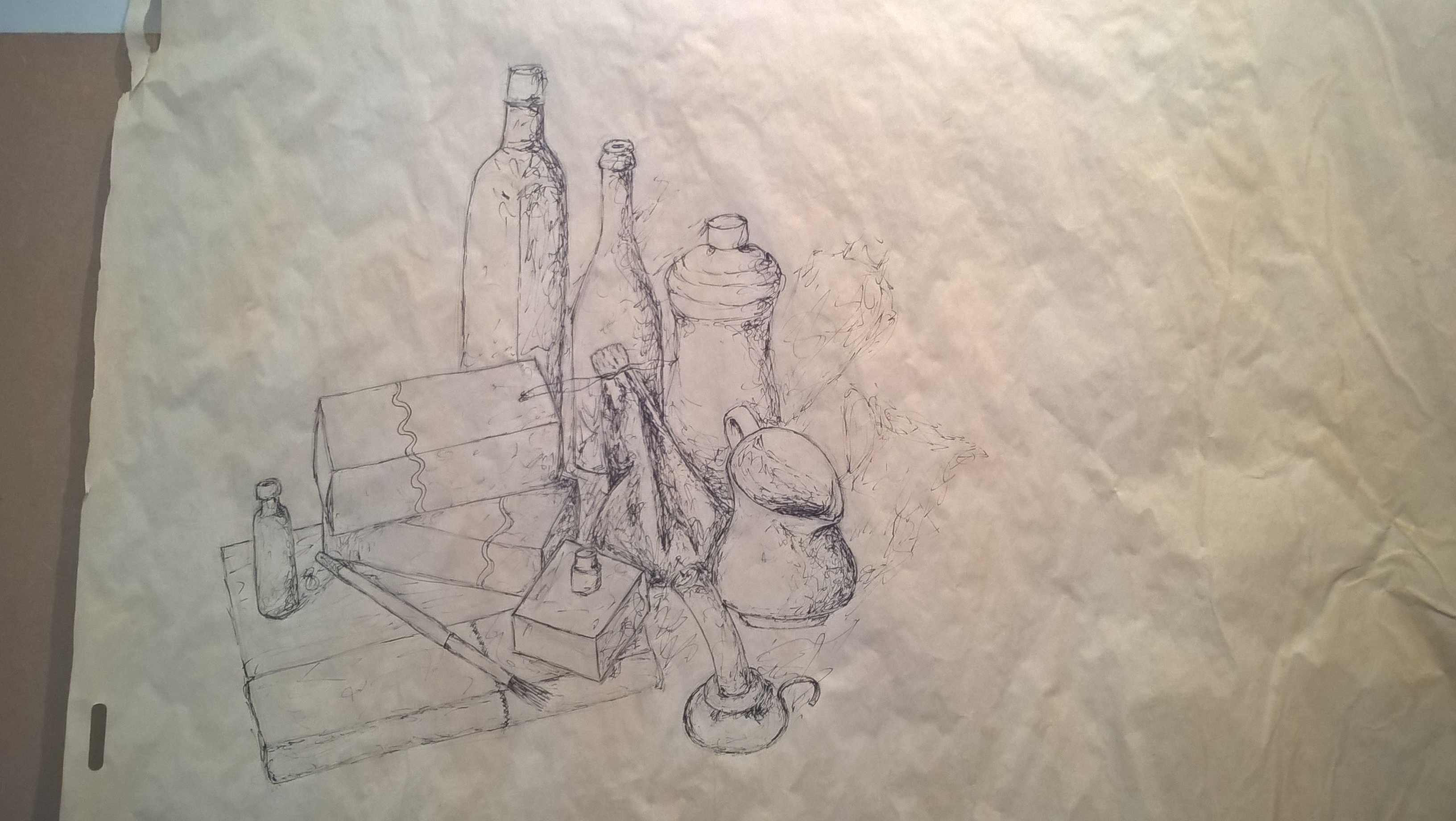
i
ii
iii
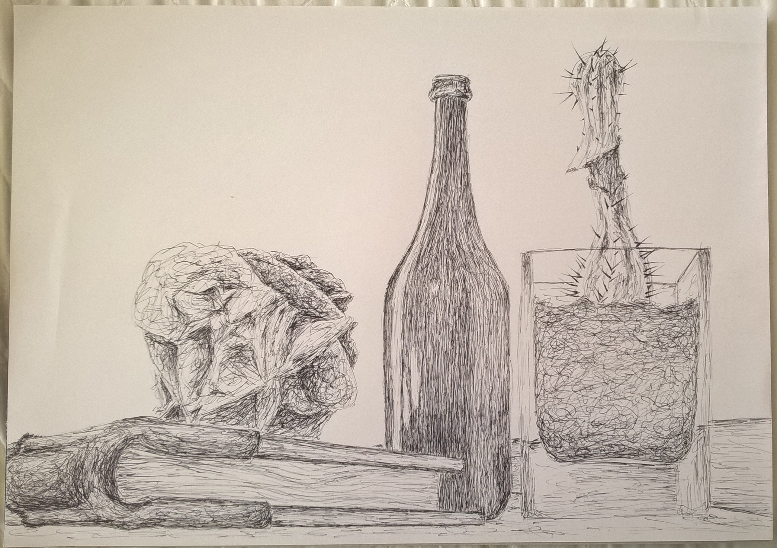
I chose an angle looking from the bottom of the still life because it shows more depth and perspective. Unfortunately I also chose an angle that has an empty white wall as a background aside from the back edge of the table. The smooth background however does contrast with messy lines of the object. I also used objects that contrast in surface texture although I may have not portrayed at as well as if I used a wet brush with the ink but I am still very happy with the result. MY smoother surfaces such as the glass and the wood have been done with straight lines and the rougher textures such as the rocks were done with more scribbled lines.
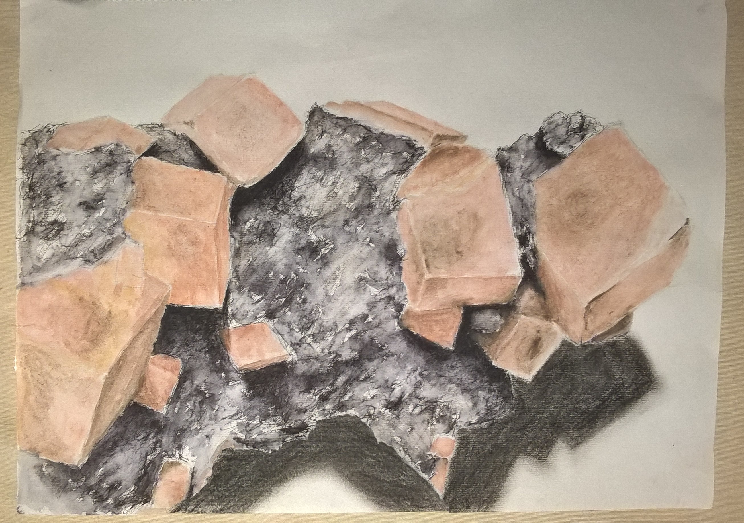
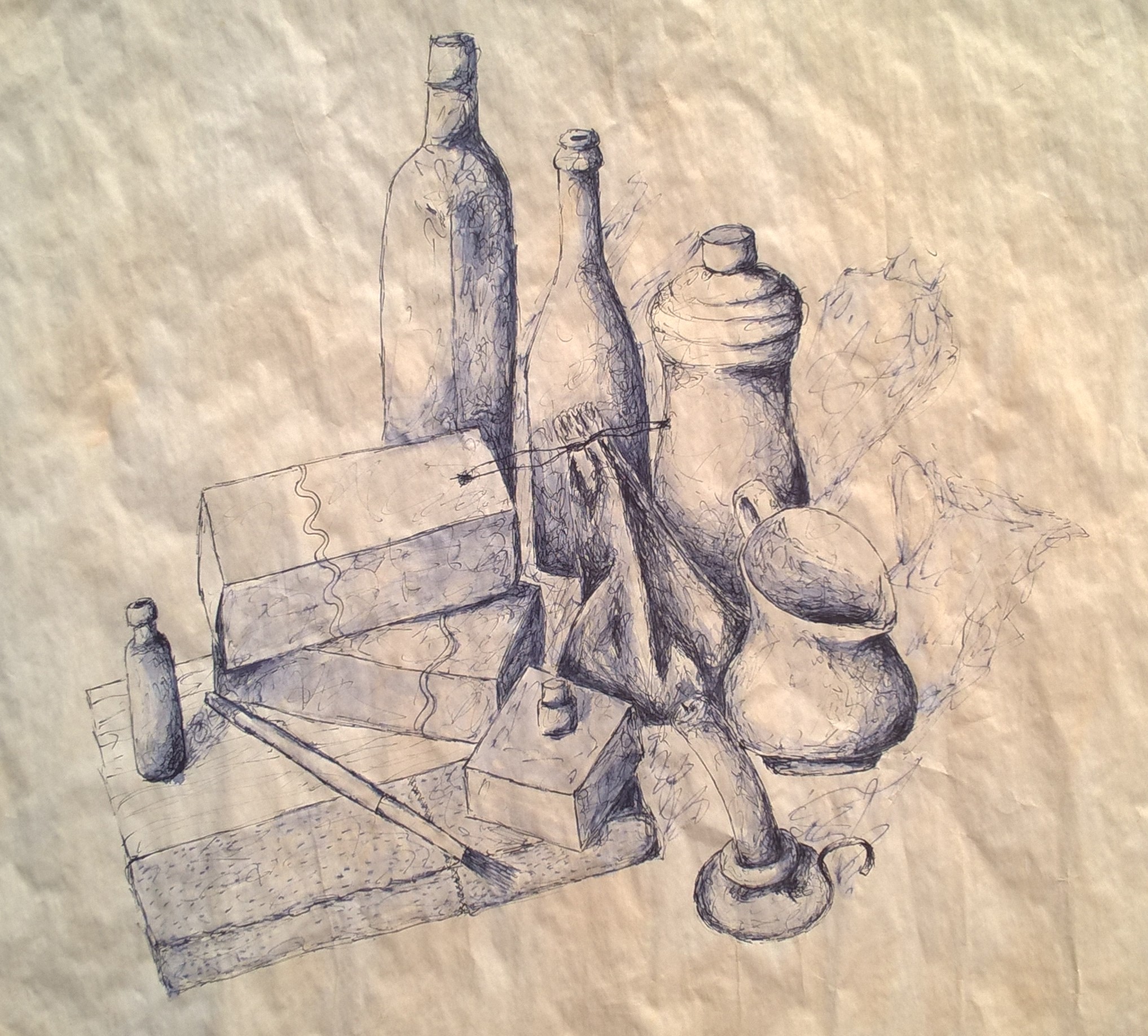
final piece
While doing this exercise I noticed that my style of drawing is developing. My drawing skills, control medium and mark making is also getting more confident. When sketching out these drawing I found I did not have rework the shapes I drew. My line work is certainly improving and I thoroughly enjoyed the exercise.
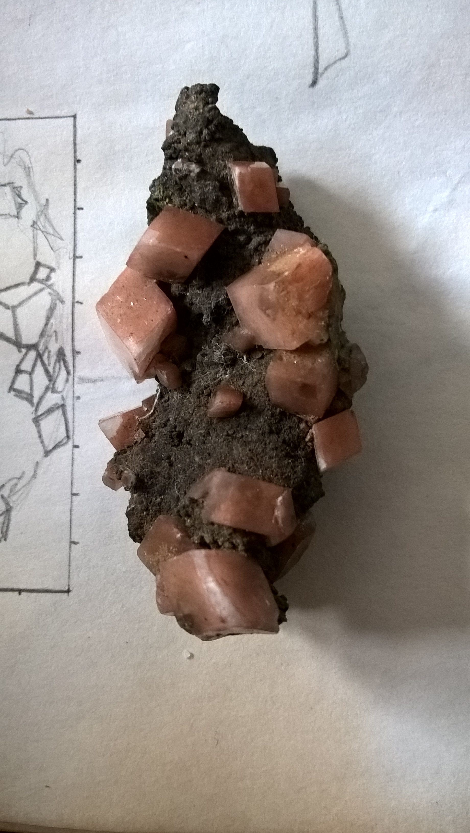
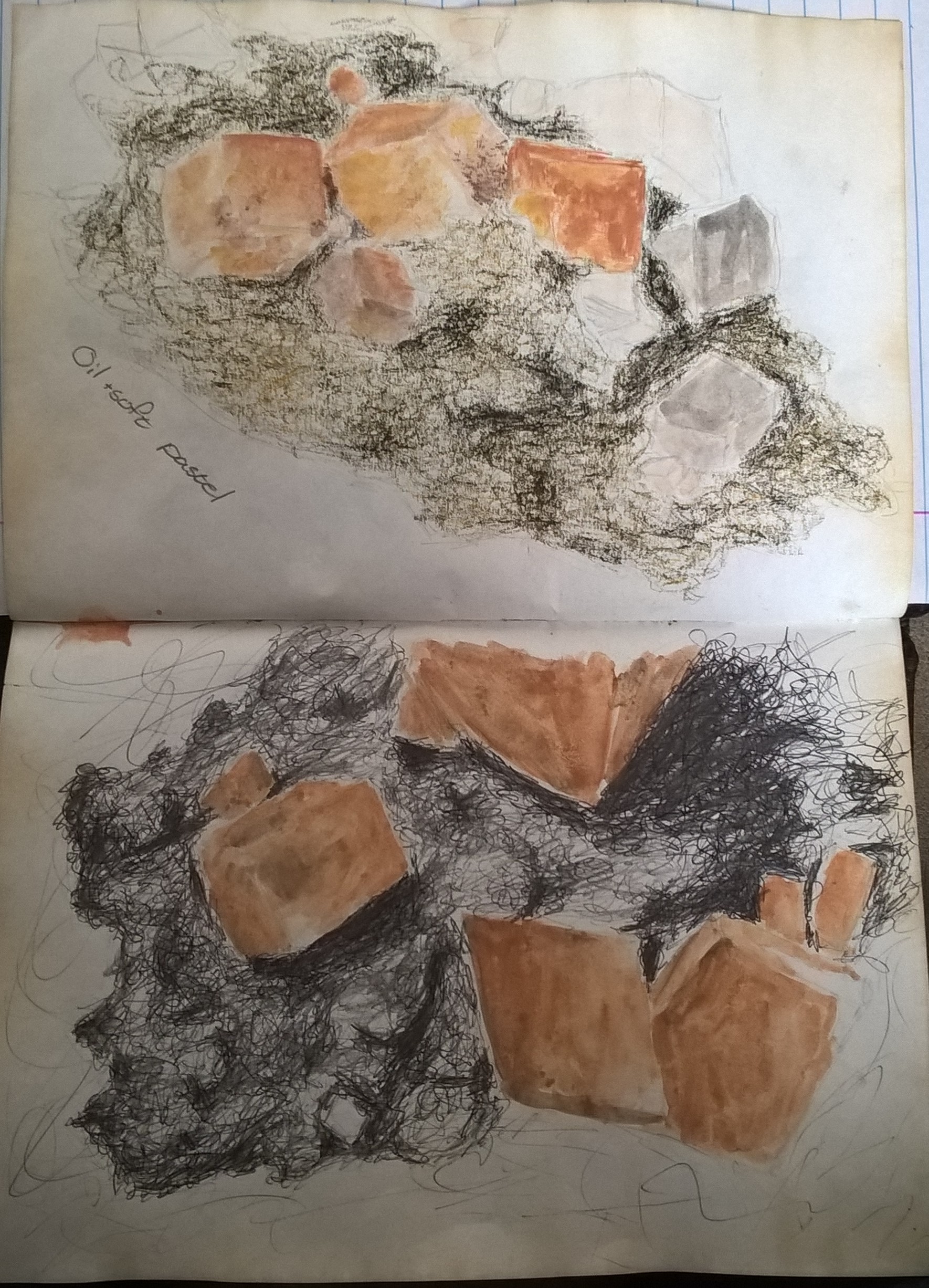
I started off by doing life size sketch of my rock then made a larger scaled one and tested out possible colouring.
life size sketch
One main focus was to find a way to portray the colour and texture of the rock. I was also a bit nervous about adding colour since the exercise never exactly said we could use colour. In the end I felt that the tone in the small crystals would be portrayed better if done in colour and so I decided to continue with that while keeping the rock in fairly muted tones of black and white with small hits of its natural brown colour.
Sketch 1: here I made a larger scaled sketch of the life sized sketch. At the time I had thought of making the sketches by measuring dimensions from life and converting it according to scale but this turned out to be too much of a mission and so decided to free hand the rest. I coloured the rock with a mixture of oil pastels and wax crayons. I did the crystals with wax crayons because they had soft tones but in the end the lack hues and rough texture was what made me decide not to use them.
I then went and made sketches of one small area of the rock at a time instead of doing the entire thing.
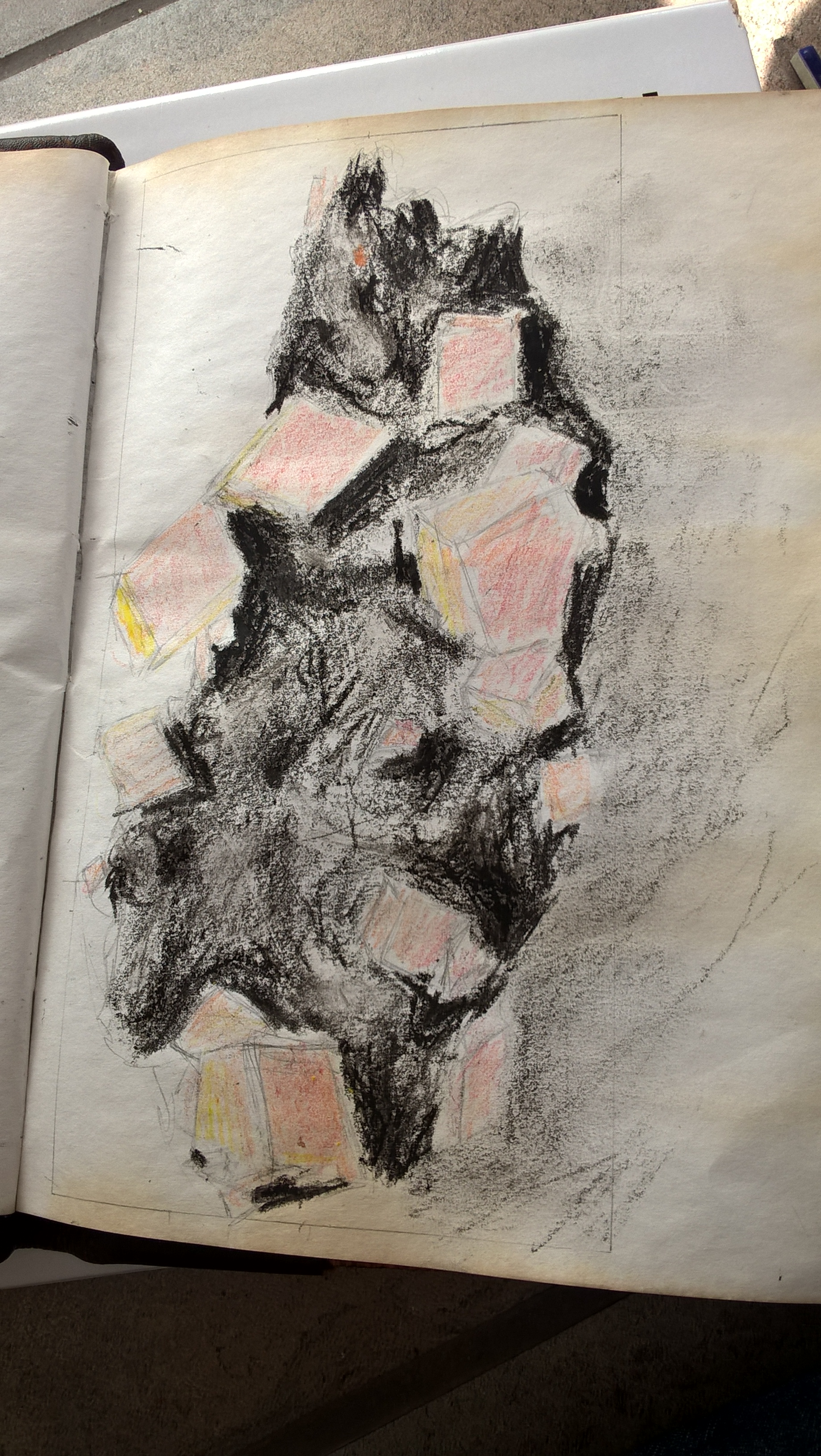
Sketch 2: Here for the crystal areas I decided to use soft pastels. I also tested out using colours or shades of grey but preferred the effect of the colour and so stuck with that. For the rock I decided to try the oil pastels again but try to use colour instead. I did not like the outcome of using colour colour and so decided to rather stick to Black and while. However I was still not quite happy with the texture of the rock and so decided to carry on with the sketches.
Sketch 3: here I added a cooler brown to the crystals which I feel gave it more translucent depth. I tried shading the rock with a ball point pen although I still felt it did not portray the texture correctly. I then tried shading over it with a pencil but that made no improvement.
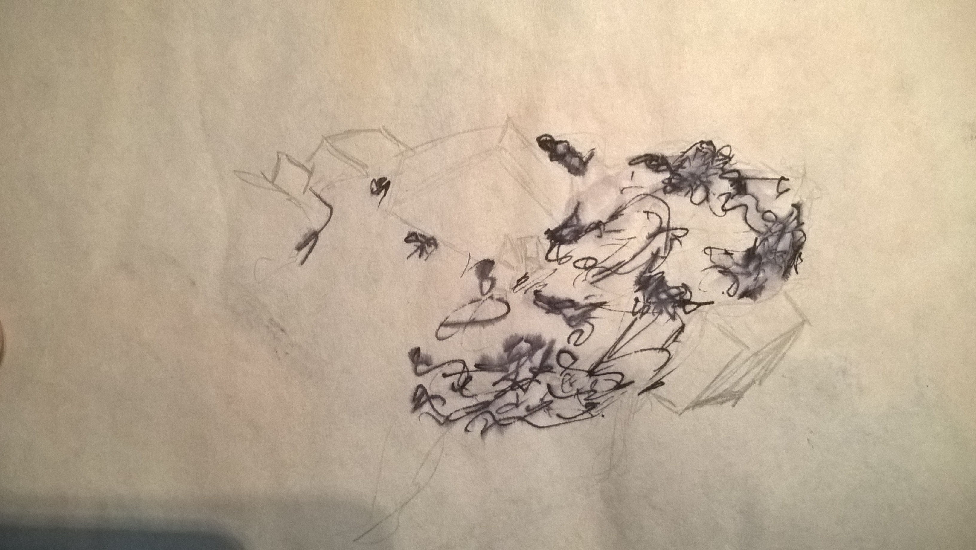
I felt that ink would be my pest bet still so I did one last ink test but this time with my dip pen. In the test however it still wasn’t the correct texture but i knew that my dip pen and ink would give me the best results so I carried on with it in my final peace anyway.
sketch 1
ink test
sketch 2(top), sketch 3(bottom)
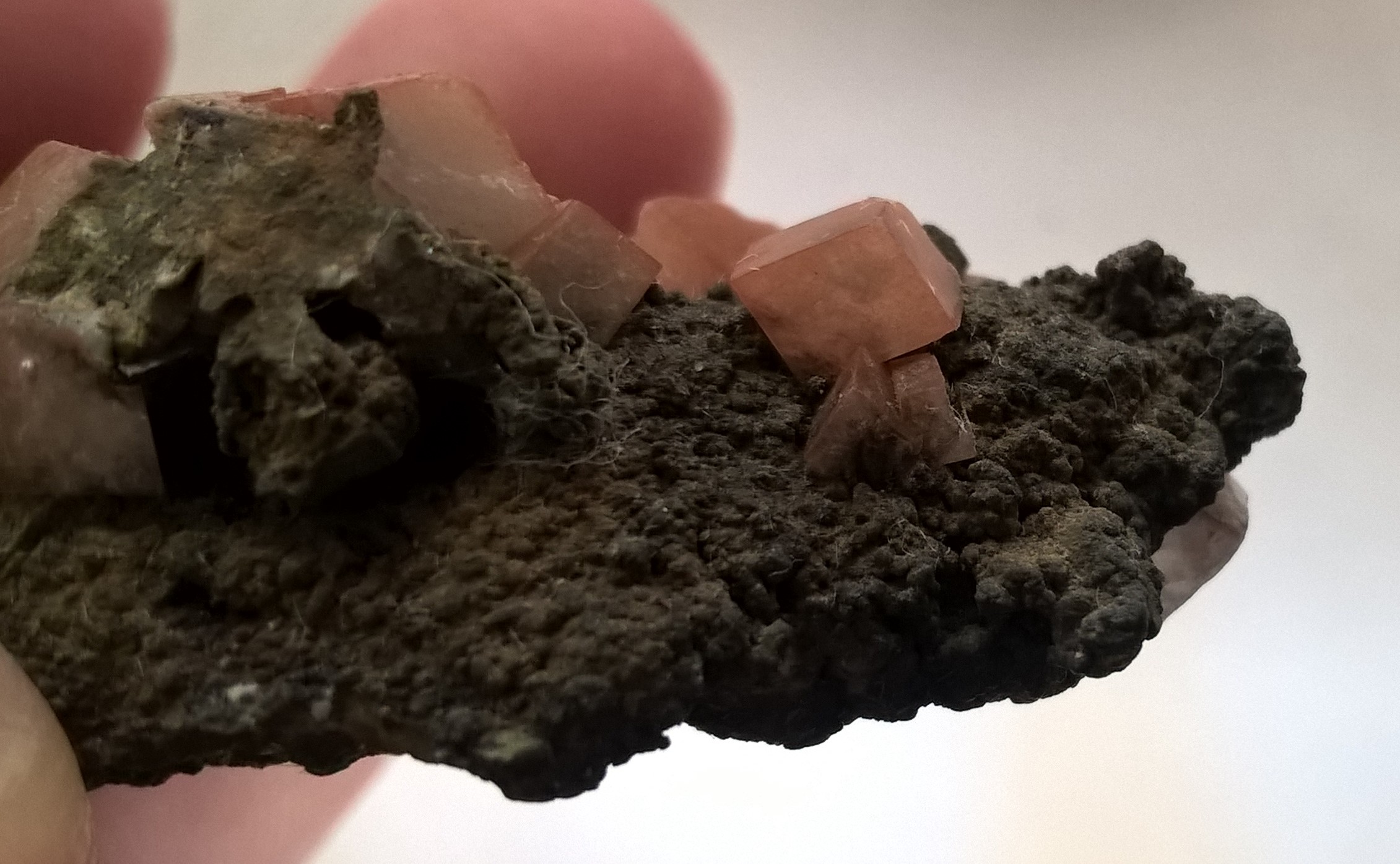
After finding an angle I liked, I took a photo reference and then picked one area of the rock to focus on and zoomed into that area of the picture.
I am very happy with the outcome of the rock texture in my final piece. I went in with my finest dip pen nib and so could make very delicate lines. I struggled on fulling the darkest shadows though so I went in the a cool dark brown powder pastel and then tent over with a wet brush. I also lightened areas by going over with the wet brush and then dabbing tissue paper. I then went over the rest of the are with the wet brush to create my more mid ones and left clean white patches for highlight.
In my final piece the crystals are a lot lighter than those in the sketches but I felt the lighter crystals looked closer to the actual reference object I had although they appear darker in the reference pictures. I felt it to be challenging to define the corners of the crystals but I think I did a good job at it. Blending the stone into the crystals was also difficult. Overall I’m happy with the results.
In my practice sketches I neglected to take in account of the shadow and so it was very poorly done, with powder pastel, in my final piece.
Unfortunately part of my paper was eaten by my rabbit and instead of redoing the entire drawing I decided to try and incorporate it into the drawing and added another piece of paper behind it so i could full in the shadow.
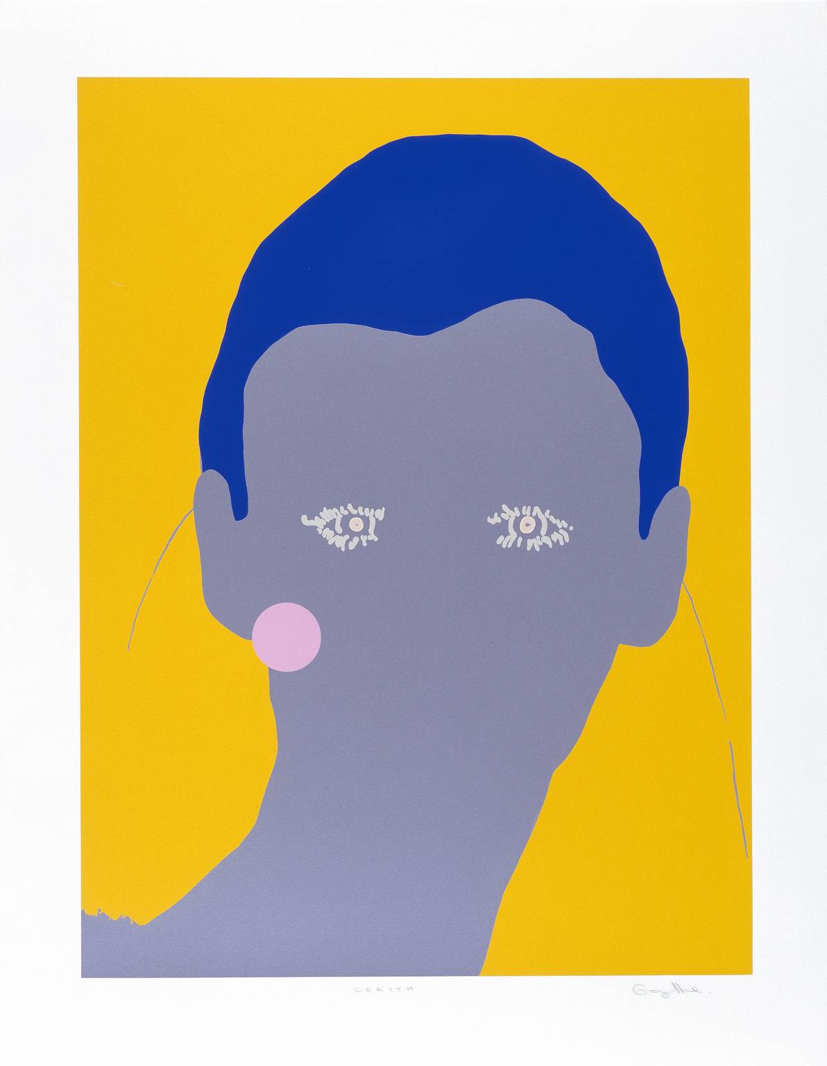
Gary Hume’s work is influenced by many different art movements and his work can be described as Post-modern. His simplistic subject matter and large flat planes of colour are influence from Minimalism and Pop Art. Other influences come from OP-Art and Neo-Geo
Hume states, “I used to think of the areas of color as tectonic plates meeting, so in the paintings it’s like there are these molten plates that would hit each other and dry. I wanted one of those plates to be higher than the other, and I wanted the hit to be more abrupt.” This can especially be seen in the images bellow. He uses cool colours for the faces and warm colours for the background. This use of colour makes it appear that the background is coming forward while the subject moves back. The use of complimentary colours also cause the flat planes to clash and stand out even more.
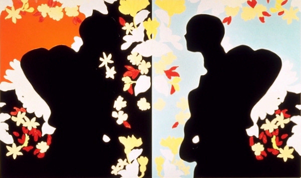
In “love loves unlovable” the subjects are black silhouettes framed by flowers. It is as though the light it coming off of the colourful flowers. The subjects are made from negative space yet it is clear that they are the main focal points of the artwork.
The silhouettes mirror themselves yet it is unclear which is the reflection. This artwork symbolizes a period in Hume’s life of self-evaluation and growth as to the type of artist he wished to be.
Love Loves Unlovable (1994)
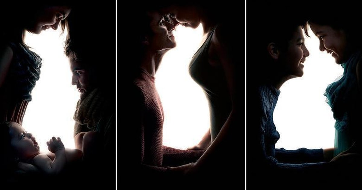
Bellow are photographs taken by artist Amil Jadhav. the purpose of these pictures was to inspire people to adopt animals from shelters. Jadhav’s amazing use of positive and negative space creates impressive optical illusions. When I first saw the pictures I immediately saw the white silhouettes of the animals and assumed that as the positive space. Upon a closer look I realized that the darker areas consisted of people and what I had mistaken as negative space was really the positive space. Although I’d say that the positive and negative spaces are interchangeable.
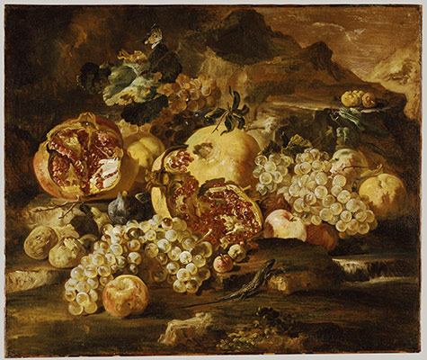
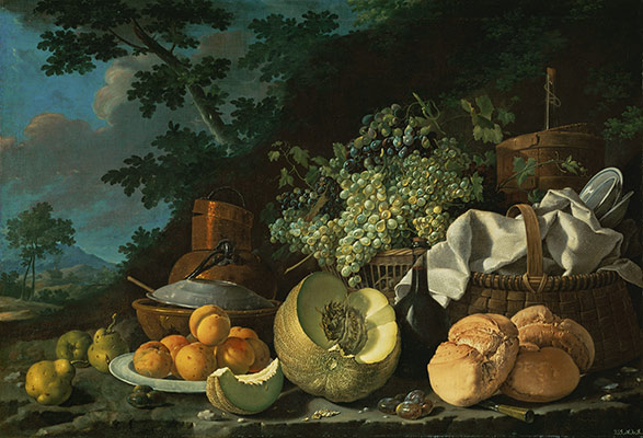
sixteenth- and seventeenth- century Dutch painters
The still life genre boomed in Flanders, Holland and Germany during the sixteenth century due to the Prodistant revolt against the Church of Rome. This lead to the near end of religious artwork and allowed artists to explore new subject matter and mediums.
This new genre challenged artists to create realistic and true-to-life artwork. This level of mastery was reached in the seventeenth century and is known as “Dutch Realism”.
The earliest still lifes AD were done in 1502 and 1504. Later, in 1520s-30s paintings containing moral messages and symbols was introduced by the German artist Hans Holbein the Younger. These messages were portrayed by using symbolic objects. The purpose of this symbolism was to remind the viewer of their/our short and sad lives on the earthly plane of existence.
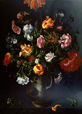
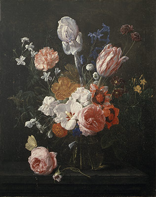
Nineteenth- century artists’ interpretation
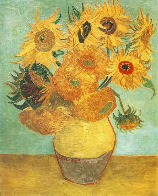
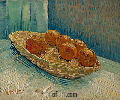
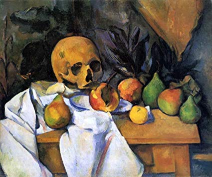
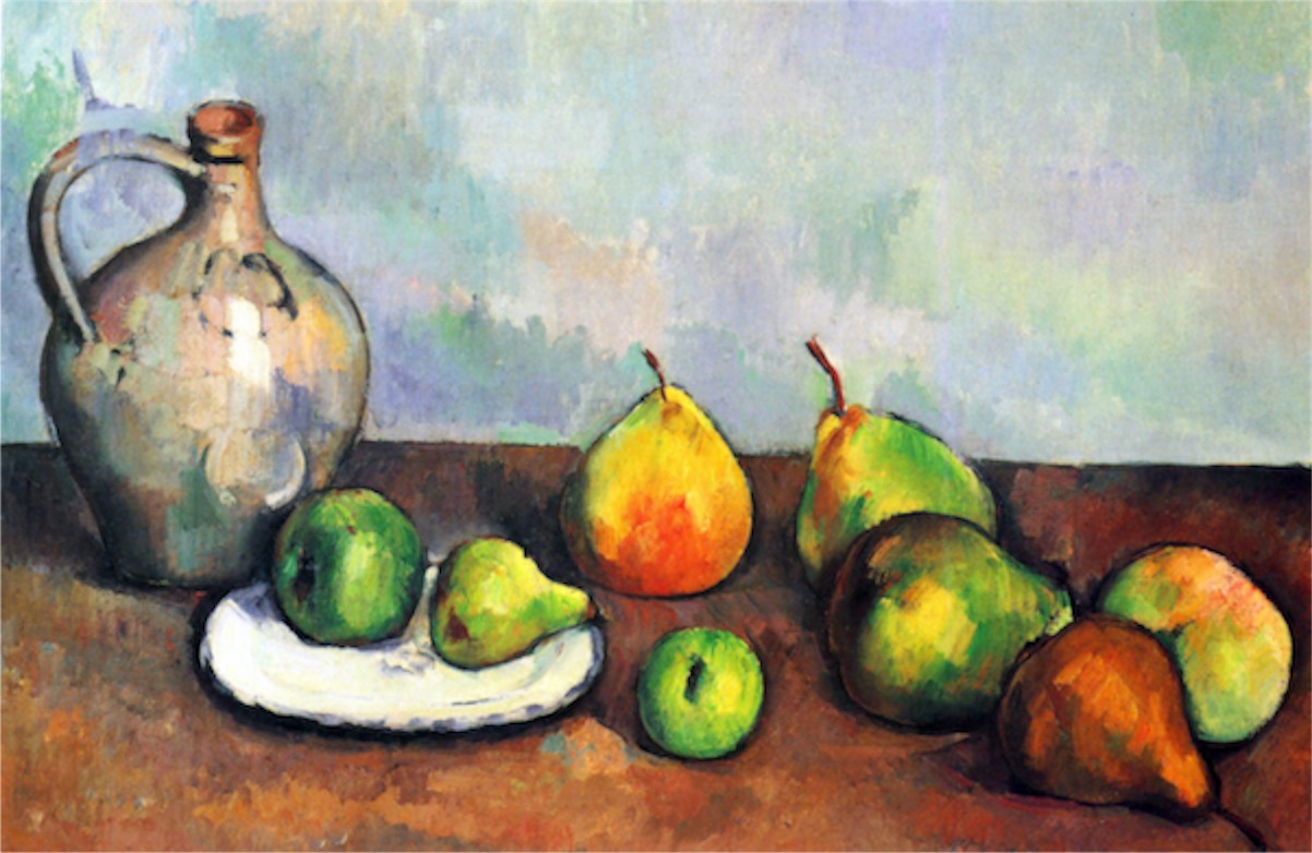
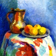
Still life has survived through many different art movements. These artworks would usually consist of everyday objects. Each art movement inspired a new approach to still life and painting as a whole. It was most popular during Post-Impressionism and was adopted by both Van Gogh and Cezanne. Cezanne also incorporated skulls into his work, influenced by the vanitas genre.
Van Gogh
Van Gogh
Cezanne
Cezanna
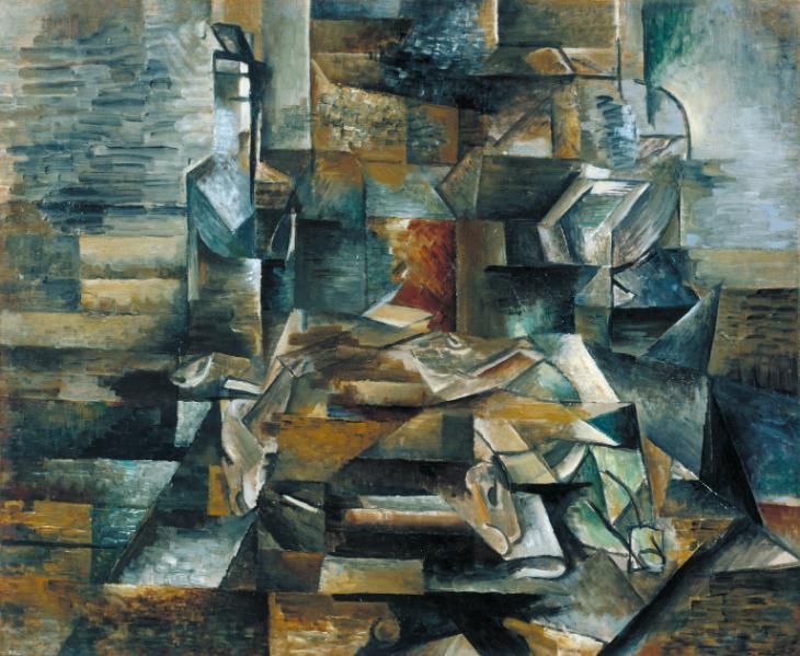
The Cubist approach to still life involved breaking down objects into flat basic shapes. they would paint the subjects as viewed from multiple angles at once.
Bottle and Fishes c.1910-2 Georges Braque
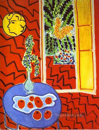
Fauvists went about incorporating unnatural colours into their still life paintings. They focused more on portraying their emotions and feelings towards the objects instead of the objects themselves.
Contemporary artists
Themes such as death, time and consumption are common in contemporary art today. Photography is often used and many artists will try and compete with the quality of today’s technology by creating hyper realistic artwork.
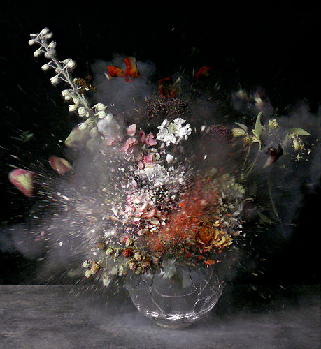
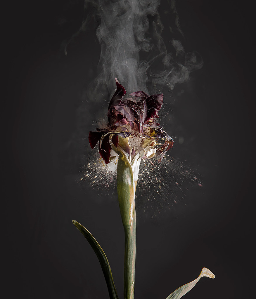
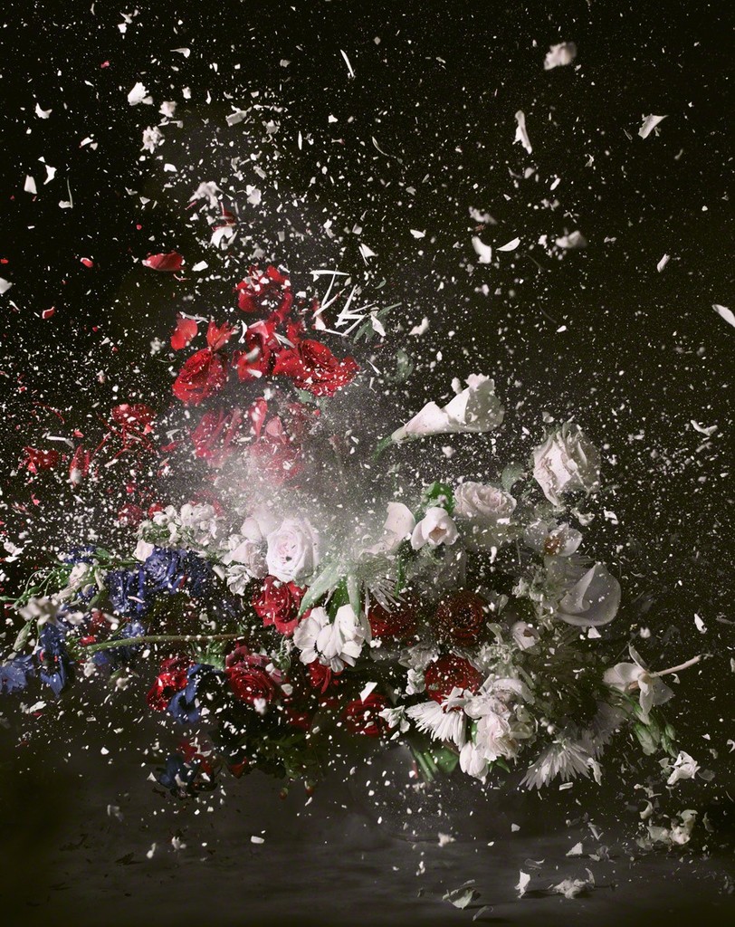
Ori Gersht recreates scenes from 19th century still life art with vases of flowers and photographs them mid explosion as part of his series “History Repeating”. He does this to depict history repeating itself and the fragility of life.
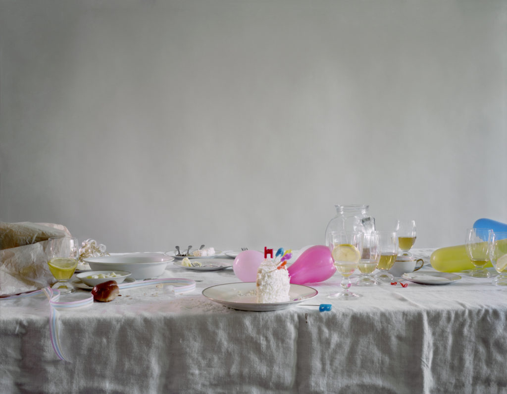
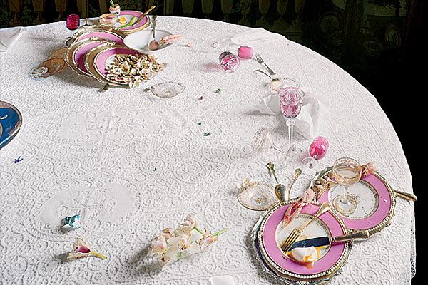
Laura Letinsky is an artist who depicts things after their purpose has been fulfilled; she says she wants to explore “the more meager path, an inclination to be happy with what you have. It all made me want to look at the still life in the moment after things are consumed—thinking about this ‘post’ moment, about hunger, about desire and want and need.”
In her “The Dog and The Wolf” series, she photographs still lifes with orange peels, half eaten foods such as cake, deflated balloons and other such objects that show that people have been there in left their discarded materials behind.
She invites us to enjoy life but at the same time shows the passing of time and that all things end.
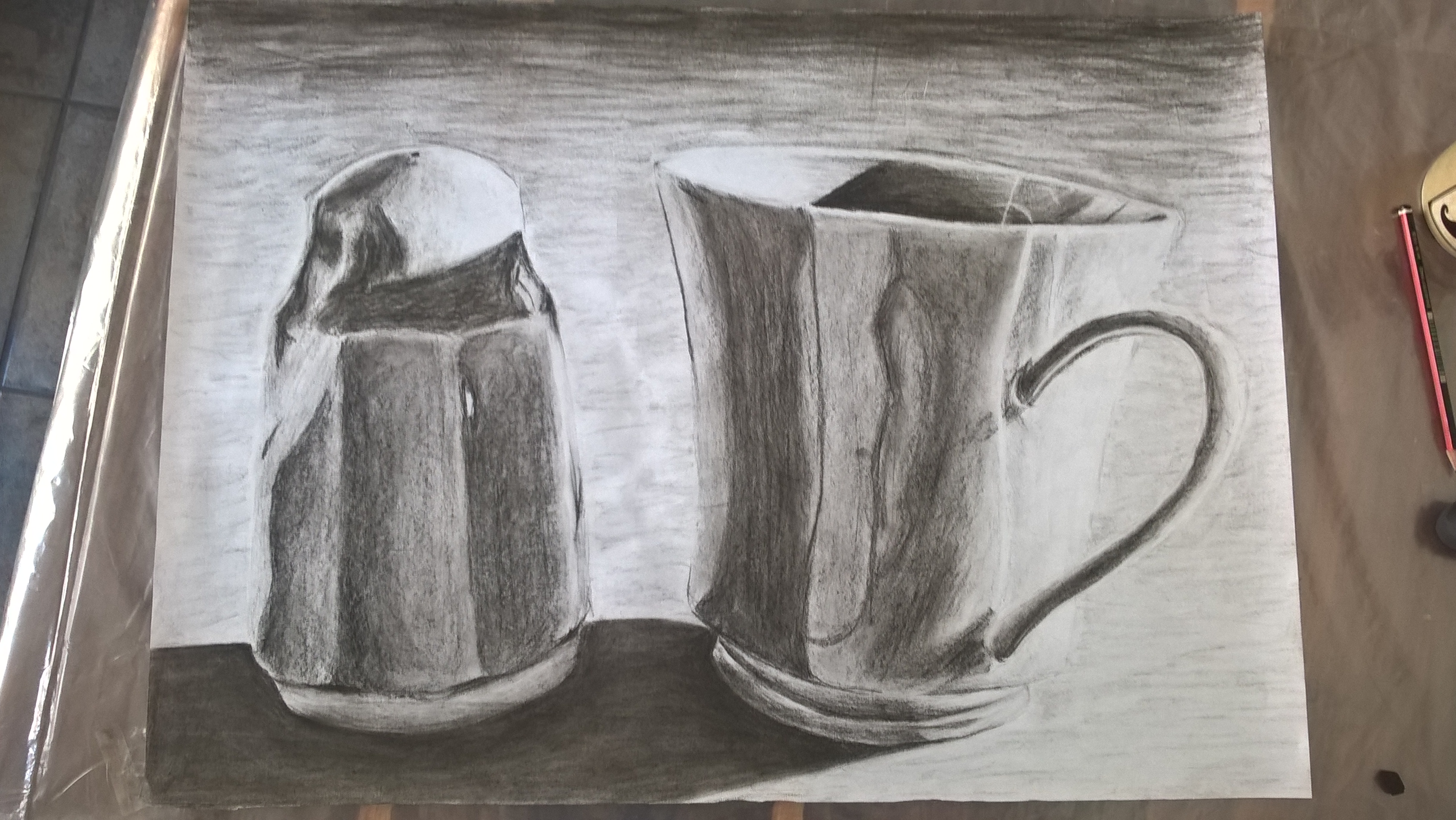
The jar at the back of the drawing contains the ashes of my pet dog whom was very dear to me. He had a wild and static personality with I tries to portray in the texture of the jar.
The jar towards the right is a glass jar of spice which I use to mix my own paints. I tried to portray the gloss of the glass by using watered down ink and charcoal and I’m quite happy with the way it came out.
Towards the left is a velvet pouch given to me by my step mother who raised me. I used charcoal and water to portray the soft texture of the velvet.
In front of the pouch is an old make up container from France. France used to be my home when I was a baby, the container represents this. The container has a glittery surface and so I tried to portray all the spots of light and shadow by using oil pastel. I started with only using black but I was not happy with the range of tone and so used white as well.
The small Buddha statue is something my grandmother gave me and so it is quite special to me; Buddhism has also always intrigued me and I love learning about different religions. There are many small details on the statue and so I used my finest nib for my dip pen. I also went back and forth between using washes of ink and the dip pen.
I used that same ink technique on the acorn although I relied more on the dip pen and only used the ink wash in the darkest areas. The acorn represents the trip I went on to Greece and Italy, which was a large turning point in my life. While on the trip I was inspired to go into the field of archaeology and conservation which is also way I am currently working on my fine arts degree.
Around the acorn is a bracelet that was also gifted to me by my step mother. I used a mixture of charcoal and water to portray the smoothness of the beads. I also went in with some white charcoal to lighten up some of the areas that I felt were too dark.
Lastly I did the pocket watch, it was the gift I received after finishing school. It’s not very sentimental to me but I really like the look of it. Here I used a mixture of my gel pen and charcoal. I am not very happy with the result though and if I were to do the drawing again I may just leave it out.
I tried to use different textures/ mediums for the different objects however I don’t think I did a very good job at portraying emotion. There was difficulty when it came to the shadows of the different objects crossing over. I did not know where to end with one medium and start with the next, especially when it came to the area in front where the oil pastel and charcoal had to mix but overall I think it came out rather well.
following feedback from tutor
Not enough sketch book art (tutor). Not much progress/ development in my artwork(tutor).
Must draw more often and not just when I do exercises. To help encourage myself to draw more often I have made a new board on Pintrest where I can keep images for inspiration.
By drawing more often, the development of my skills will become more evident.
I tried using darker tones for less fat white space like in my precious works. I feel that I may have done this piece too dark, although it could just be that I am not used to adding so much shadow. I think creating a wider range of tonal values is still something I need to work on.
I also tries to full in more of the background in an attempt to make the white areas in my objects stand out more.
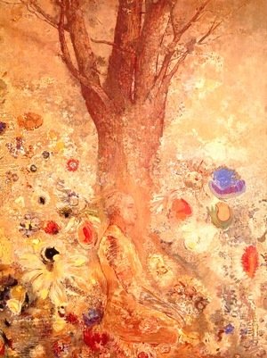
I love Redon’s artwork, both early and late. I feel that they are very emotive, he is able to take mere ideas and turn them into expressive works of art.
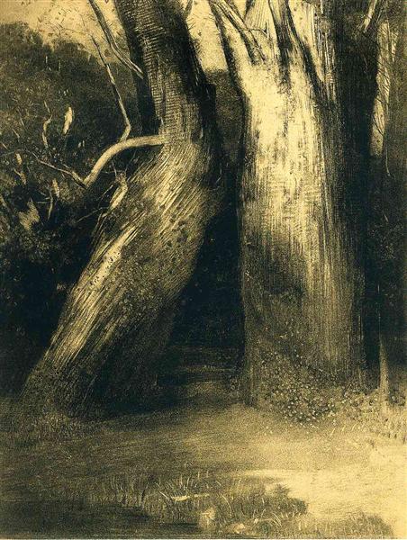
Redon’s earlier work consisted of black and white drawings, known as his “noir” work, as he describes it. These pieces are very detailed and realistic (e.g. Two trees) . However he did not feel that these pieces were emotive enough and so turned to more abstract and dream inspired work. (e.g. The crying spider)
While sticking to his new style, he stared using more and more colour in his work. He would start with a black and white under drawing and then go over in colour.
He used a verity of mediums and would layer them in order to create his desired effect. He was very experimental with his techniques. I too enjoy experimenting with mediums and techniques and so this draws me toward his work. (e.g. Buddha in His Youth)
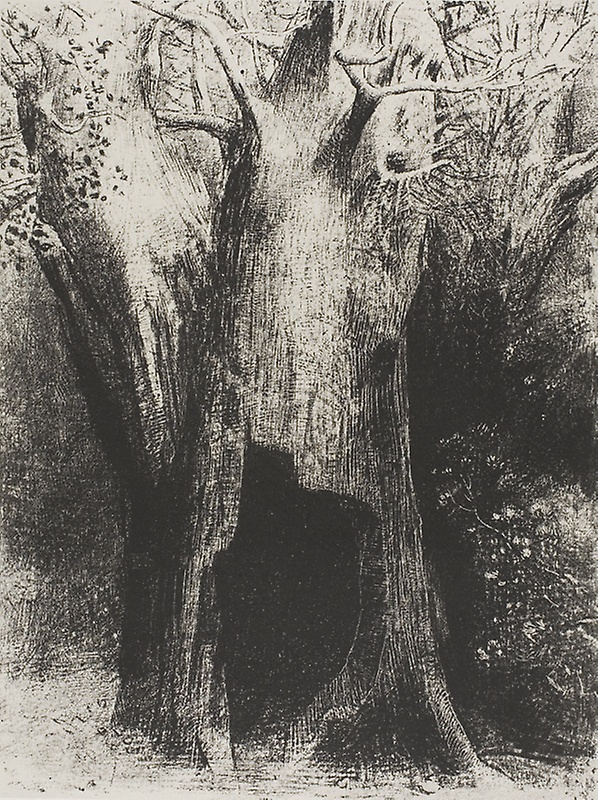
Redon does not outline his work and merely uses shadows to create substance and depth. The artwork bellow has a busy yet calm feel to it. He has used cross hatching on the main trunk of the tree which makes it seem rough and sturdy and tells the viewer that these trees/ this forest is old and holds many stories. the smaller branches are smooth and light. The leaves in the top left corner look so small and delicate in comparison to the trees.
The dark shadows behind the trees and in the hole of the center tree creates a feeling of depth. It creates a stark contrast and gives the trees substance. I feel as though if I were to go beyond the trees I would fall into nothingness.
I plunged into solitude. I dwelt in the tree behind me.
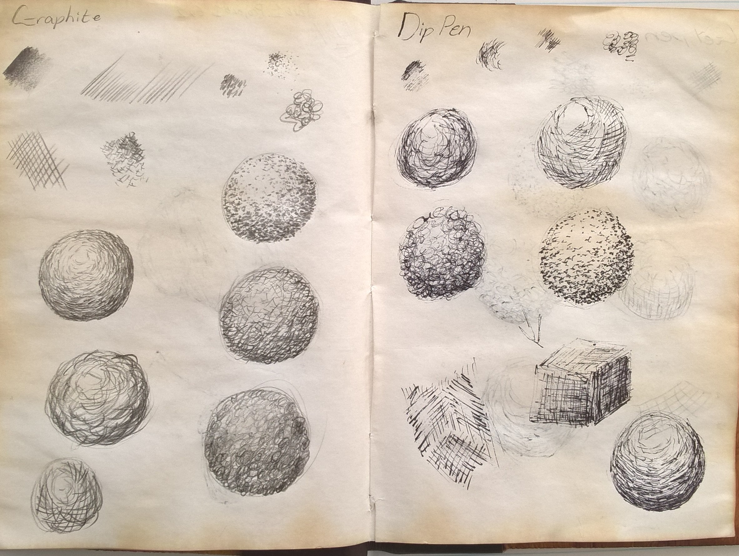
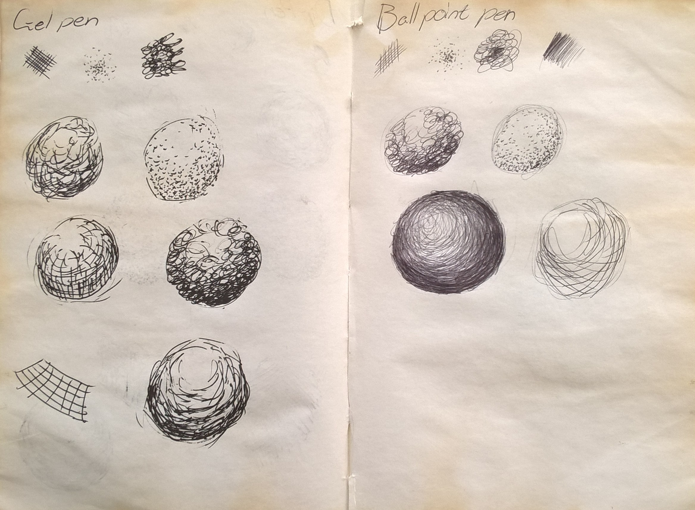
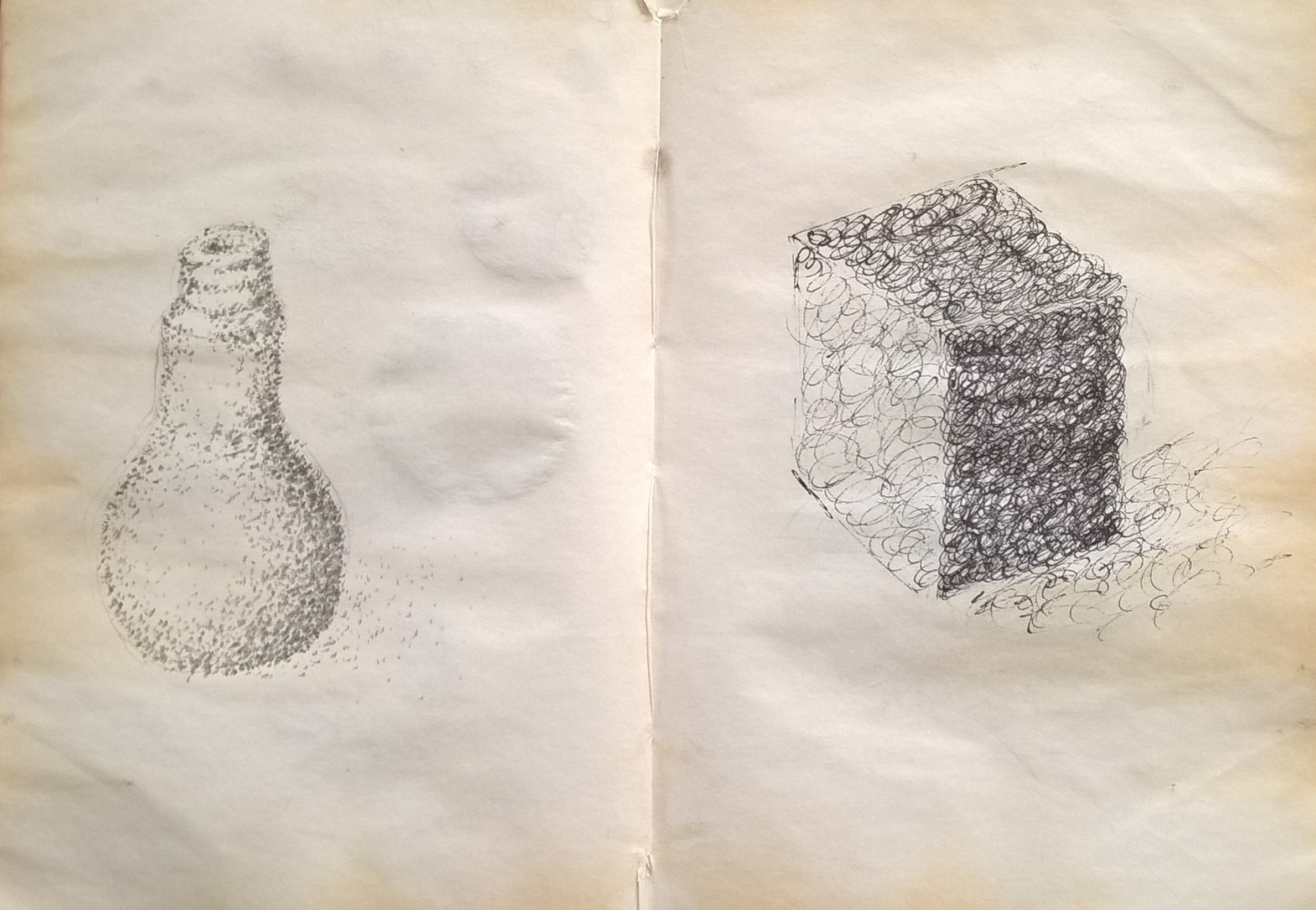
I found this exercise to be rather challenging because many of the techniques are new to me. I did however enjoy the opportunity to try new methods of drawing and shading. I decided to test the all the techniques with every medium in order to see the mediums effect on the textures.
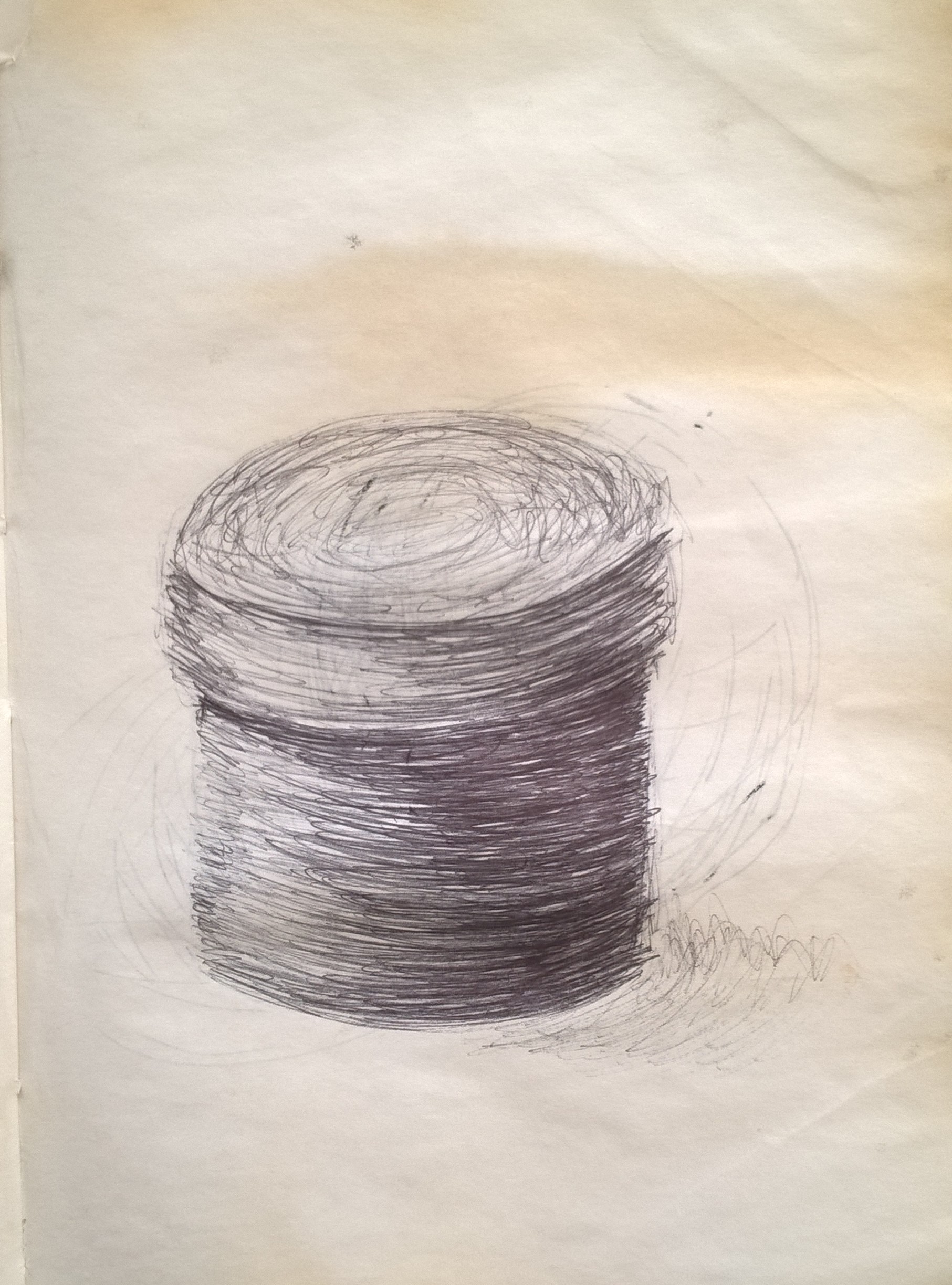
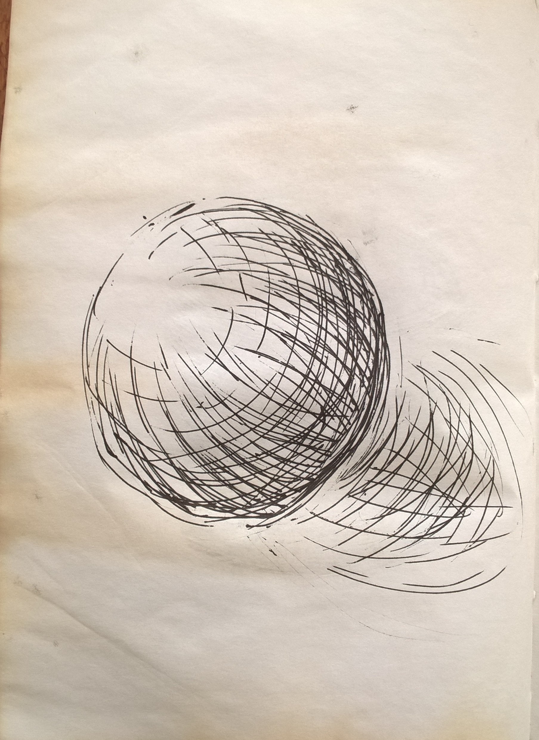
Originally, concerning the two drawings bellow, I had planned to do the cross-hatching technique on the cylinder and do the hatching on the sphere. However, after attempting the cross-hatching on the cylinder, I was not satisfied with how it turned out and thus decided to do the cross-hatching on the sphere and the hatching on the cylinder.
ballpoint pen
gel pen
I found it difficult using the dotting technique mostly because I was not used to it. The circles on the other hand felt more natural although I feel they would work better with a rounded object.
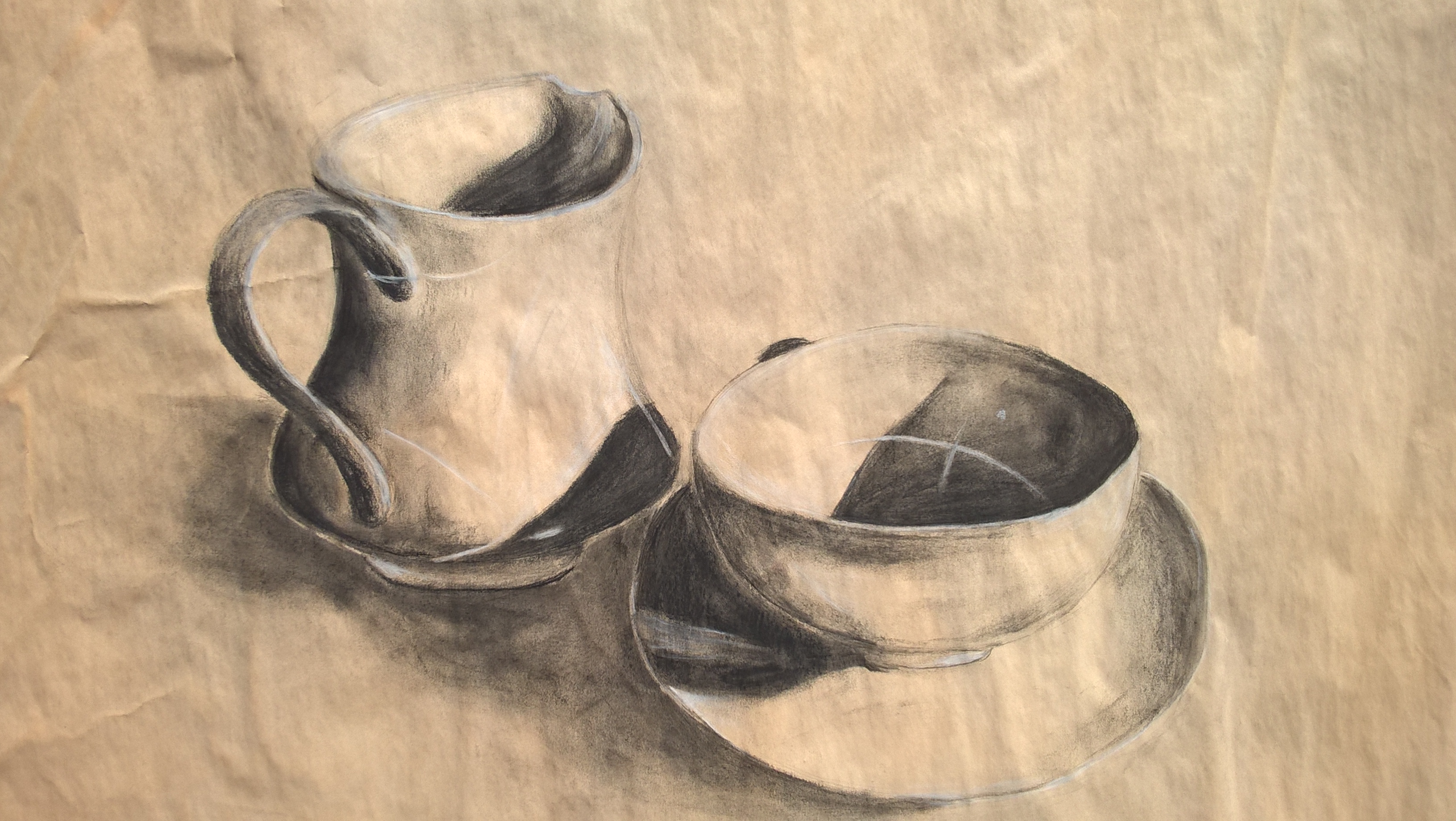
I decided to work on light brown paper and have it act as a lighter mid tone. I then used black charcoal for my shading and white charcoal for my lightest tone. I found it difficult to create a smooth transition from light to dark.
Looking back I feel perhaps I should have embraced the rougher shading techniques explored in the next exercise of this project. I find that my drawing style tends to change depending on what medium that I am working with. I also find that I tend to be afraid of making my drawings too dark and so end up making them much too light.
After setting up my objects I drew their shapes with pencil before using my ink and dip pen.
pencil sketch
I had initially intended on using just my dip pen. I used quick spontaneous gestures to shape and shade my objects. I made made looser movements for the lighter areas and tighter movements for the darker areas.
I was not satisfied with the effect of using only the dip pen so used a paintbrush and mixed the ink with water to do more shading. In some areas I worked with a paintbrush dipped only in water to make the pen lines bleed. I worked back and forth with the brush and pen until I was happy with the drawing.


