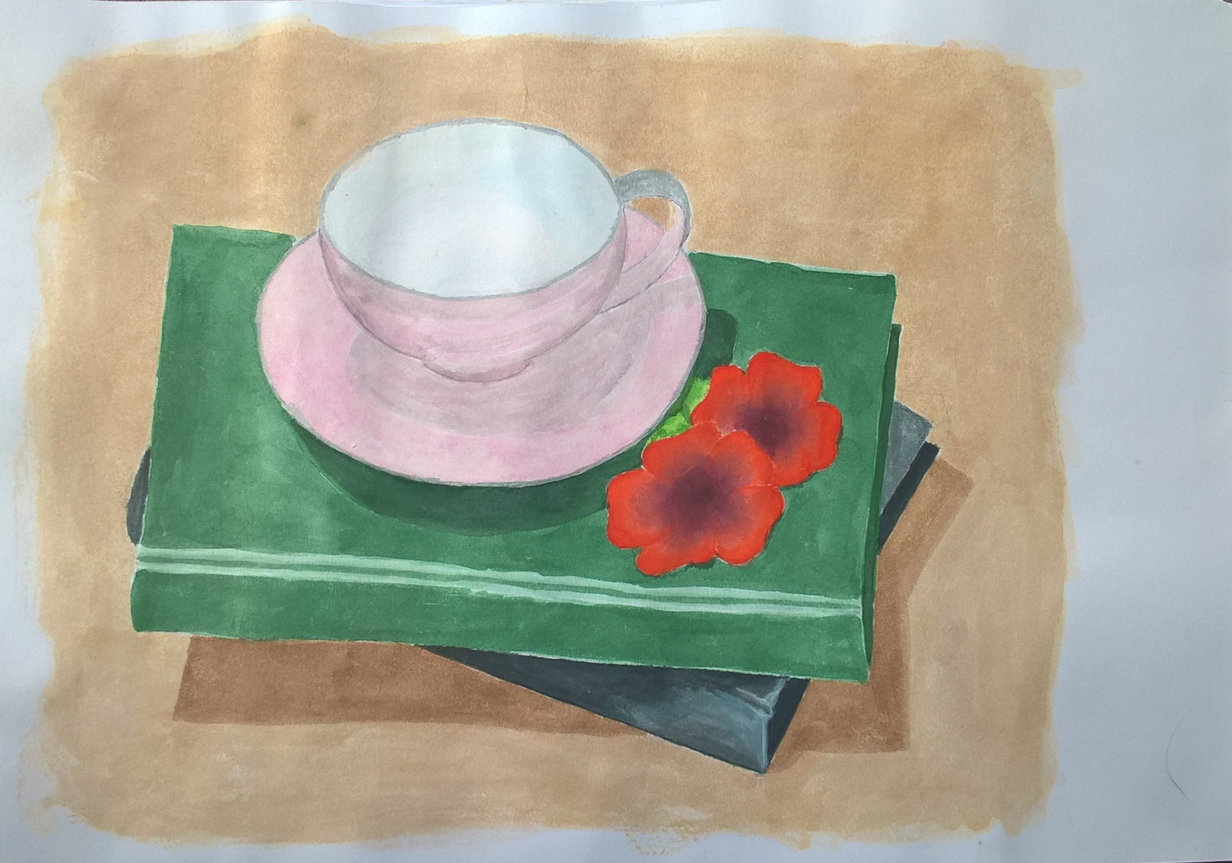
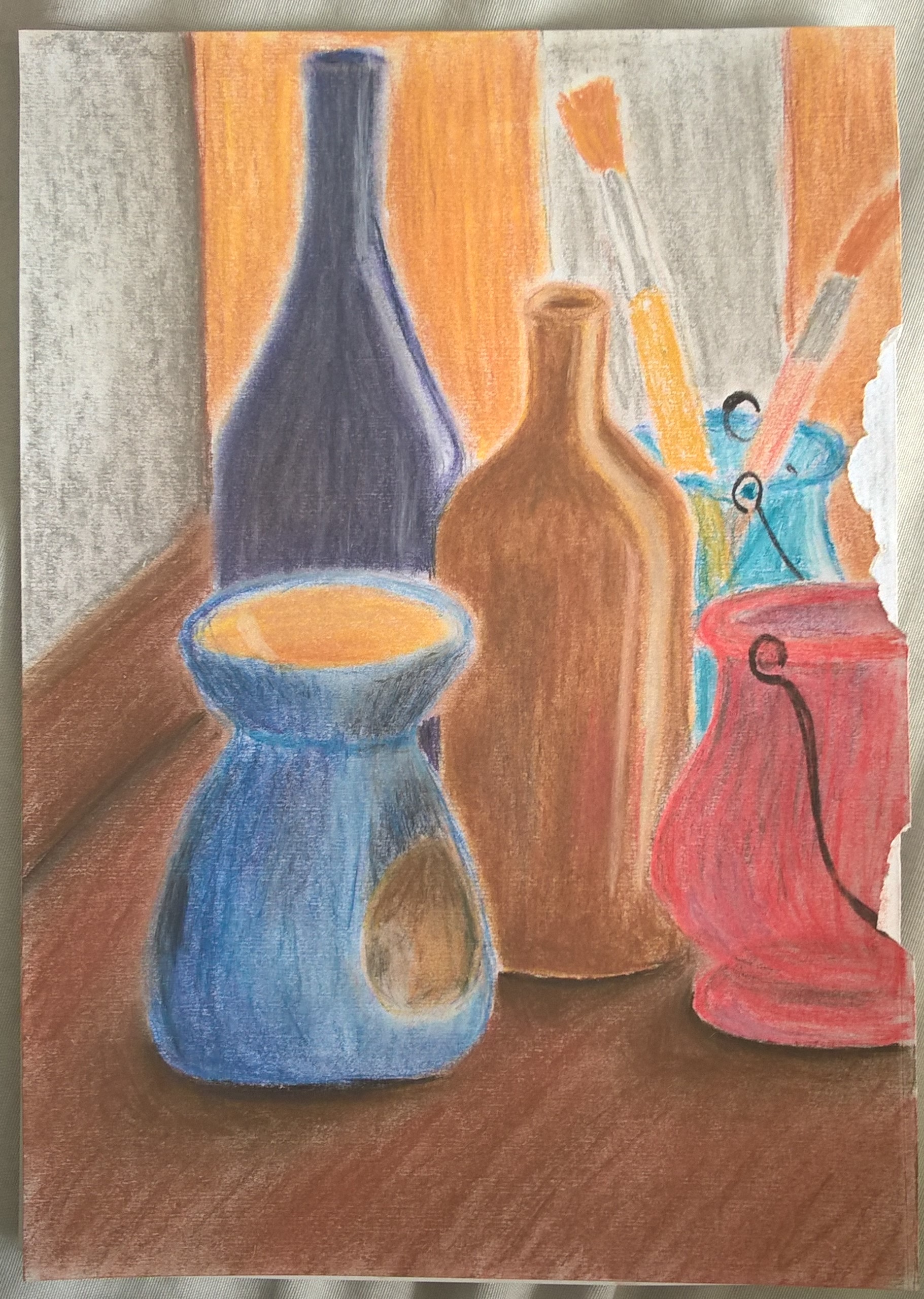
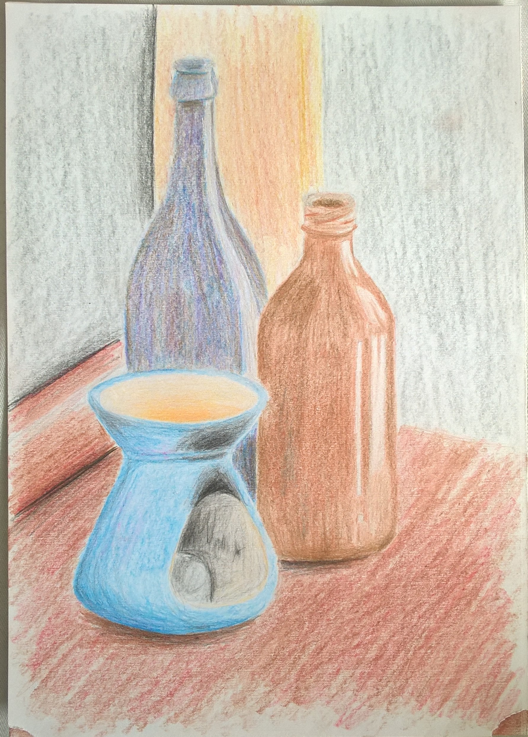
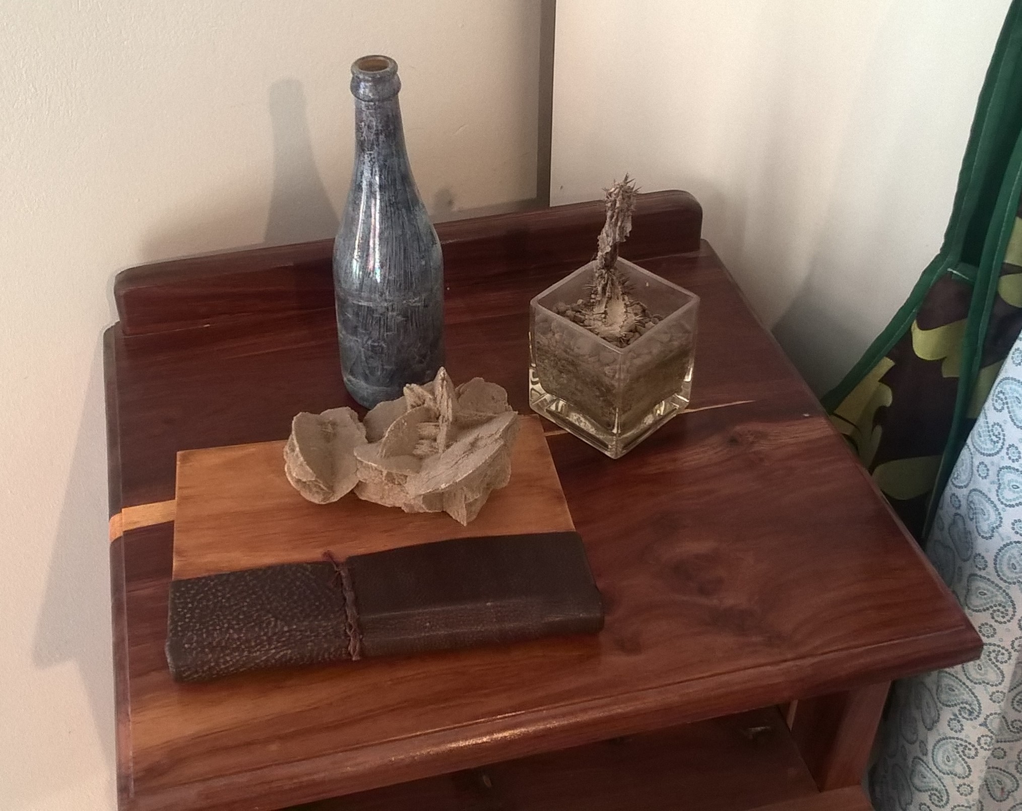
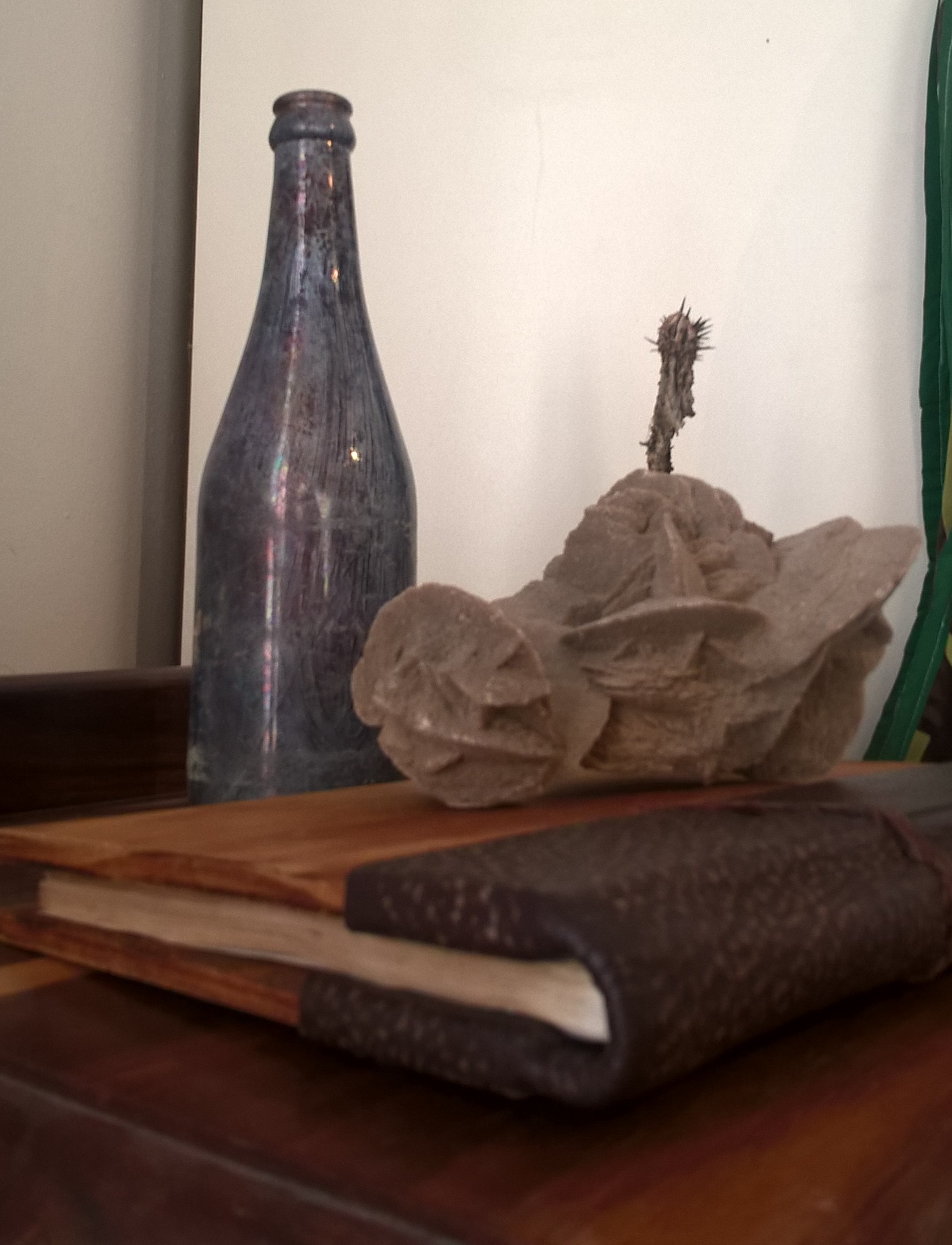
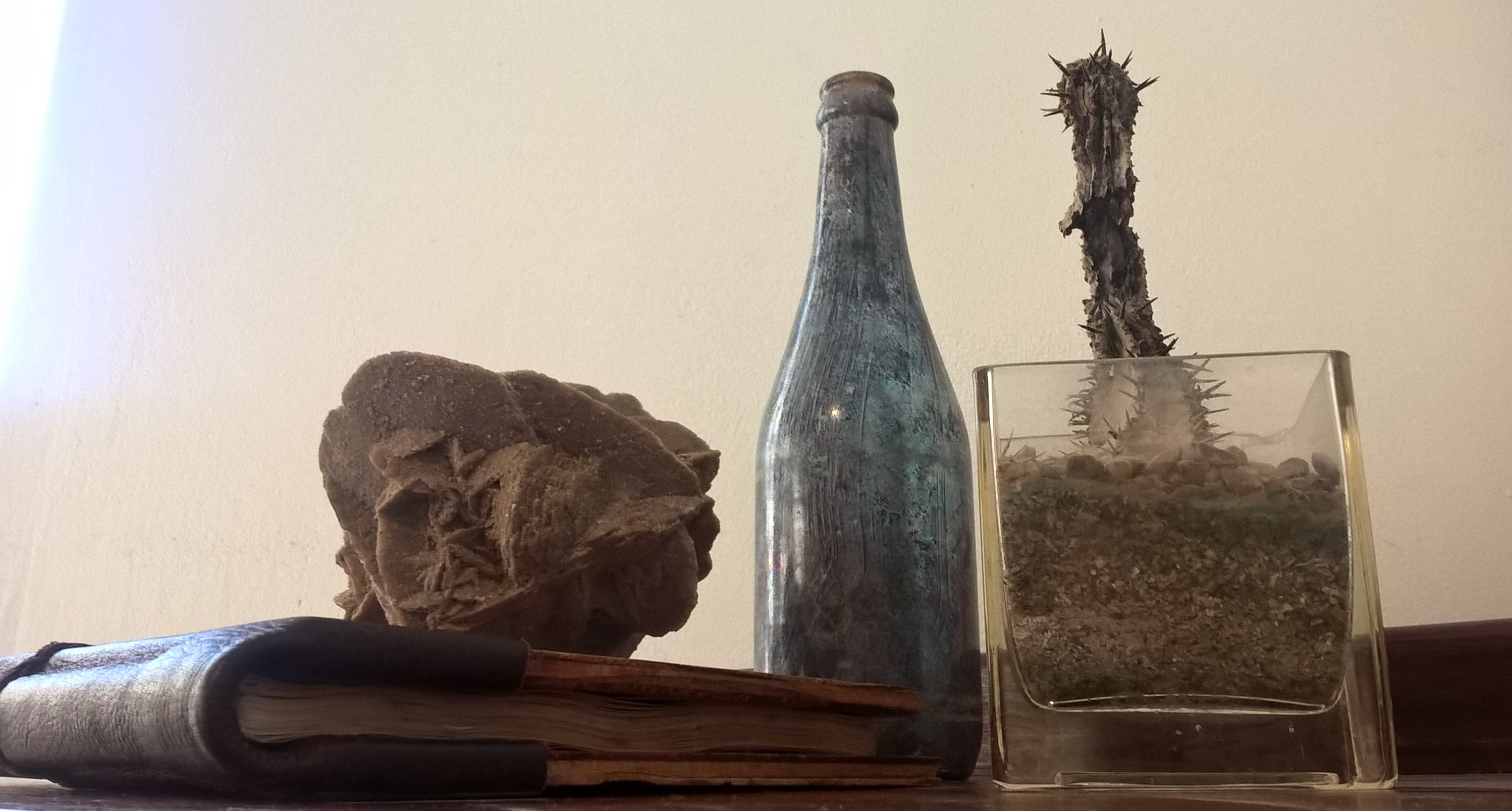
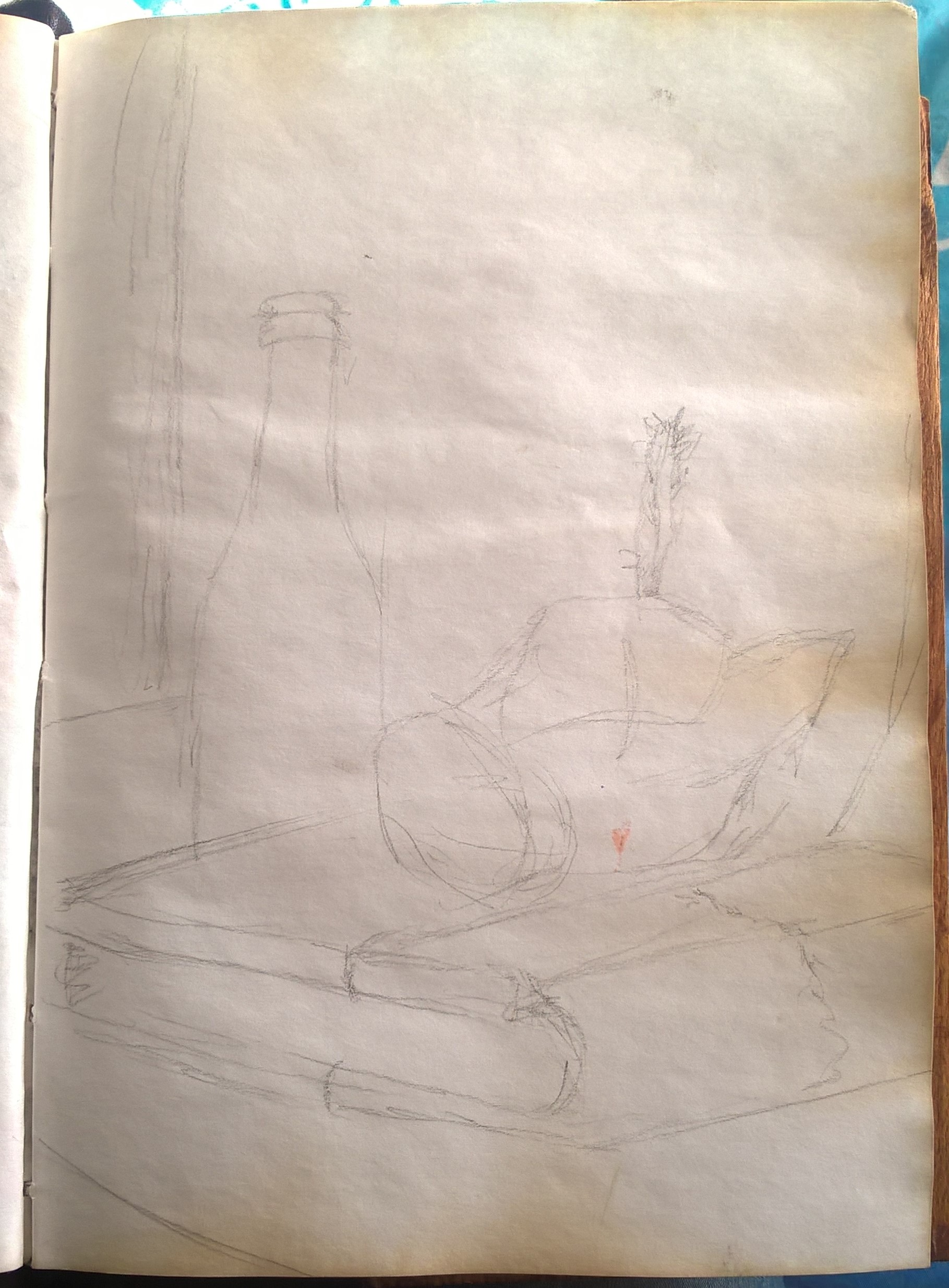
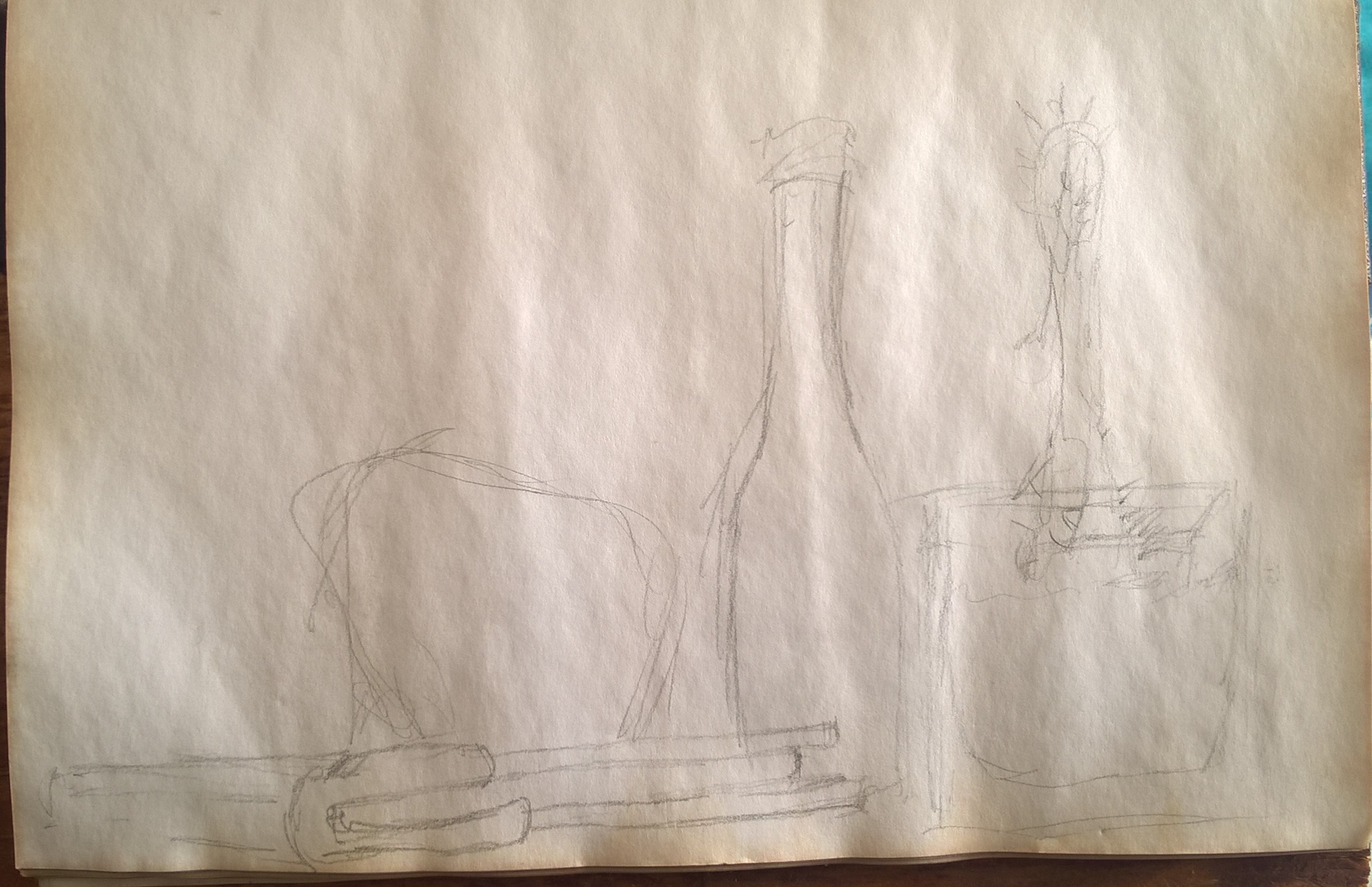
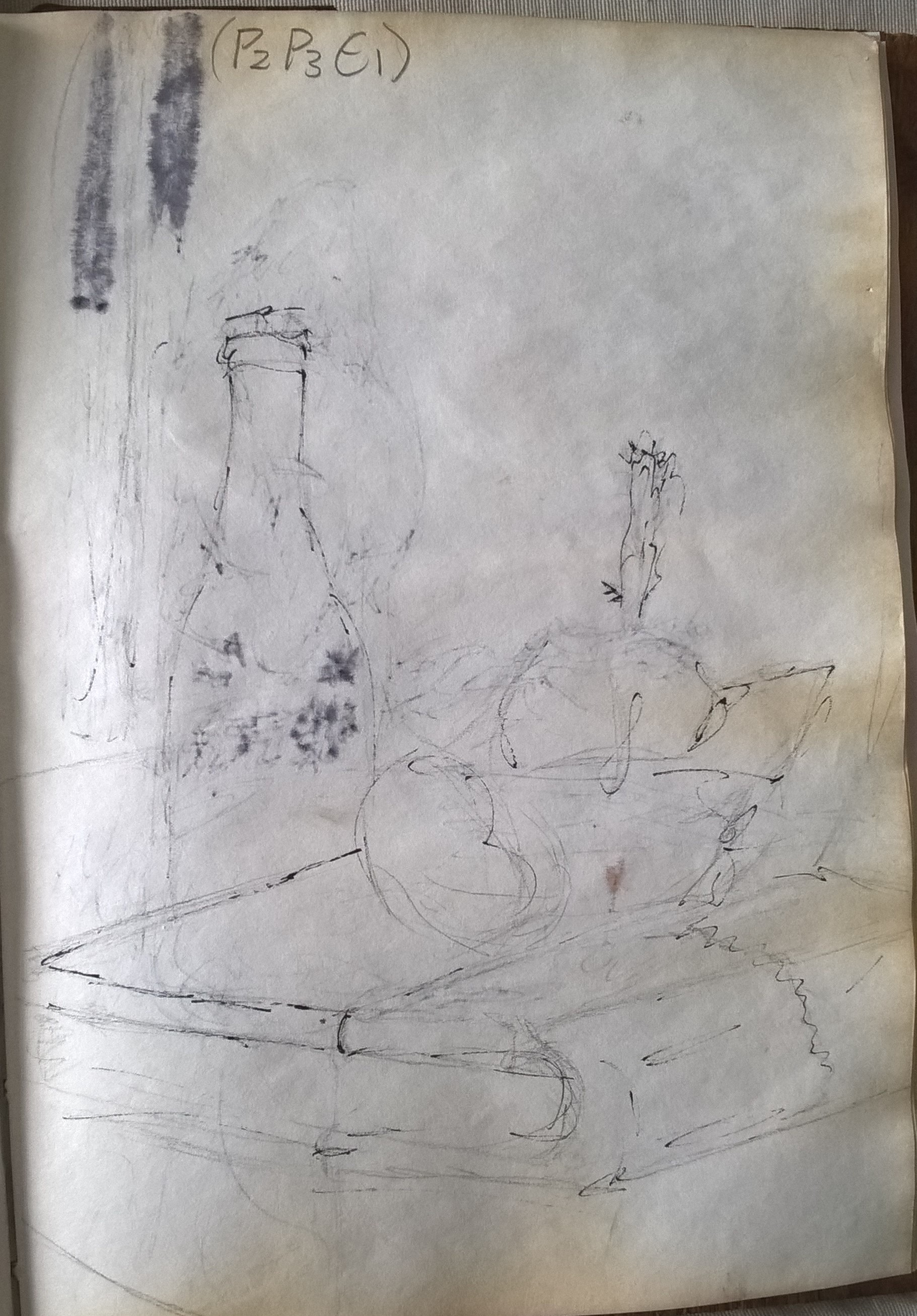
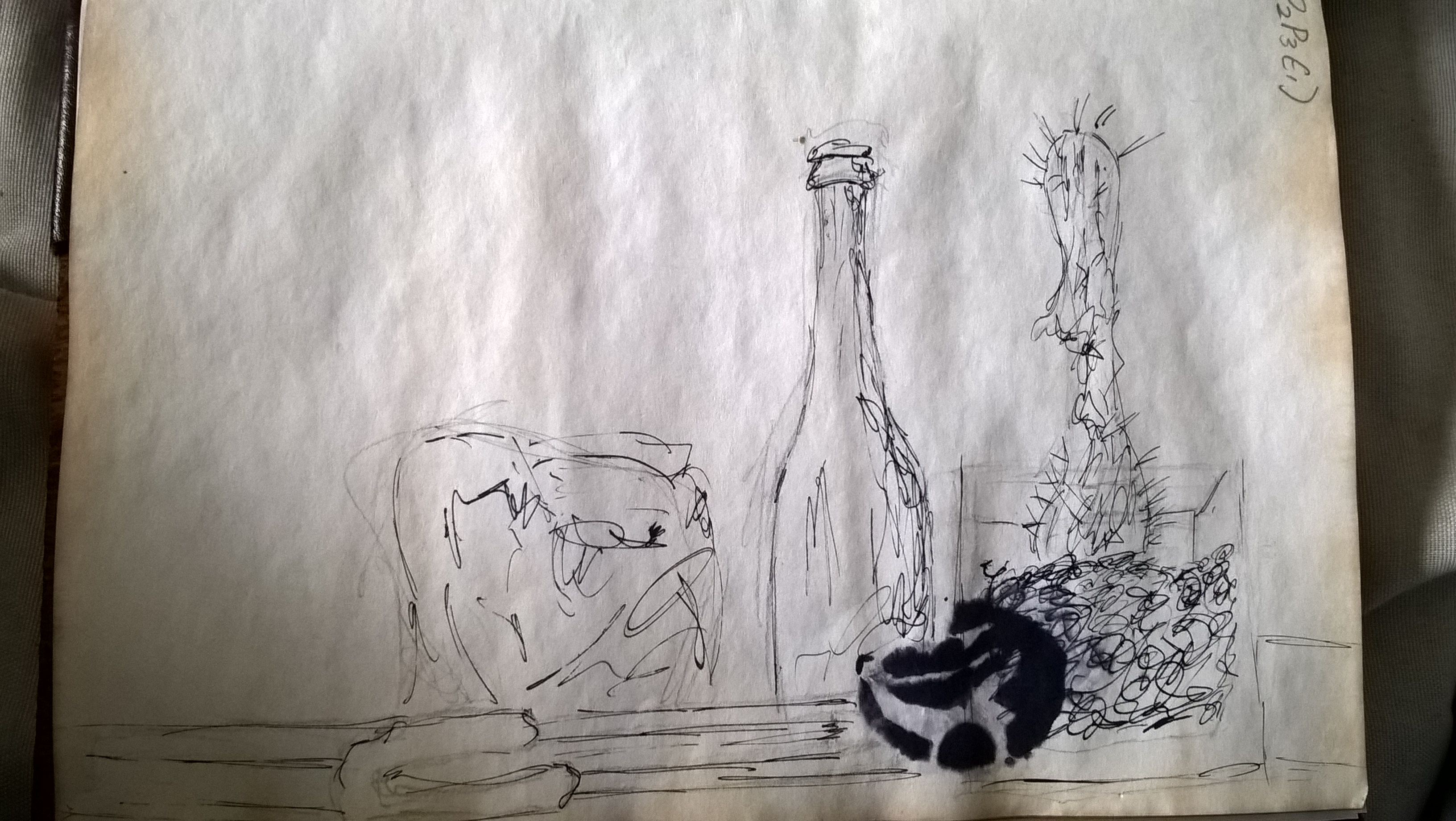
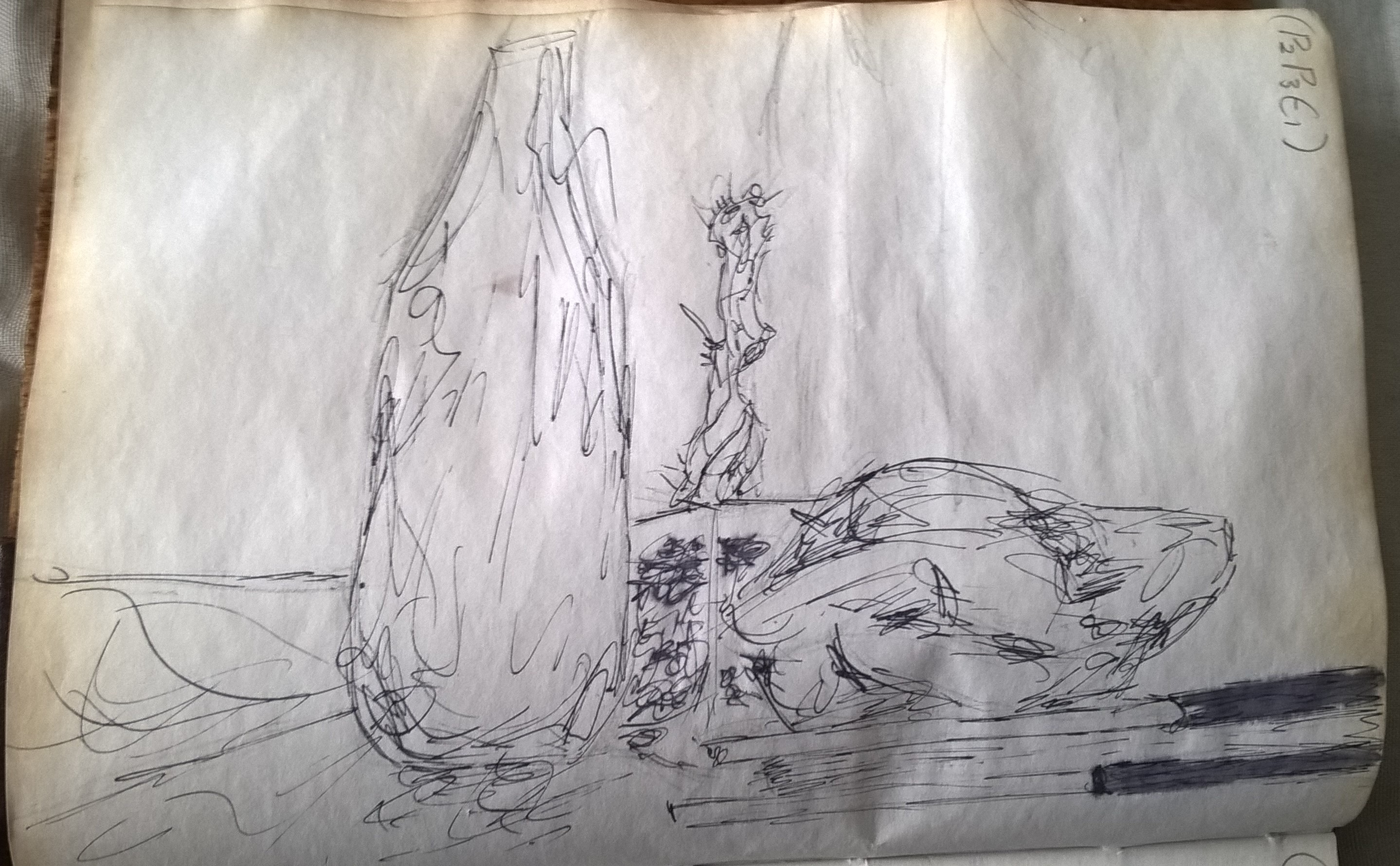
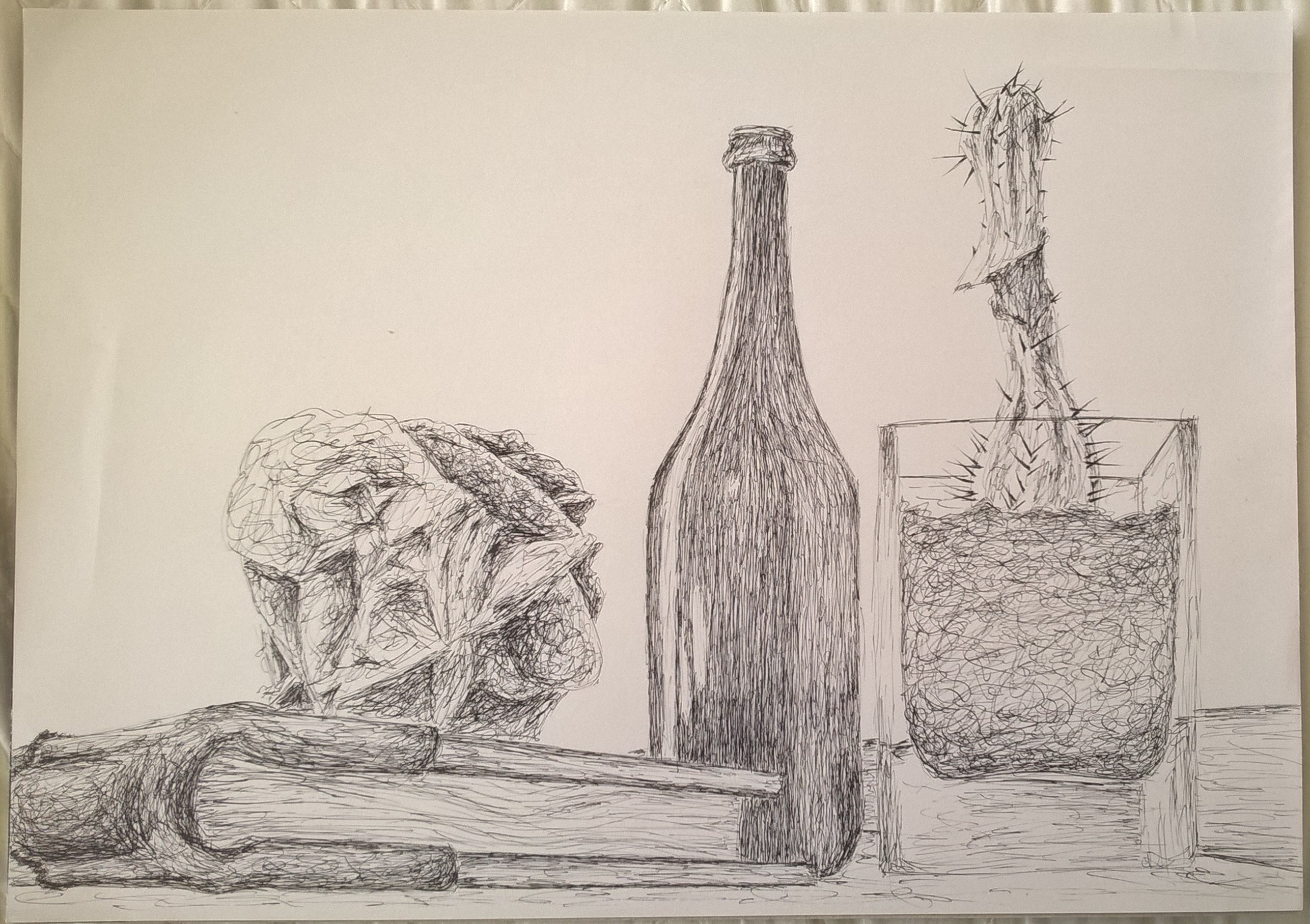
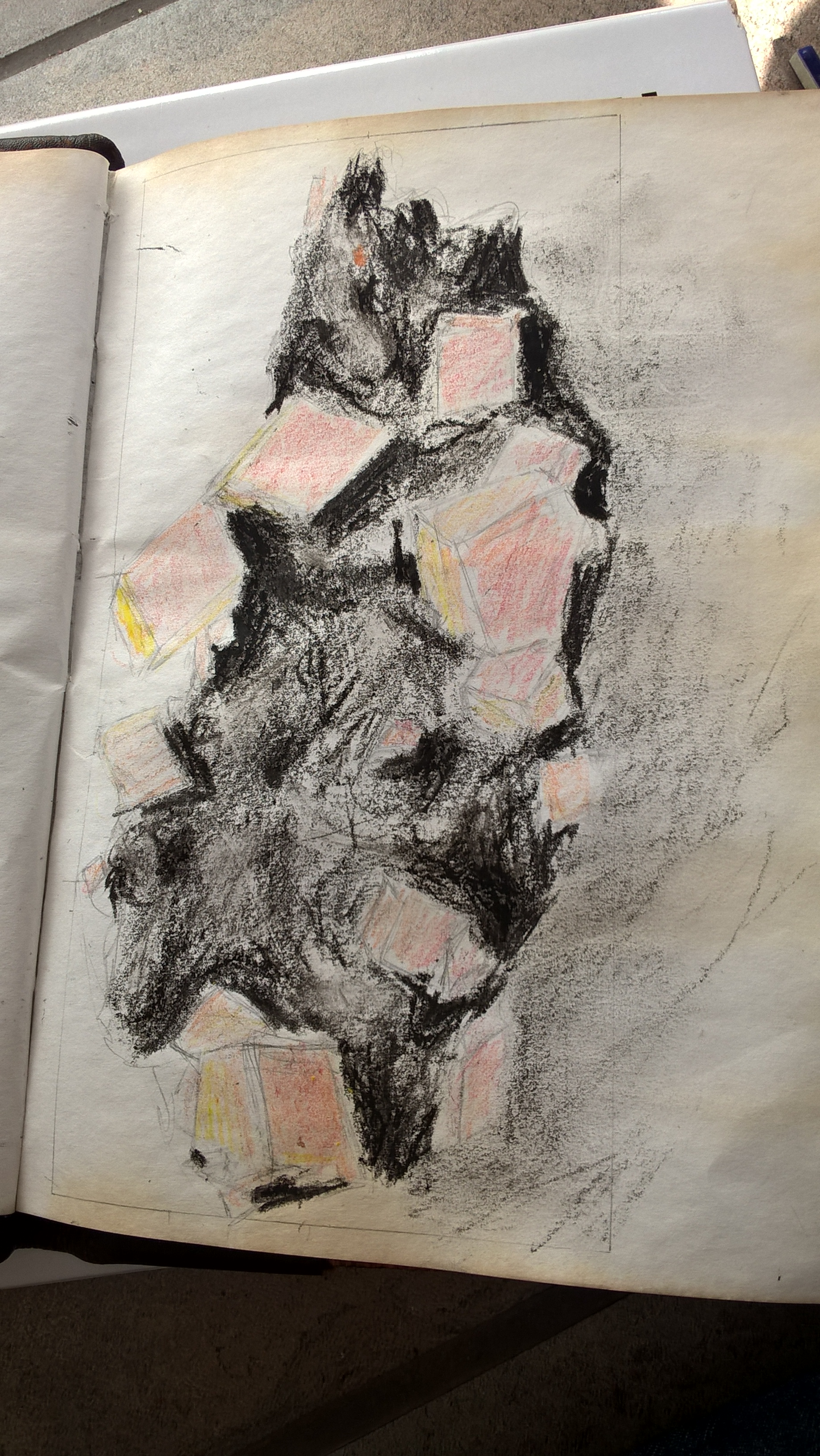
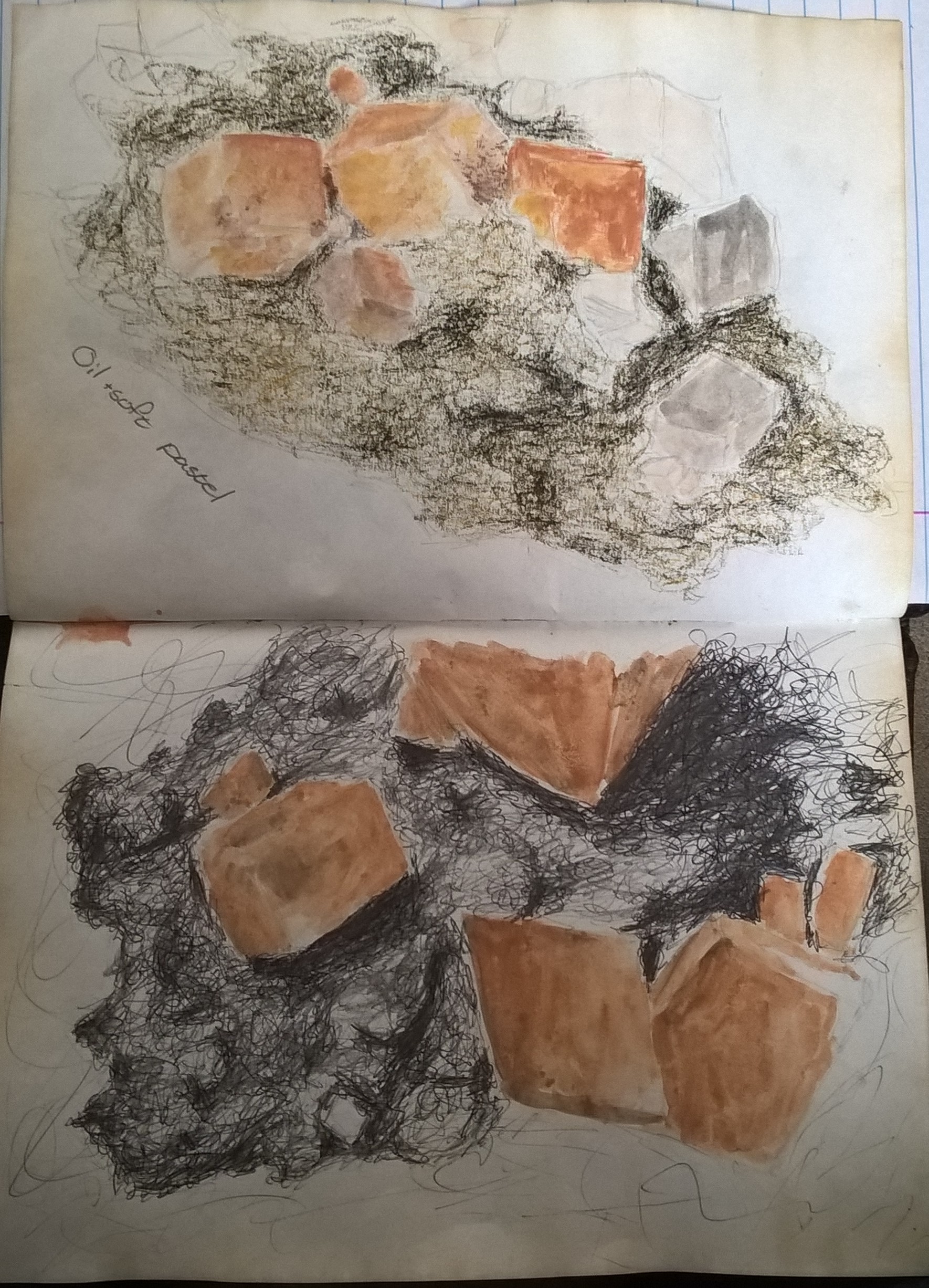
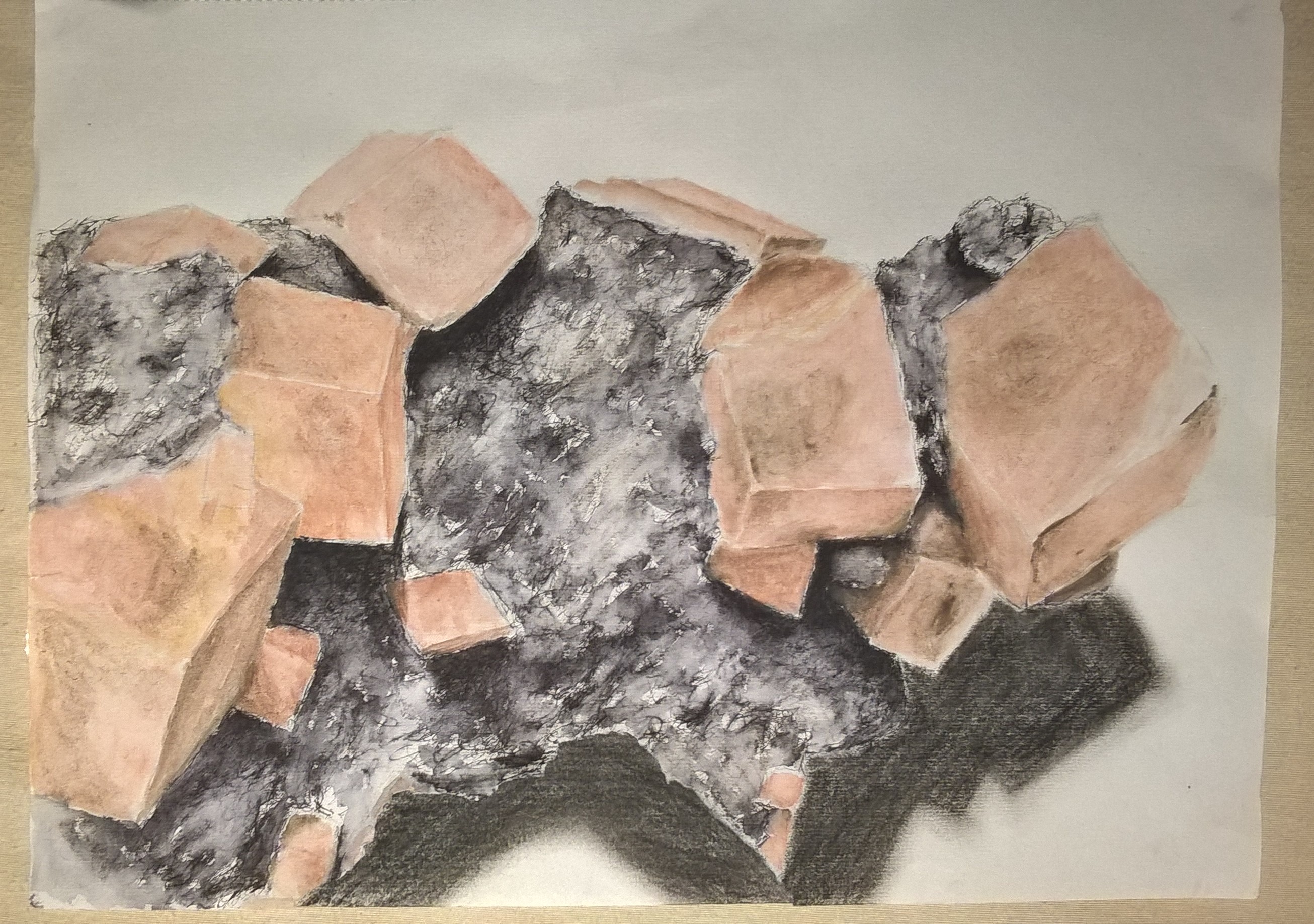
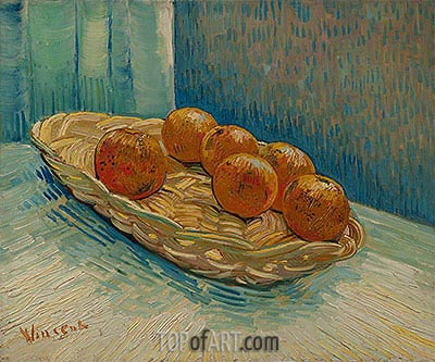
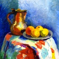
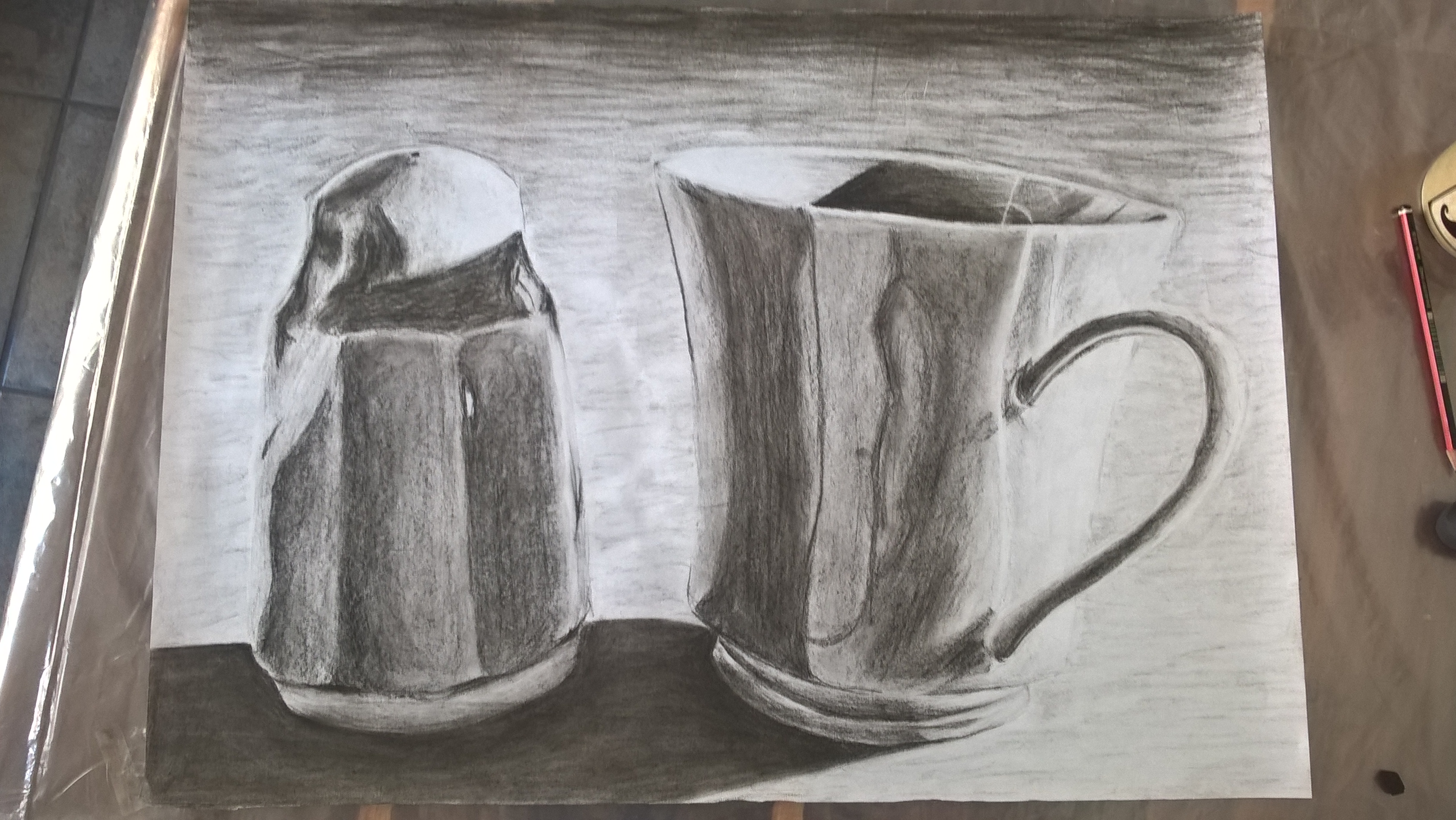
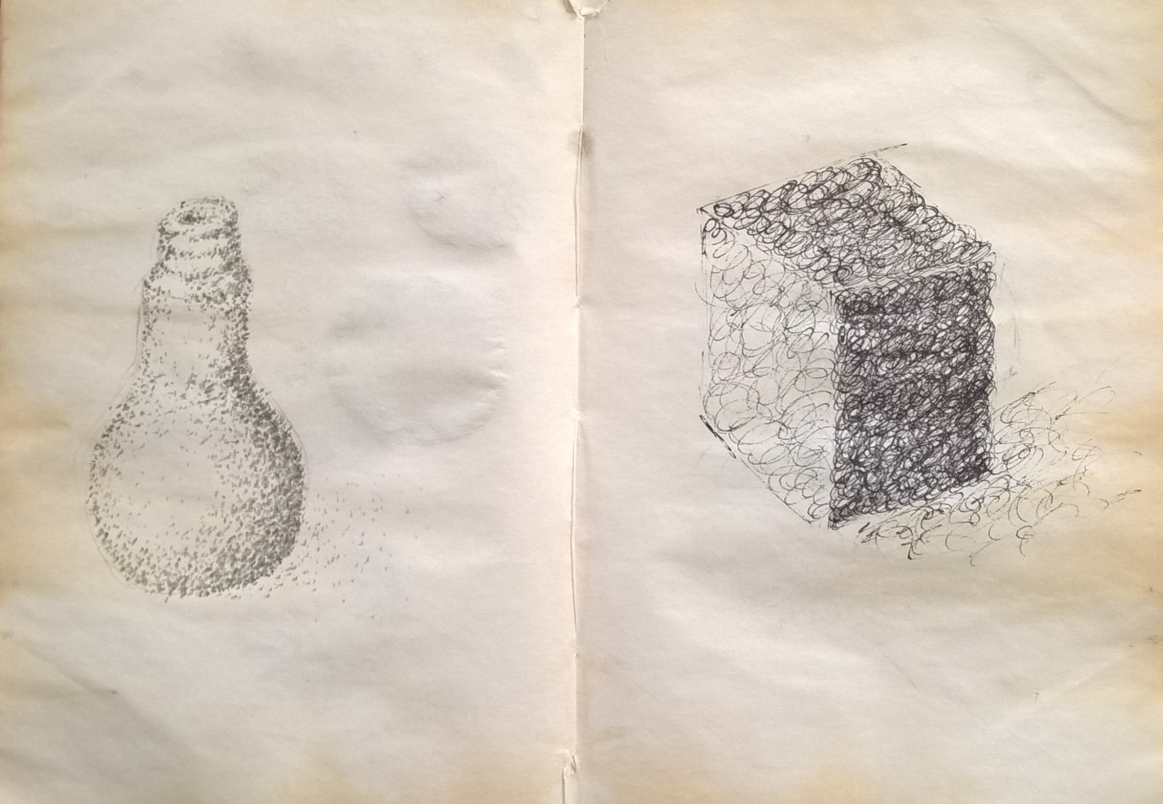
I decided on using blue because it is a calm colour and it is my favorite colour. The medium I used was watercolour because it is the one I am most familiar with. I wanted to try making different underlying colours in my different objects. But as you can see in my first prep drawing (i), I made those tones too strong. I was happy with the outcome of my second prep drawing and so immediately went on to my final.

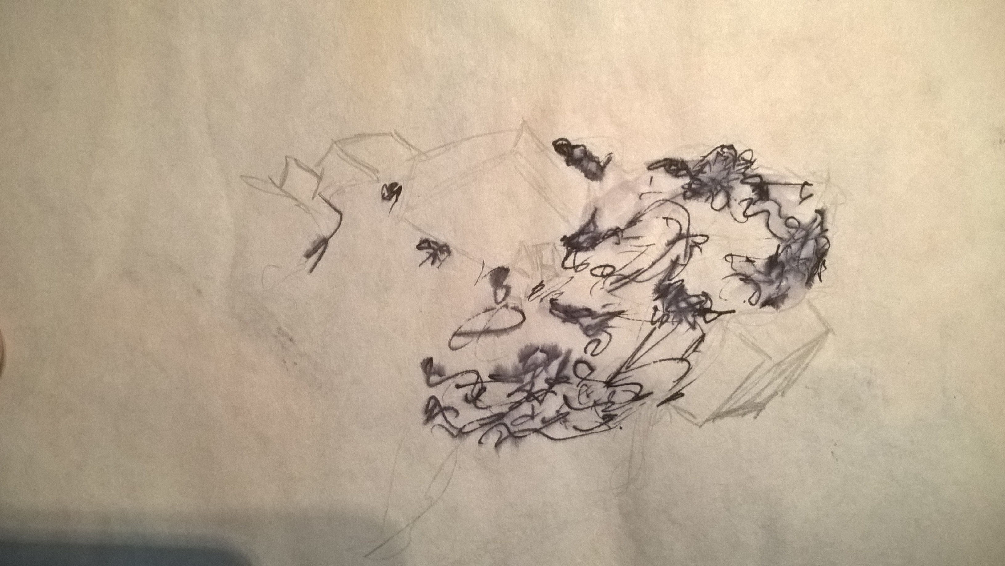
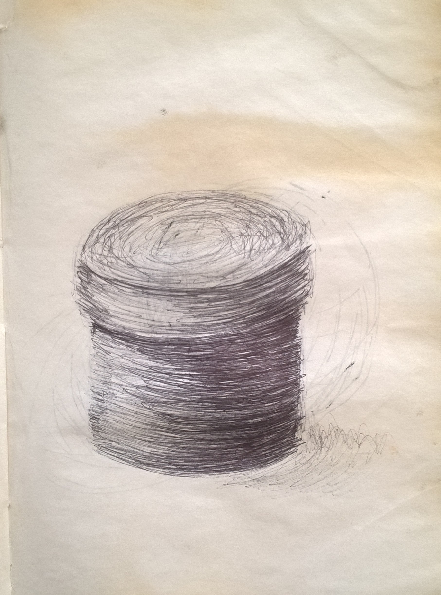
i 
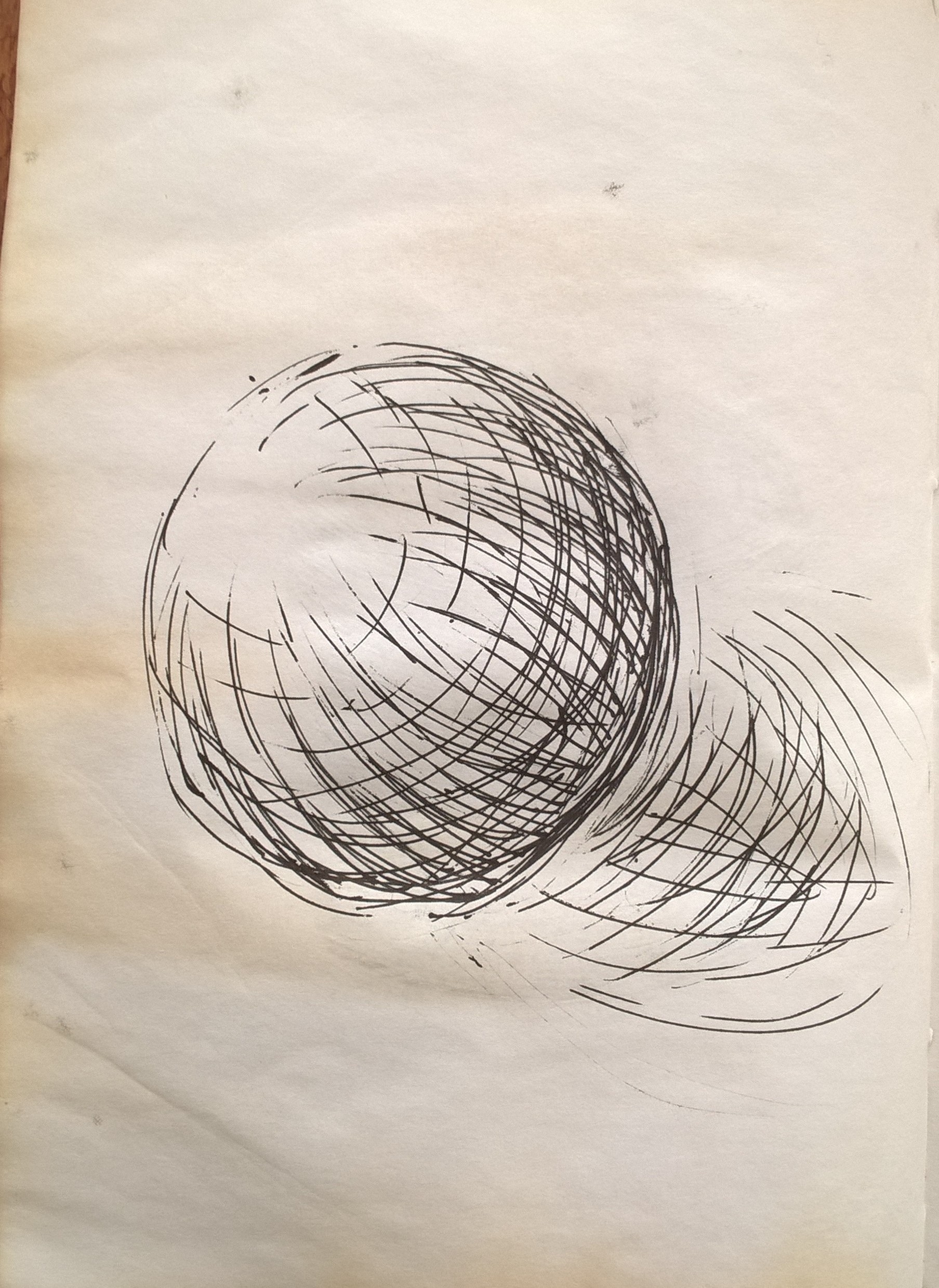
ii
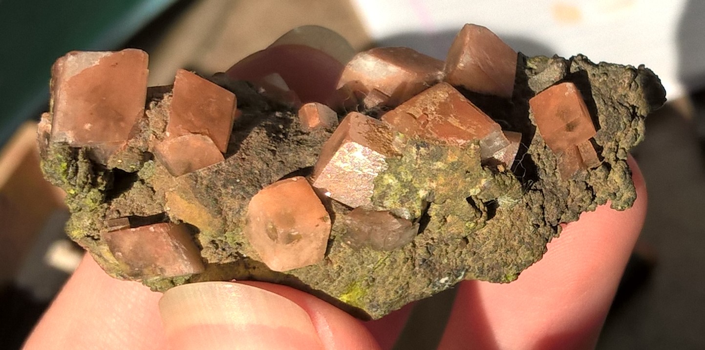
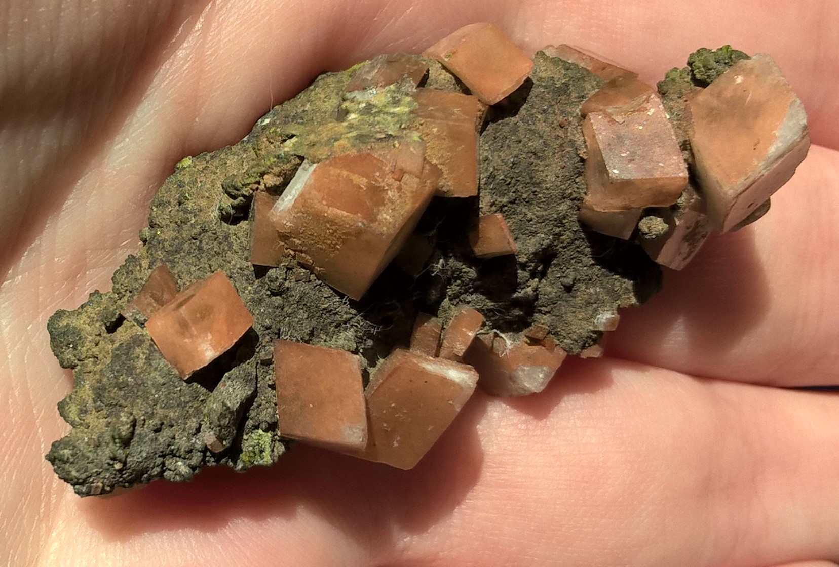
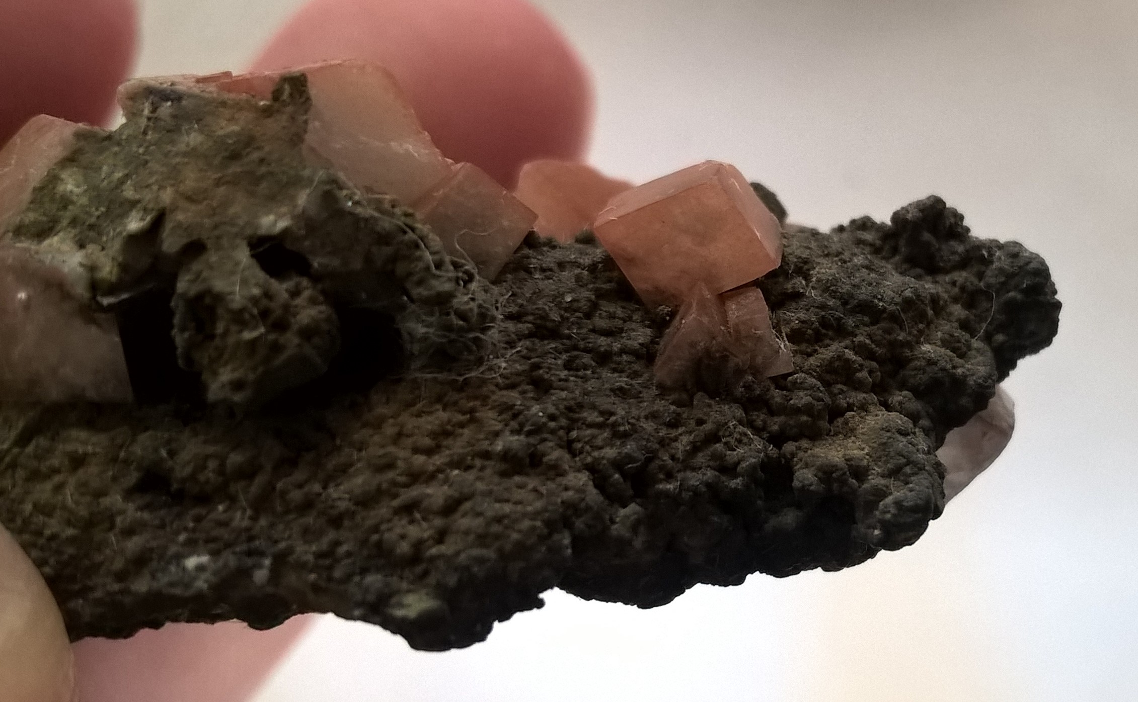
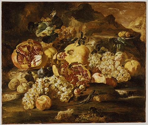
The skins of the fruit are shiny but not reflective. The bowl and the table are both reflective, the table more so, and so they reflect off of each other. I chose to use a table that is very reflective so as to make the artwork a but busier.
The fruit were lit up from behind and so they have a halo of light surrounding them which just separates them from the background. The bowl of fruit has the widest range of tones, giving them more detail and helping them to stand out as the main focus of the composition. In some areas of the apples I did not leave space for the lighter tones and so had to go back over with white paint, this shows a lack of planning.
The back ground has both light and dark tones but they are more muted and there is not a large variety.
I feel that the watercolour also worked tell because the smoothness and simplicity of the paint works well to portray the subjects which do not have very rough surface texture.
I did not do a very good job at keeping clean lines however and this is most evident in the background.
I preferred the texture of the apples in my first and second prep drawings. I was able to get a bit of the same texture in my final piece and I think it still came out good but it would have been better if i got the texture correct. The texture I preferred was that where the different tones did not blend together 100%. The apples in the front have a smoother gradient because started with them first and only got the hang of it when I got to the fruit in the back. This texture was about my preferred style of watercolour painting than about portraying the surface texture if the apples.
At the end of the day I am happy with what I made but perhaps I should have made a prep drawing in the same size paper that I would be working on in my final piece and should have then made more notes details how to get my desired style.


