Gornik’s work often features cloud formations, here she has captured the majesty of the storm while reminding us that it is a mere painting. This however does not stop the viewer from feel as though they have been transported into the scene.
The small patch of yellow light in the bottom center of the painting signifies what little wildlife is left that still remains untouched by humans.
Peter Doig
Doig uses photographs as references for is artwork but then adds his own unique and mystical touch to the work. This piece was based off of a photograph of his brother standing on a frozen pond and looking down at his reflection. The reflection represents one being absorbed into nature his/her surroundings
It was very interesting to see how the landscape changed just by turning my head slightly. I chose to draw my favorite view which is just in front of my old house which looks over farmland. This particular view is indeed one I visit often when I am looking for insperaton
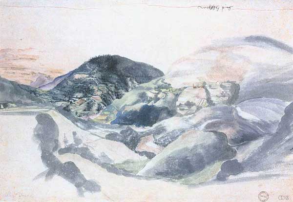
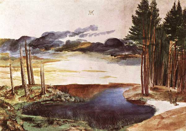
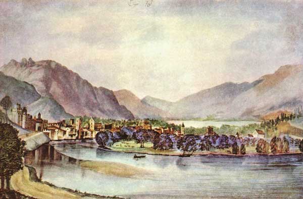
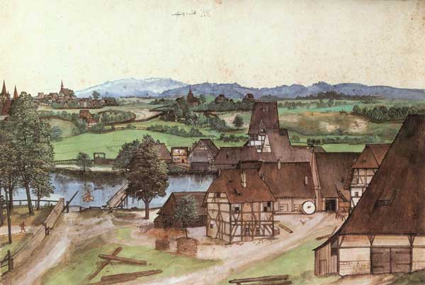
When Durer worked in watercolour his main focus was usually nature and so a large portion of his works in this medium consists of landscapes. He was also one of the artists who led Germany into the renaissance. He studied the findings of other great artists, giving his artwork great composition and proportions.
other works by Albrecht Durer
Claude Lorrain
Lorrain was heavily influenced by the roman countryside and was fascinated by the ancient ruins. He was drawn in by how the natural light of the sun played on the landscape and so always incorporated natural lighting into his paintings. He’d always carry a sketch book with him and would sketch scenes which he would then take back to his studio and use to make his elaborate and detailed landscape paintings.
Unlike most artists around his time, he would add people into his works to add to the beauty and composition of the landscape instead of having the landscape add to the emphasis of the people. He would also be particular as to who he added into his paintings to make sure they add to the meaning of the work.
In the artwork below the focus is on the tree, which holds reference to the story of Apollo and Diana. There is a child on the bridge to the left which is looking at the tree and the figures to the right are pointing toward the tree and appear to be in in discussion with regards to the trees meaning. Lorrain also added a temple of Apollo, inspired by ruins he had sketched previously, adding to the significance of the tree and the landscape around it.
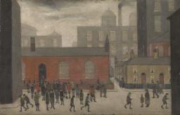
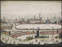
L. S. Lowry
Although Lowry’s style is rather simplistic,his work captures much detail and emotion of urban 20th century life.
In the piece below Lowry depicts a generalized version of and urban environment and is not a depiction of any one area. The weather i not very detailed and seams to imply that the clouds are simply made up of smoke coming from all the factories. He works mostly in primary colours but mutes them and manages to make them feel cool. Depth is created by buildings becoming duller and less solid as they get further away, this also adds to the effect of the smoke from the factories.
The first two drawings are of pictures I had taken of my surroundings and the last two are pictures I had found on the internet.
The first is of the beach. I struggled to draw the difference between the sand and the surrounding rocks and went back and fourth adding textures to the rocks. The picture was taken on a calm summers day and the sea was almost completely flat with no clouds in the sky.
My second drawing was of and abandoned farm house next to the road outside my town, It was a clear evening with the setting sun giving everything a golden glow. This scene is one of my utmost favorites and has been the inspiration for quite a few of my artworks.
I chose this scene for its cool and calming atmosphere and I enjoyed the beautiful contrast of light on the mountains.
This was an image that had been taken on a misty day and I struggled a bit to portray the scenery disappearing into the mist.
All these drawings were done on A3 paper and I think I should have rather used larger paper in order to capture better detail.
I enjoyed this exercise and tried out multiple mediums which all came with their own difficulties. I’d say I still need to work on my tone and practice drawing clouds more often
pencil
Here I had difficulty showing the small details and textures of the clouds and so they now look like smooth mounds.
oil pasteloil pastel
After my second attempt at oil pastels I decided to try out watercolour instead. The could at the top came out quite well whereas the bottom ones ended up looking rather muddy.
watercolour
Here I tried to go for a cloudy sunset but come out well. I should have made the tops of the clouds darker and grayer and put the colour at the bottom
watercolour
Here I used the same technique as above and the clouds came out quite well but I failed to give any depth to the artwork overall.
watercolour
Over here I tried to make light coming through the clouds but the clouds themselves were not very defined and so it looks more like light coming through water.
watercolour
Another mistake I think I made was to make these drawings portrait and not landscape, the general composition would have been better hat way.
Here I was influenced by the classical statues of ancient Greece and Rome. I decided to emphasize the imperfections of the statue by ripping the paper where part of the statue had been broken off.
I decided to use watercolour to make this piece. The photo makes it look very washed out and the colours are a lot richer in person.
I made the paint more watered down as the trees got further away to help with perspective.
Originally I had drawn all the trees in place and was going to paint the sky between the trees but I decided to rather paint the entire sky first then freely put in the trees on top.
When I put in the trees the paper was still damp from when I had painted in the sky and so the paint bled quite a bit. I should have done more tests beforehand.
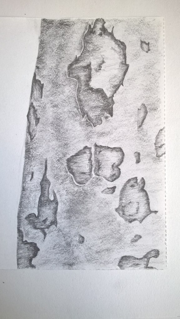
For this exercise I used an A3 paper and a pencil that i constantly sharpened. I’m very proud of this artwork and the detail I was able to make. I feel that maybe I should have done a larger area of the tree but this blue gum tree had a lot of detail from where bark was pulled off and so I wanted to show it in more detail.
The light was very clearly coming from the right of the tree. I feel I managed to also capture the shape and gentle curves of the tree trunk.
Oil Pastel Practice No.1
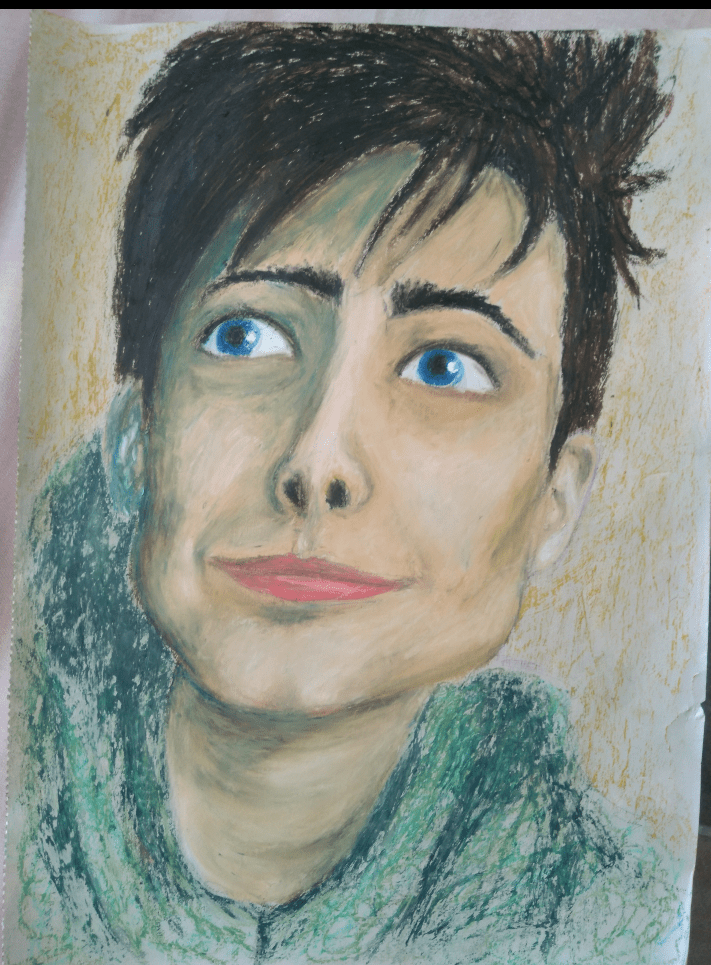
The face is a tad distorted but I’m happy with the result. I’ve previously had difficulty with different brands of oil pastels not blending well because some were softer than others so to counteract this I heated whatever i was using with my hairdryer.