For the limited pallet study I used orange, brown, black and white. I am very happy with the way it turned out. I succeeded in creating depth is my foreground but I did not focus enough on the background.

My learning process and growth in art
The category containing all posts for part 3.
For the limited pallet study I used orange, brown, black and white. I am very happy with the way it turned out. I succeeded in creating depth is my foreground but I did not focus enough on the background.
The scene I chose was one of a house on a cliff face overlooking a lake. I should have added colour to make the scene more readable and interesting. I’m quite happy with how the grass came out, I spent quite a lot of time on it. I should have also spent more time on the shore on the far side of the lake.

It was very interesting to see how the landscape changed just by turning my head slightly. I chose to draw my favorite view which is just in front of my old house which looks over farmland. This particular view is indeed one I visit often when I am looking for insperaton


The first two drawings are of pictures I had taken of my surroundings and the last two are pictures I had found on the internet.
The first is of the beach. I struggled to draw the difference between the sand and the surrounding rocks and went back and fourth adding textures to the rocks. The picture was taken on a calm summers day and the sea was almost completely flat with no clouds in the sky.

My second drawing was of and abandoned farm house next to the road outside my town, It was a clear evening with the setting sun giving everything a golden glow. This scene is one of my utmost favorites and has been the inspiration for quite a few of my artworks.

I chose this scene for its cool and calming atmosphere and I enjoyed the beautiful contrast of light on the mountains.

This was an image that had been taken on a misty day and I struggled a bit to portray the scenery disappearing into the mist.

All these drawings were done on A3 paper and I think I should have rather used larger paper in order to capture better detail.
I enjoyed this exercise and tried out multiple mediums which all came with their own difficulties. I’d say I still need to work on my tone and practice drawing clouds more often

Here I had difficulty showing the small details and textures of the clouds and so they now look like smooth mounds.


After my second attempt at oil pastels I decided to try out watercolour instead. The could at the top came out quite well whereas the bottom ones ended up looking rather muddy.

Here I tried to go for a cloudy sunset but come out well. I should have made the tops of the clouds darker and grayer and put the colour at the bottom

Here I used the same technique as above and the clouds came out quite well but I failed to give any depth to the artwork overall.

Over here I tried to make light coming through the clouds but the clouds themselves were not very defined and so it looks more like light coming through water.

Another mistake I think I made was to make these drawings portrait and not landscape, the general composition would have been better hat way.
I decided to use watercolour to make this piece. The photo makes it look very washed out and the colours are a lot richer in person.
I made the paint more watered down as the trees got further away to help with perspective.
Originally I had drawn all the trees in place and was going to paint the sky between the trees but I decided to rather paint the entire sky first then freely put in the trees on top.
When I put in the trees the paper was still damp from when I had painted in the sky and so the paint bled quite a bit. I should have done more tests beforehand.

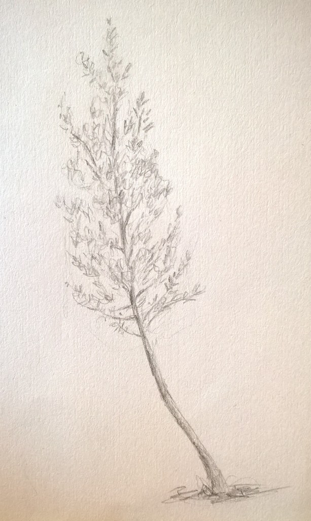
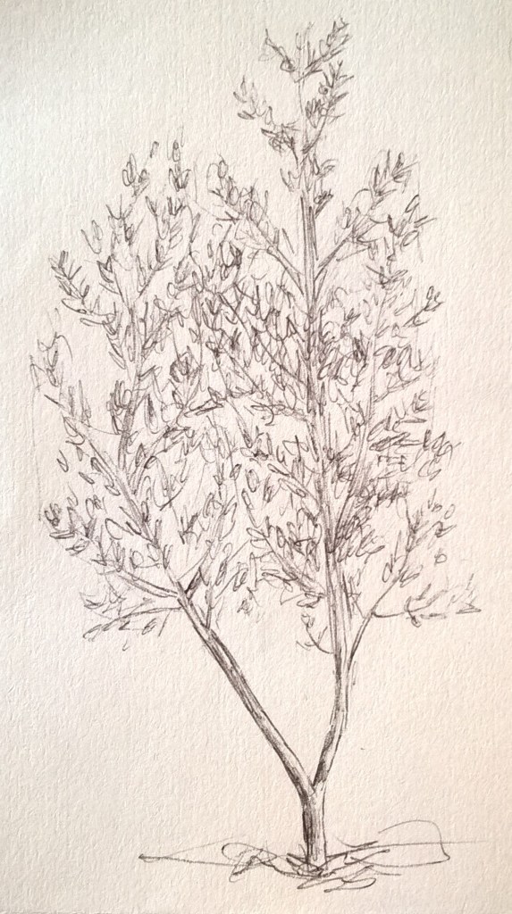
Trees are my favorite subject matter to draw. I started off with pencil and then went and did some drawings in ink. I struggled a bit with finding the texture of the leaves but soon got the hang of it. In some areas shading was a bit difficult since I had made dark outlines and then struggled to blend them in well.
I decided to not do any erasing and so the lines can still be seen from where i marked out the shapes.


I tried making a tree in watercolour but it did not come out as well as i would have liked. I should have let more of the paper shine through the leaves so it would not look so flat. My shading and colouring of the trunk and branches still needs work as well.

