For the limited pallet study I used orange, brown, black and white. I am very happy with the way it turned out. I succeeded in creating depth is my foreground but I did not focus enough on the background.

My learning process and growth in art
The parent category for coursework.
For the limited pallet study I used orange, brown, black and white. I am very happy with the way it turned out. I succeeded in creating depth is my foreground but I did not focus enough on the background.
The scene I chose was one of a house on a cliff face overlooking a lake. I should have added colour to make the scene more readable and interesting. I’m quite happy with how the grass came out, I spent quite a lot of time on it. I should have also spent more time on the shore on the far side of the lake.

It was very interesting to see how the landscape changed just by turning my head slightly. I chose to draw my favorite view which is just in front of my old house which looks over farmland. This particular view is indeed one I visit often when I am looking for insperaton


The first two drawings are of pictures I had taken of my surroundings and the last two are pictures I had found on the internet.
The first is of the beach. I struggled to draw the difference between the sand and the surrounding rocks and went back and fourth adding textures to the rocks. The picture was taken on a calm summers day and the sea was almost completely flat with no clouds in the sky.

My second drawing was of and abandoned farm house next to the road outside my town, It was a clear evening with the setting sun giving everything a golden glow. This scene is one of my utmost favorites and has been the inspiration for quite a few of my artworks.

I chose this scene for its cool and calming atmosphere and I enjoyed the beautiful contrast of light on the mountains.

This was an image that had been taken on a misty day and I struggled a bit to portray the scenery disappearing into the mist.

All these drawings were done on A3 paper and I think I should have rather used larger paper in order to capture better detail.
I enjoyed this exercise and tried out multiple mediums which all came with their own difficulties. I’d say I still need to work on my tone and practice drawing clouds more often

Here I had difficulty showing the small details and textures of the clouds and so they now look like smooth mounds.


After my second attempt at oil pastels I decided to try out watercolour instead. The could at the top came out quite well whereas the bottom ones ended up looking rather muddy.

Here I tried to go for a cloudy sunset but come out well. I should have made the tops of the clouds darker and grayer and put the colour at the bottom

Here I used the same technique as above and the clouds came out quite well but I failed to give any depth to the artwork overall.

Over here I tried to make light coming through the clouds but the clouds themselves were not very defined and so it looks more like light coming through water.

Another mistake I think I made was to make these drawings portrait and not landscape, the general composition would have been better hat way.
I decided to use watercolour to make this piece. The photo makes it look very washed out and the colours are a lot richer in person.
I made the paint more watered down as the trees got further away to help with perspective.
Originally I had drawn all the trees in place and was going to paint the sky between the trees but I decided to rather paint the entire sky first then freely put in the trees on top.
When I put in the trees the paper was still damp from when I had painted in the sky and so the paint bled quite a bit. I should have done more tests beforehand.

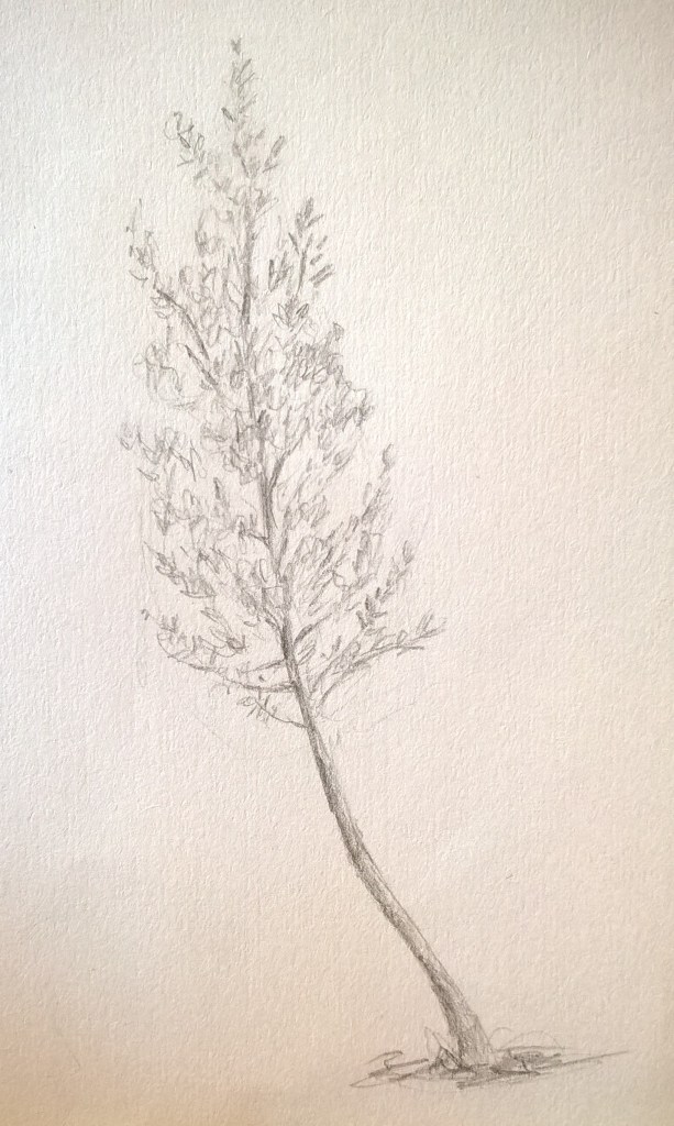
Trees are my favorite subject matter to draw. I started off with pencil and then went and did some drawings in ink. I struggled a bit with finding the texture of the leaves but soon got the hang of it. In some areas shading was a bit difficult since I had made dark outlines and then struggled to blend them in well.
I decided to not do any erasing and so the lines can still be seen from where i marked out the shapes.


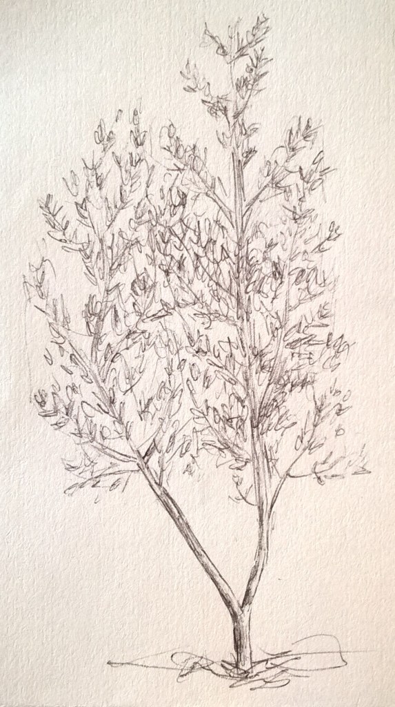

I tried making a tree in watercolour but it did not come out as well as i would have liked. I should have let more of the paper shine through the leaves so it would not look so flat. My shading and colouring of the trunk and branches still needs work as well.

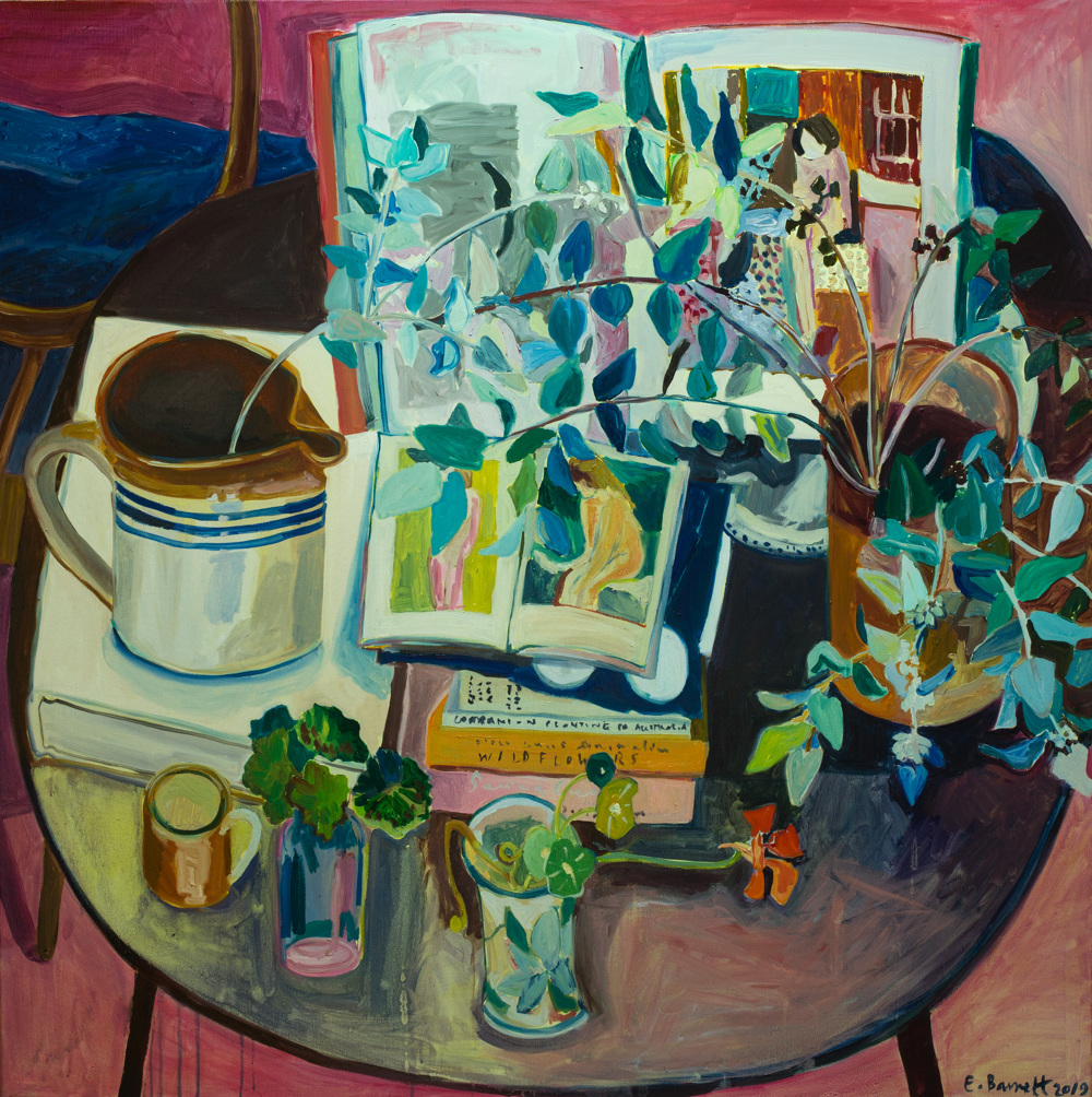
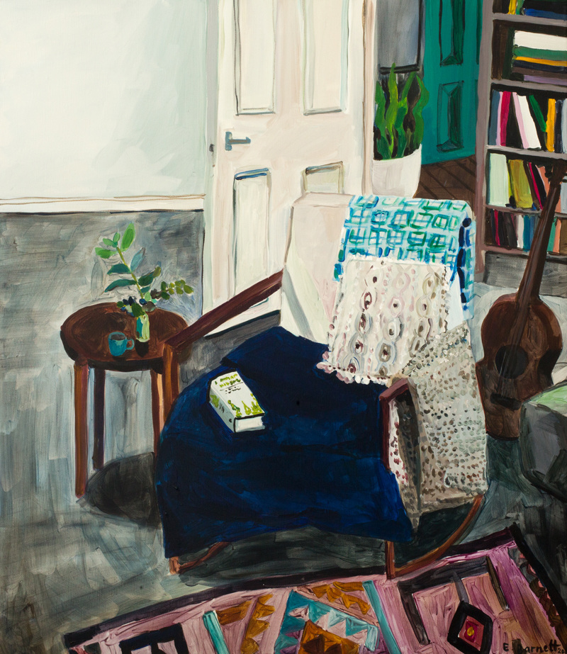
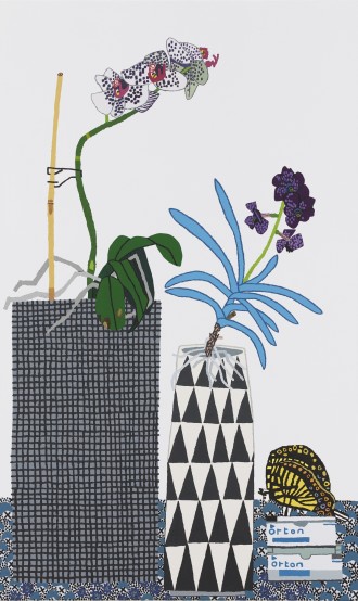
Elizabeth Barnett depicts intimate domestic scenes and still lifes with a wide range of plants, colour, personal objects, and furnishings. Her work revolves around motherhood, living off the land and her connection to nature.
Nature Table is a still life that connects nature and her domestic world. This is done by her depiction of everyday objects along side an array of plants . This artwork exists to connect humanity and nature.
Herbal Medicine is a series inspired by natural remedies, joining motherhood and Barnett’s connection to nature. Here she works on a larger scale larger scale, making compositions looser and more welcoming. The size of the canvas gives the feeling that one could walk into the artwork.


date I visited sites: 19/08/2019
https://elizabethbarnett.com/2019-Nature-Table
https://elizabethbarnett.com/2017-Herbal-Medicine-TDF-Collect
TDF Collect · ‘Herbal Medicine’ by Elizabeth Barnett
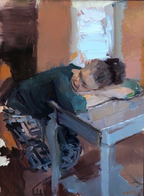
Matthias Weischer’s paintings incorporate both reality and imagination. He is interested in the historical medium, perspective and representation while making it his own by adding collage-like elements. He builds the artwork up by using many payers of paint, adding to the three -dimensionality of his work. His work strives to find the balance between chaos and harmony.


Date I visited sites: 19/08/2019
https://grimmgallery.com/artists/matthies-weischer/
https://www.artsy.net/artist/matthies-weischer
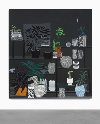
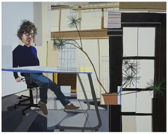
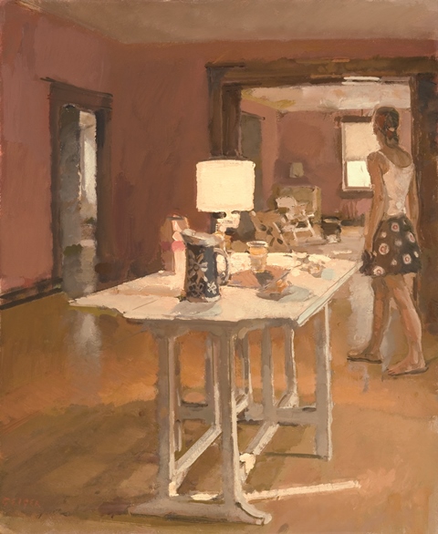
Jona Wood is well known for his depictions of everyday scenes and objects. He was inspired by the disconnected angles and planes of cubism and so uses odd views for his artwork. He starts off with photographic bases and then goes on to layer different perspectives into the artwork giving an almost abstract atmosphere to his work.
Date I visited site: 19/08/2019
https://www.sothebys.com/en/artists/jonas-wood
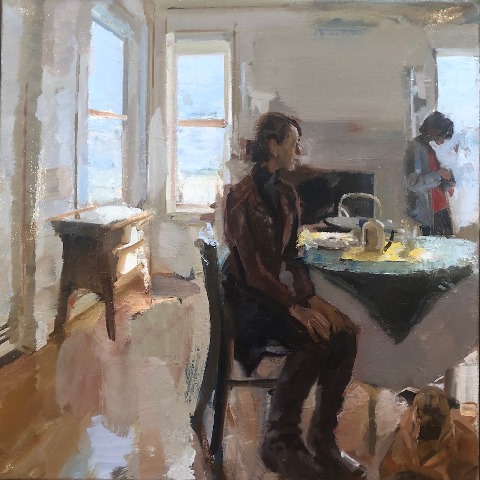
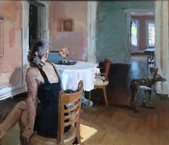
Phillip Geiger depicts scenes of everyday life with his family. His use of loose brushwork and colour give a calm and peaceful effect on the viewer. His work tells us focus on and appreciate the calm and mundane moments and events in life. His work is simplistic yet says a lot about peoples misplaced priorities. The simple and seamingly unimportant moments in life are the ones we look back on when remembering loved ones and so must be treasured. Geiger immortalizes these moments in his artwork

I decided to change from ink to pencil so that I can erase mistakes and spend more time on the drawing. At first I used coal but felt that I could not get the tonal range I wanted, This could be in part that I am not very experienced with the medium.
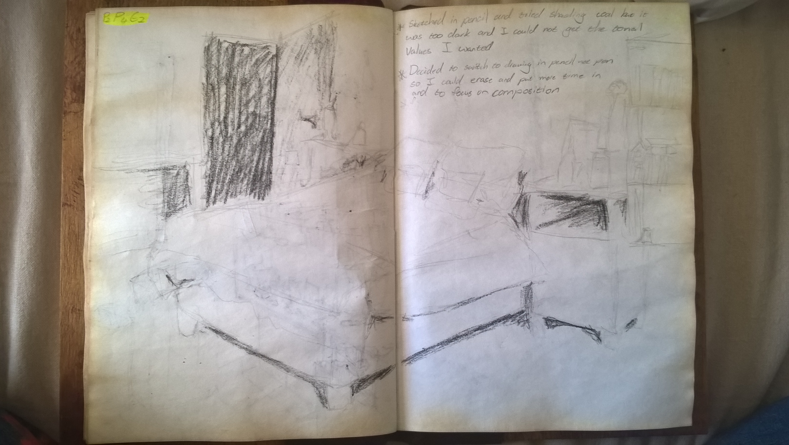
For my second drawing I just redrew the scene and shaded with pencil. I found this gave better mark making and tone.
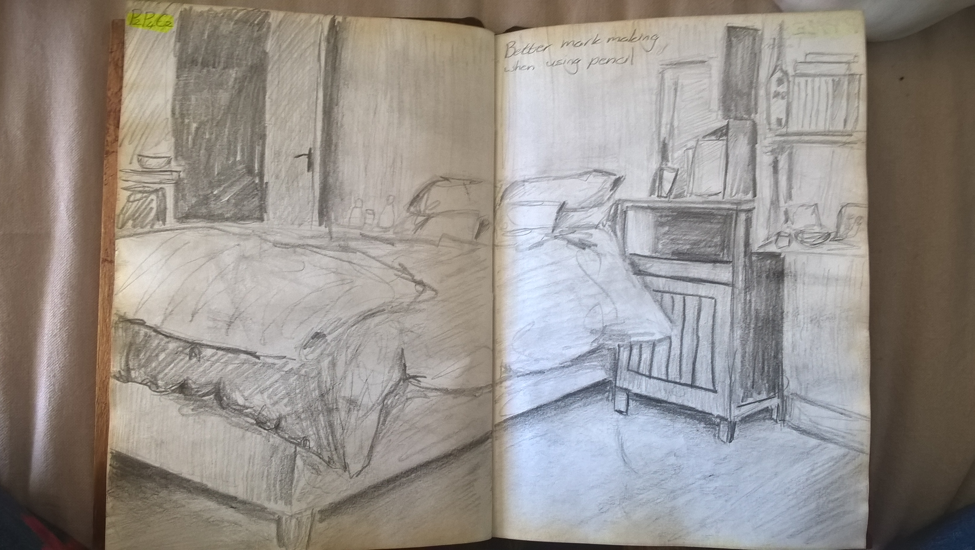
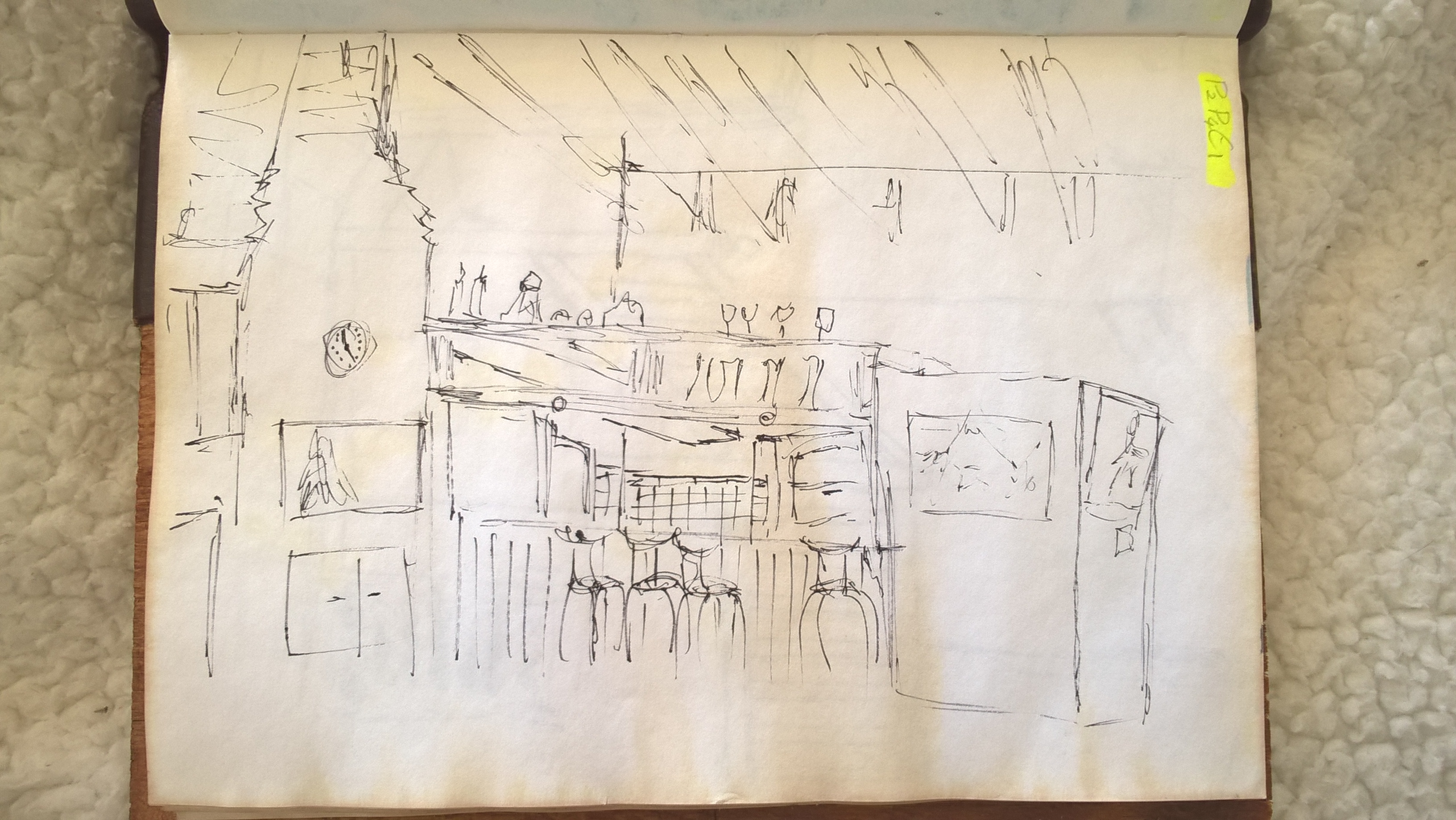
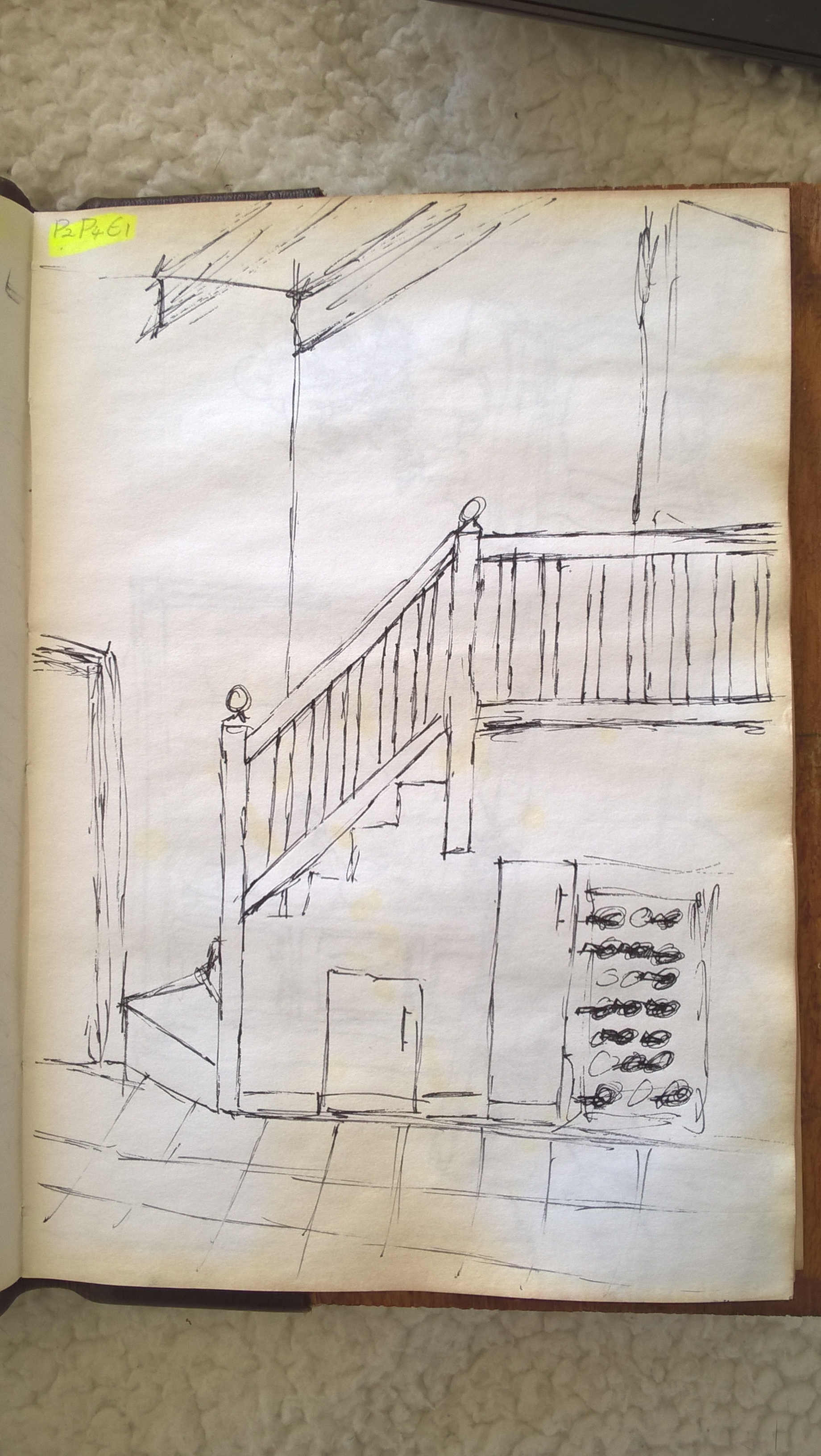
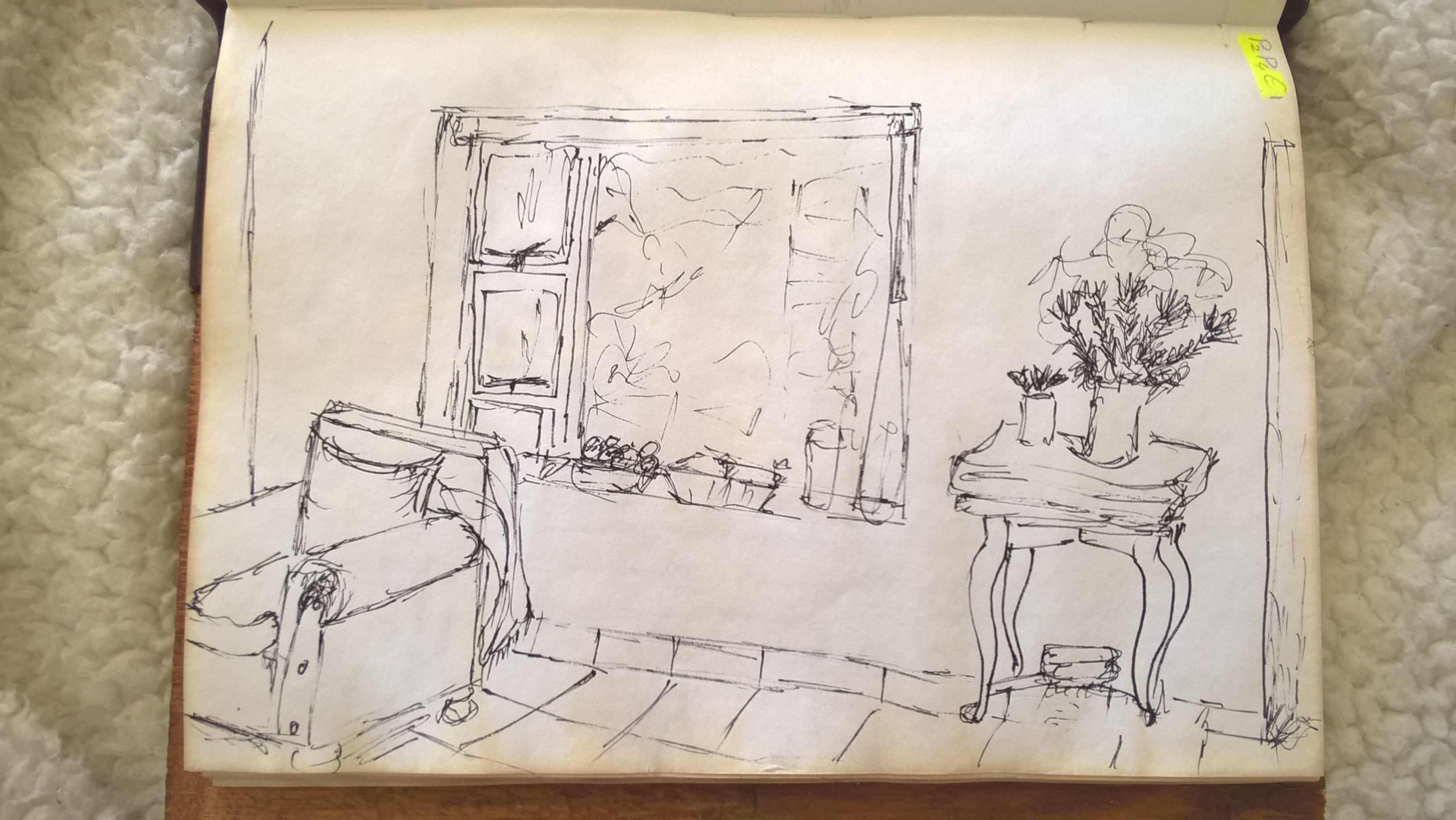
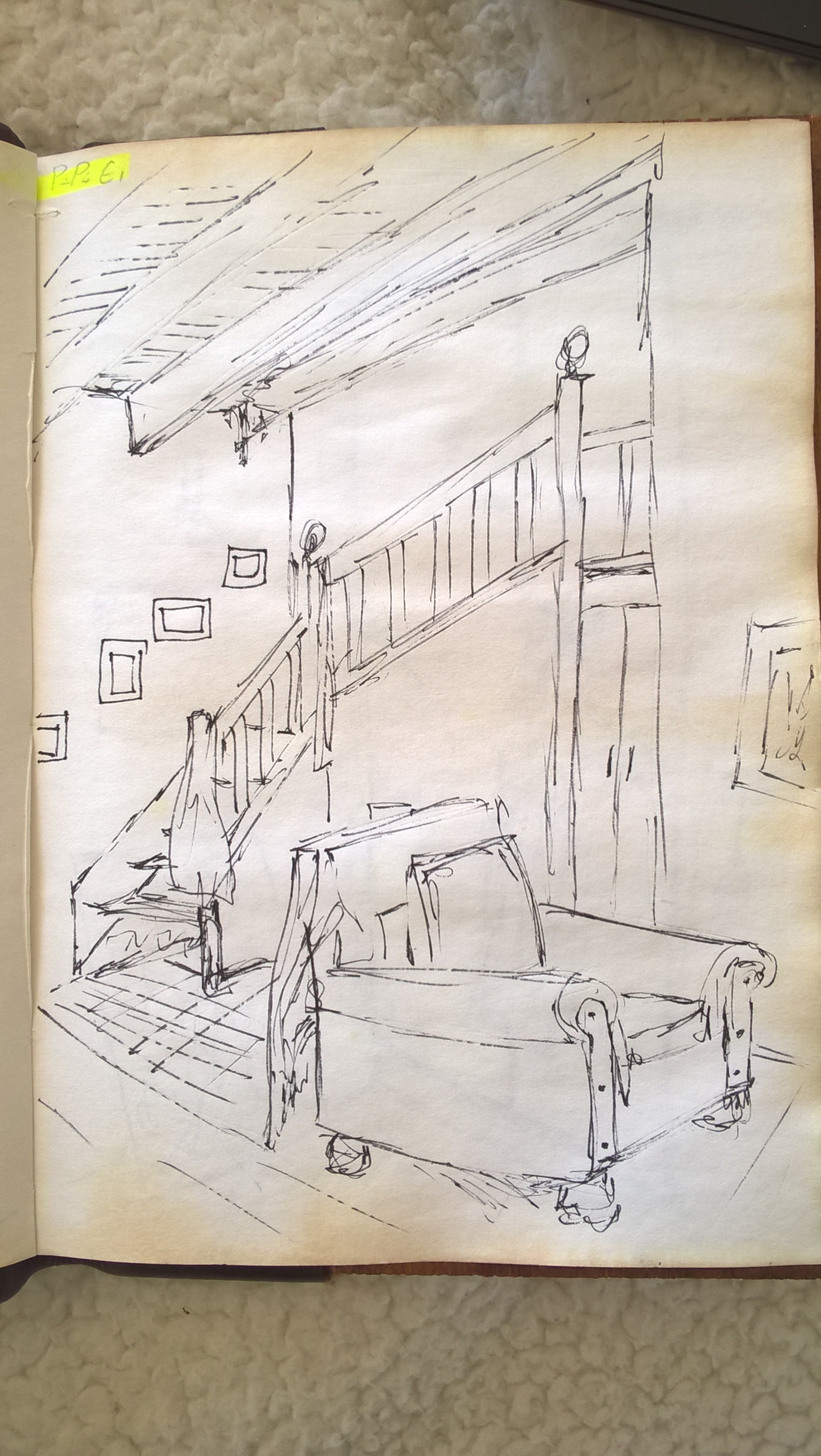
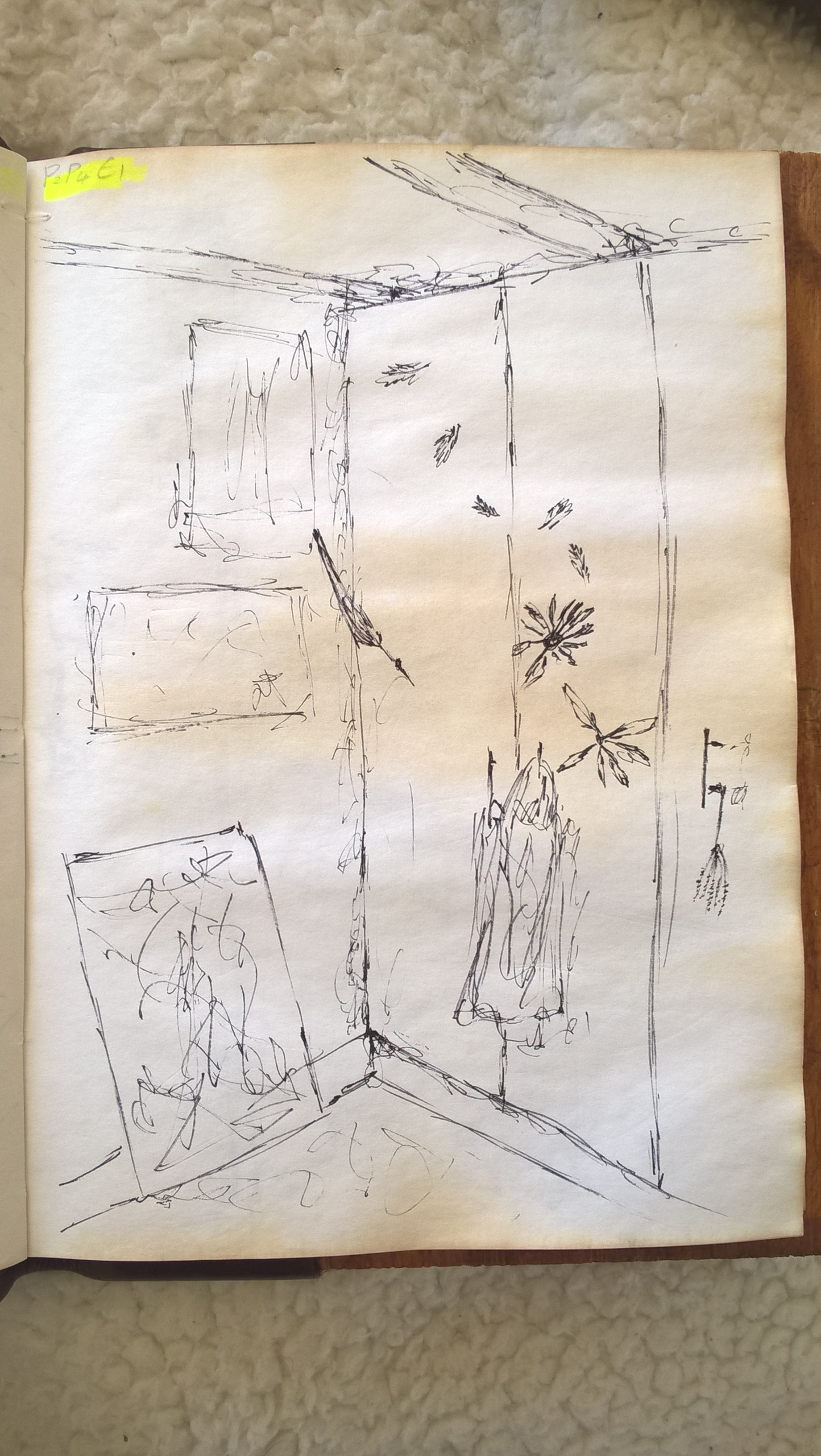
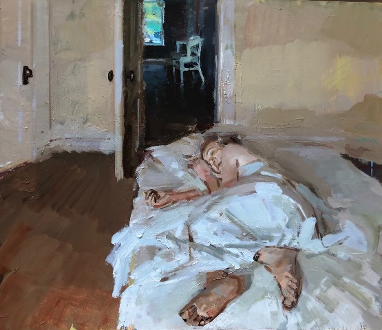
I went and drew all my favorite scenes in the house until I came to one that I liked enough to use for Exercise 3. In hindsight I think I should ave chosen the scene bellow because it is busier and more interesting, it is also a more personal and intimate space. I am still happy with the scene I ended up choosing though.

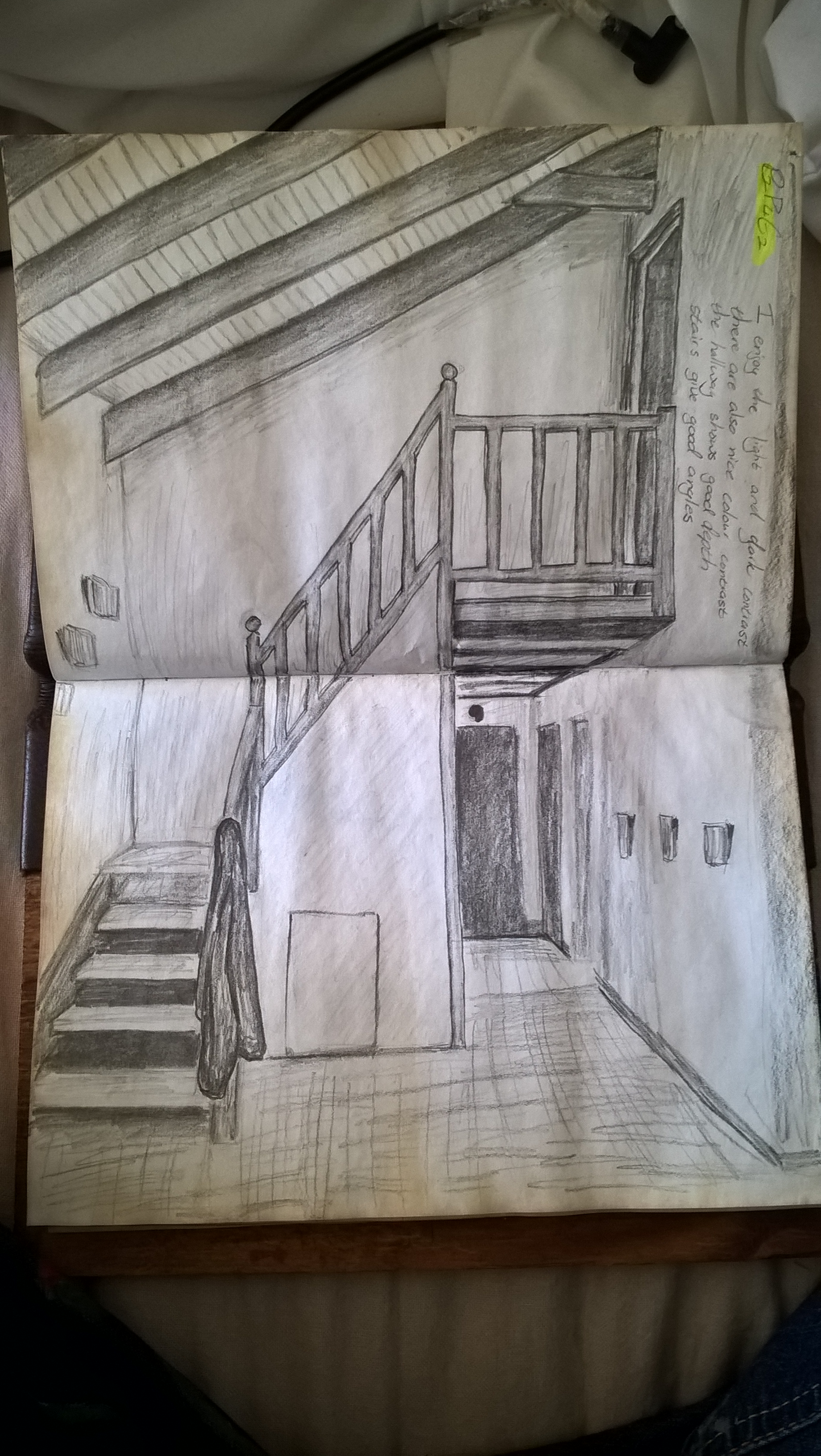
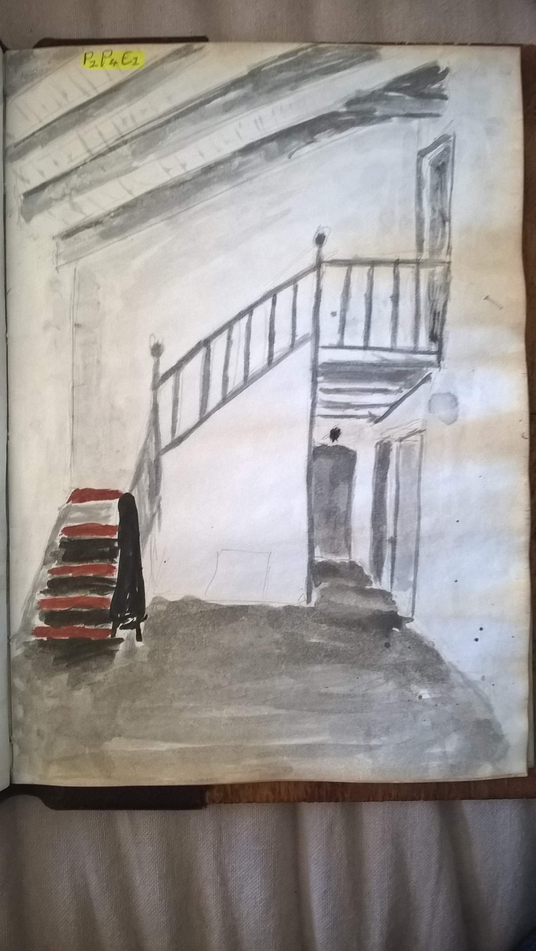
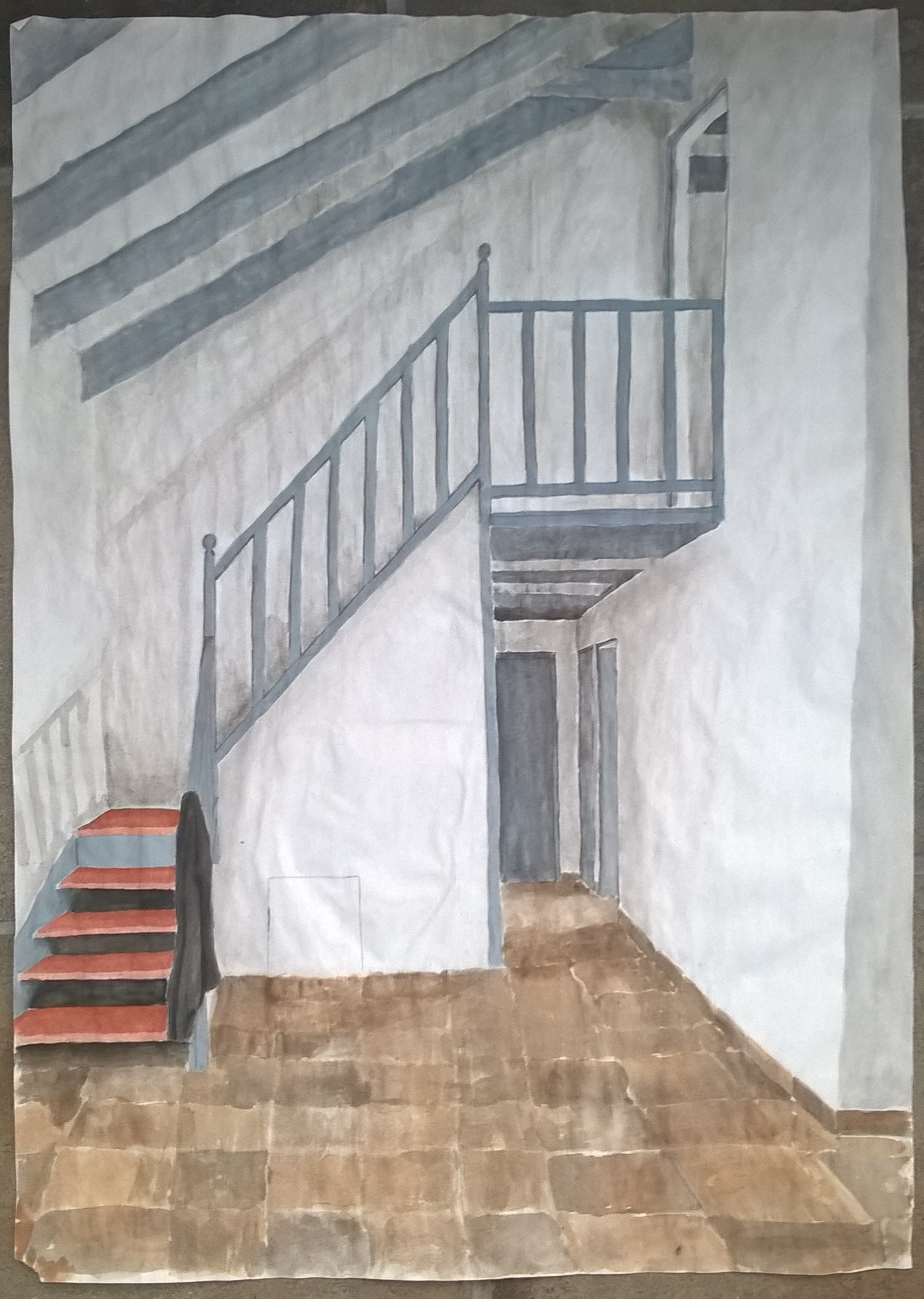
I chose this scene because I like the light and dark contrasts. There is also nice colour contrast with the warm brow of steps and the cool gray of the beams and railing. I also like the the straight and uniform lines broken only by the balls on the railing and the jacket hanging from the rails. This scene has a strong vertical plane. There is also a good sense of depth with the stairs and the hallway.
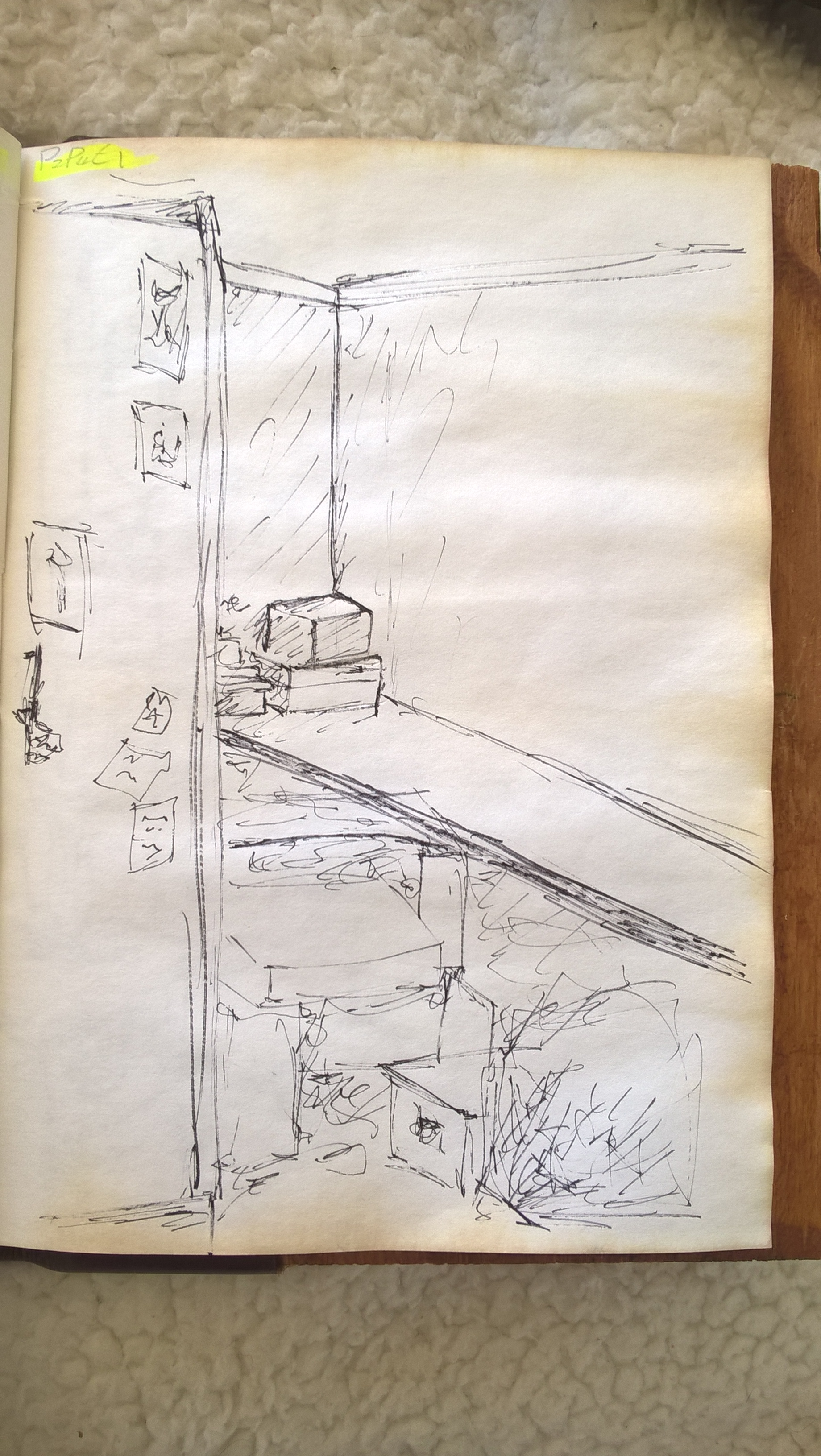
This is the rough colorization of the chosen scene.
I decided to combine these two exercises into one post, I feel it’s easier that way.
I was glad that I could add a lot of detail working on this size paper but it is not fit to be used for watercolour. As you can see the paper warped dramatically. However, I still enjoyed doing it.
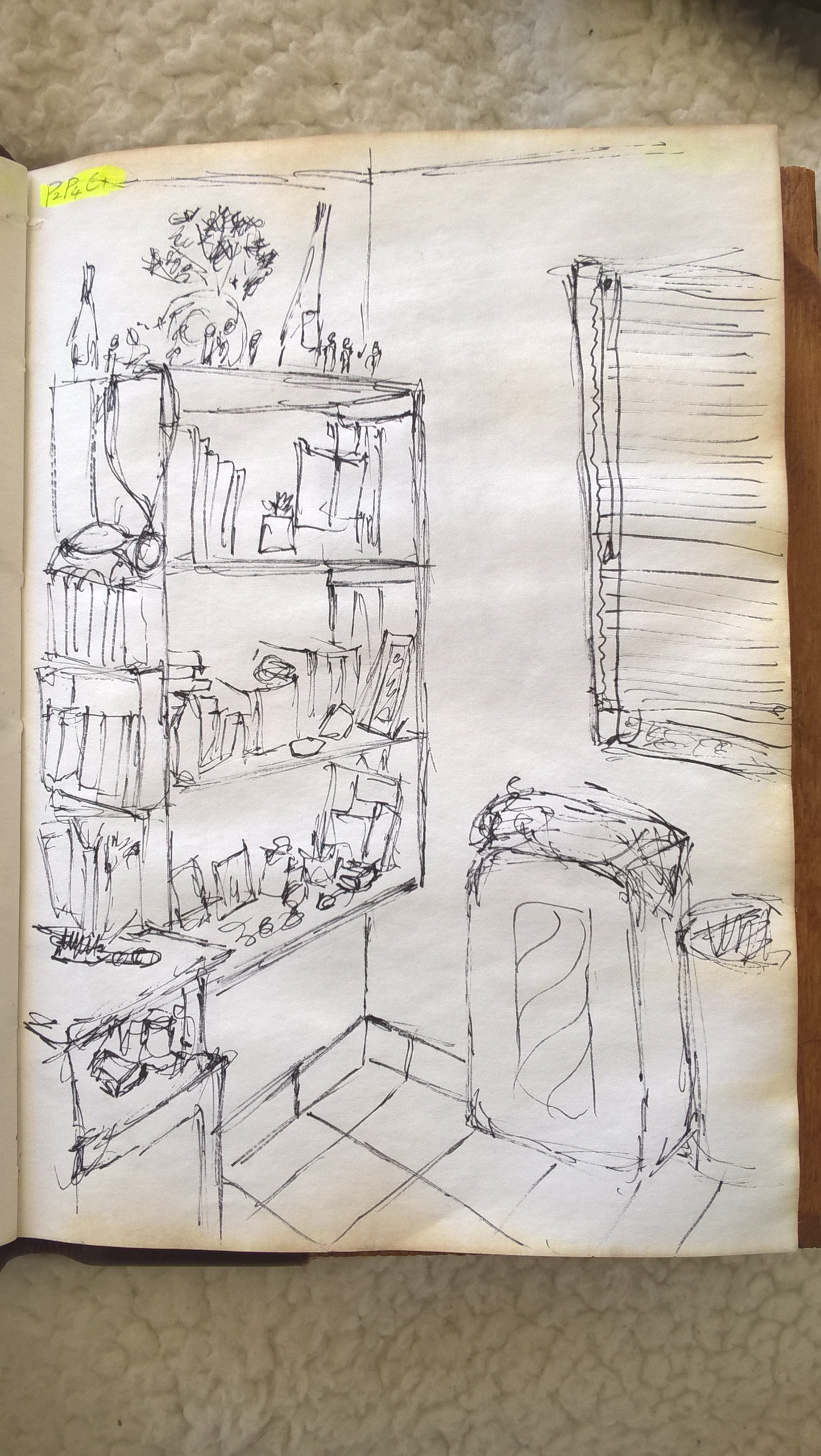
All other comentry on the scene was done on my prep drawings and I don’t feel the need to repeat it since it it has been done all in one post.
;:;
This exercise was difficult for me since I’m not used to drawing household scenes.
I decided to use a fine nib for my dip pen so I could get clean lines. I felt that using a pencil could make things too messy.
One issue with ink is that I couldn’t erase, although that did force me to quick sketches as the exercise said so that wasn’t too much of a problem. Another issue was that I found it difficult to shade which made my drawings less detailed perhaps.
Towards the end I started to get the hang of drawing inside scenes.