I decided on working with a still life and was very influenced by the work of Elizabeth Barnett because my brother and I are very interested in herbology and nature. I enjoy picking wild flowers and pressing and preserving plants.
I decided to put a cutting of milk thistle and some lavender into a glass bottle I found while gardening. I chose milk thistle because while most people see it as a weed it is a herb that is very good for you and I personally find milk thistle flowers to be quite beautiful. I also chose lavender because it is one of my favorite flowers.
At first I had the lavender and milk thistle in two separate jars but decided to put a few lavender stalks into the jar with the milk thistle because it was more simplistic and not too busy.
I started off by sketching different angles in my sketch book to get a feel for the composition.


I knew I wanted loose flowing lines in my drawing but felt I needed to work on my colour so I switched to thicker paper.
With my first colour test I made the milk thistle with oil pastel and did the back ground with watercolour. I had hoped that the rich colour of the oil pastels would bring the milk thistle forward and that the watercolours would look more washed out. In addition I had hoped that using oil pastel would make painting the background easier since I could wash over the oil without ruining it.
In the end I didn’t really like the effect so I went on to the second colour test and used only watercolour. The first colour test had also been on A5 paper and i felt that the scale was too small to practice on so I used an A4 paper for the second colour test.
I was happy with the details I was able to make with the flowers but not with that of the leaves. I also struggled with the bottle. Although I was happy with the angle and so decided to use that in my final.
I also used the second colour test to see how I should go about with my ink mark making. I liked the idea of the marks coming from the black frame and used them to draw the viewers eyes across the piece. I found that I shouldn’t draw over any of the plants or main objects since it makes the composition flat loses the focal point.

first colour test 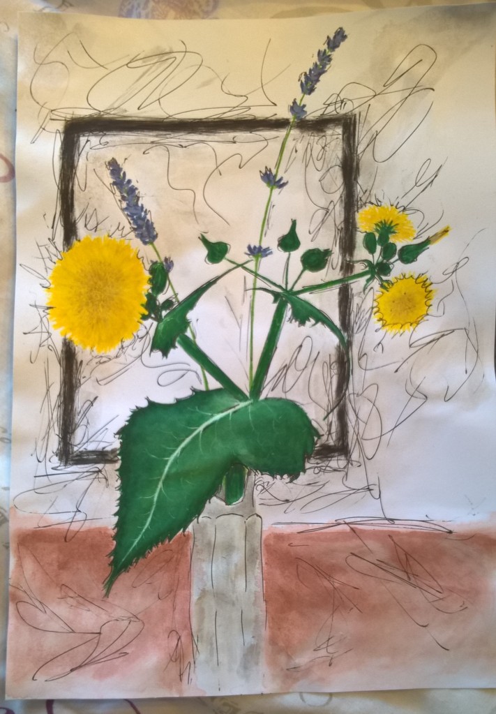
second colour test
One large challenge for me was the veins on the leaves. I also felt that I did not have a very strong light source and that made the general tone rather ambiguous.
One mistake I made in the final piece was making the cloth that the flowers sat one very dull and grey; it should have been a warmer colour like in my second colour test. I’m very happy with how mush detail I was able to capture in the milk thistle; although I feel that my lavender stems are rather uncertain and not very solid.
I struggled a bit when it came to grounding the jar since there was not clear shadow but tried to add a subtle one.

Reflection on feedback from tutor
I definitely need to work on my use of colour. I’ll be practicing using colour and creating the correct tones so that my artwork does not look flat. I will also be experimenting with different media, especially oil pastel.
I need to work on my depiction of man made objects and perspective. I also need to focus my composition, often my background does not suit my main object or is too distracting. I think I should rather have simple backgrounds and focus on putting a lot of detail in my focal points.
I also need to remember to add more self reflection in my posts.


