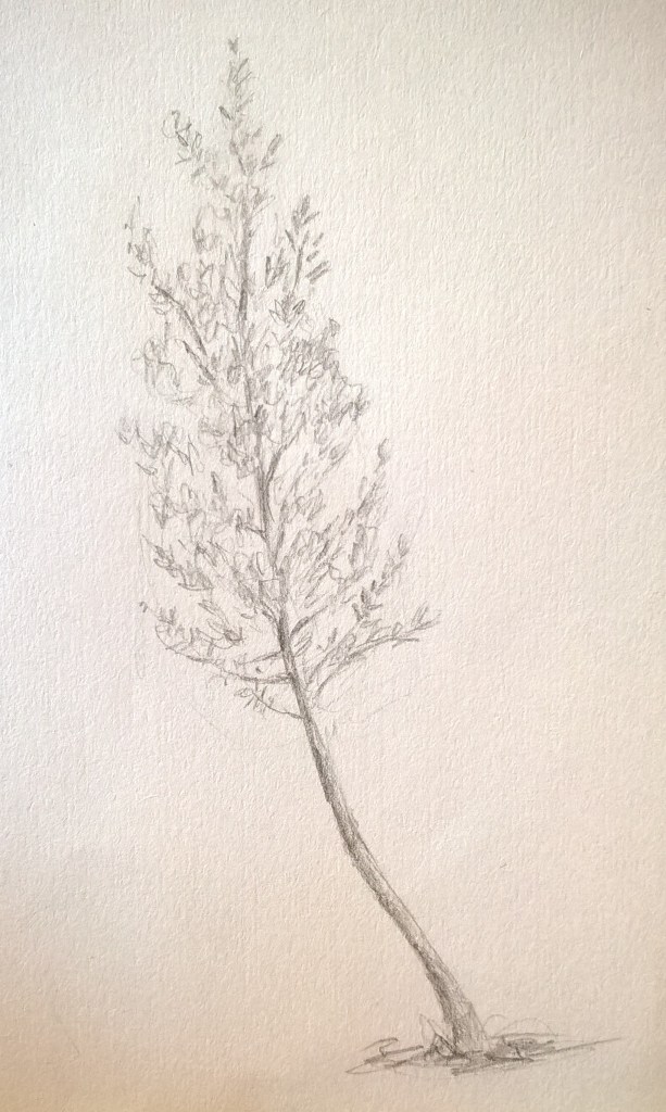
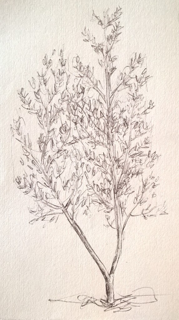
Trees are my favorite subject matter to draw. I started off with pencil and then went and did some drawings in ink. I struggled a bit with finding the texture of the leaves but soon got the hang of it. In some areas shading was a bit difficult since I had made dark outlines and then struggled to blend them in well.
I decided to not do any erasing and so the lines can still be seen from where i marked out the shapes.
I tried making a tree in watercolour but it did not come out as well as i would have liked. I should have let more of the paper shine through the leaves so it would not look so flat. My shading and colouring of the trunk and branches still needs work as well.
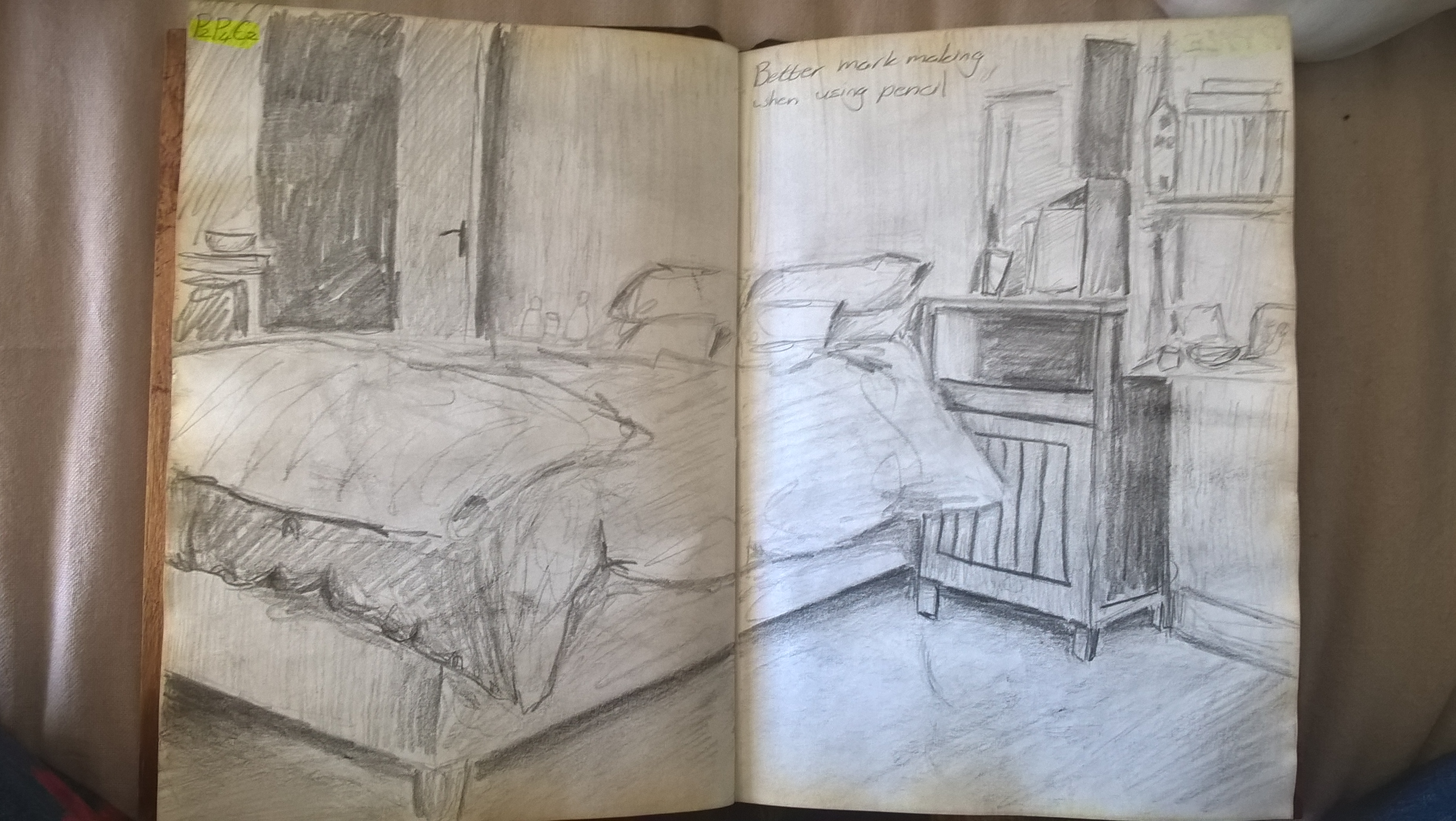
To begin I ditched the ink and used pencil so I could erase mistakes and put more time/ effort into the drawing. Then I went in with the coal but I decided I didn’t like the way it looked so I stopped and redrew the drawing and shaded with pencil.
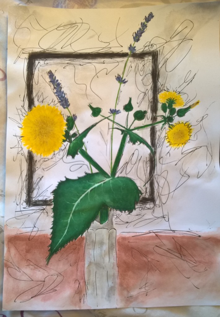
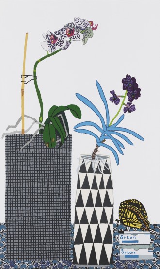
I decided on working with a still life and was very influenced by the work of Elizabeth Barnett because my brother and I are very interested in herbology and nature. I enjoy picking wild flowers and pressing and preserving plants.
I decided to put a cutting of milk thistle and some lavender into a glass bottle I found while gardening. I chose milk thistle because while most people see it as a weed it is a herb that is very good for you and I personally find milk thistle flowers to be quite beautiful. I also chose lavender because it is one of my favorite flowers.
At first I had the lavender and milk thistle in two separate jars but decided to put a few lavender stalks into the jar with the milk thistle because it was more simplistic and not too busy.
I started off by sketching different angles in my sketch book to get a feel for the composition.
I knew I wanted loose flowing lines in my drawing but felt I needed to work on my colour so I switched to thicker paper.
With my first colour test I made the milk thistle with oil pastel and did the back ground with watercolour. I had hoped that the rich colour of the oil pastels would bring the milk thistle forward and that the watercolours would look more washed out. In addition I had hoped that using oil pastel would make painting the background easier since I could wash over the oil without ruining it.
In the end I didn’t really like the effect so I went on to the second colour test and used only watercolour. The first colour test had also been on A5 paper and i felt that the scale was too small to practice on so I used an A4 paper for the second colour test.
I was happy with the details I was able to make with the flowers but not with that of the leaves. I also struggled with the bottle. Although I was happy with the angle and so decided to use that in my final.
I also used the second colour test to see how I should go about with my ink mark making. I liked the idea of the marks coming from the black frame and used them to draw the viewers eyes across the piece. I found that I shouldn’t draw over any of the plants or main objects since it makes the composition flat loses the focal point.
first colour test
second colour test
One large challenge for me was the veins on the leaves. I also felt that I did not have a very strong light source and that made the general tone rather ambiguous.
One mistake I made in the final piece was making the cloth that the flowers sat one very dull and grey; it should have been a warmer colour like in my second colour test. I’m very happy with how mush detail I was able to capture in the milk thistle; although I feel that my lavender stems are rather uncertain and not very solid.
I struggled a bit when it came to grounding the jar since there was not clear shadow but tried to add a subtle one.
final piece
Reflection on feedback from tutor
I definitely need to work on my use of colour. I’ll be practicing using colour and creating the correct tones so that my artwork does not look flat. I will also be experimenting with different media, especially oil pastel.
I need to work on my depiction of man made objects and perspective. I also need to focus my composition, often my background does not suit my main object or is too distracting. I think I should rather have simple backgrounds and focus on putting a lot of detail in my focal points.
I also need to remember to add more self reflection in my posts.
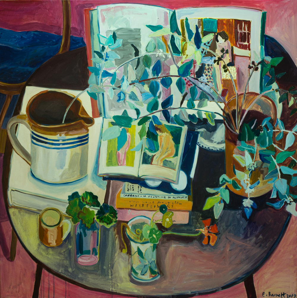
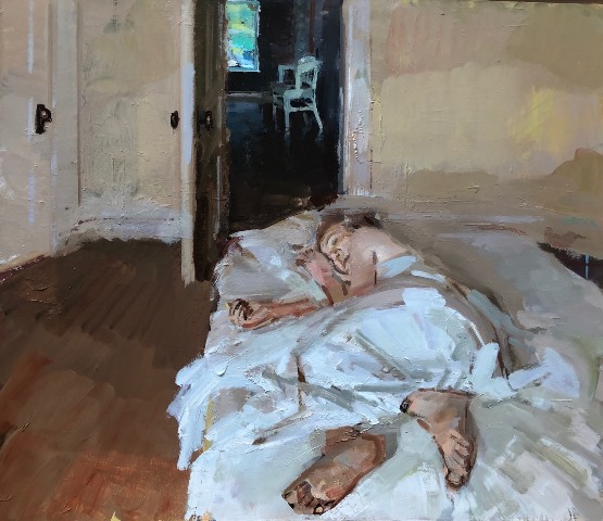
Elizabeth Barnett depicts intimate domestic scenes and still lifes with a wide range of plants, colour, personal objects, and furnishings. Her work revolves around motherhood, living off the land and her connection to nature.
Nature Table is a still life that connects nature and her domestic world. This is done by her depiction of everyday objects along side an array of plants . This artwork exists to connect humanity and nature.
Nature Table
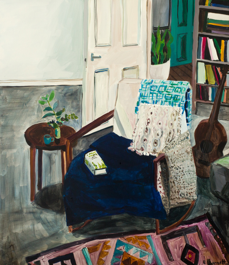
Herbal Medicine is a series inspired by natural remedies, joining motherhood and Barnett’s connection to nature. Here she works on a larger scale larger scale, making compositions looser and more welcoming. The size of the canvas gives the feeling that one could walk into the artwork.
Matthias Weischer’s paintings incorporate both reality and imagination. He is interested in the historical medium, perspective and representation while making it his own by adding collage-like elements. He builds the artwork up by using many payers of paint, adding to the three -dimensionality of his work. His work strives to find the balance between chaos and harmony.
Jona Wood is well known for his depictions of everyday scenes and objects. He was inspired by the disconnected angles and planes of cubism and so uses odd views for his artwork. He starts off with photographic bases and then goes on to layer different perspectives into the artwork giving an almost abstract atmosphere to his work.
Phillip Geiger depicts scenes of everyday life with his family. His use of loose brushwork and colour give a calm and peaceful effect on the viewer. His work tells us focus on and appreciate the calm and mundane moments and events in life. His work is simplistic yet says a lot about peoples misplaced priorities. The simple and seamingly unimportant moments in life are the ones we look back on when remembering loved ones and so must be treasured. Geiger immortalizes these moments in his artwork
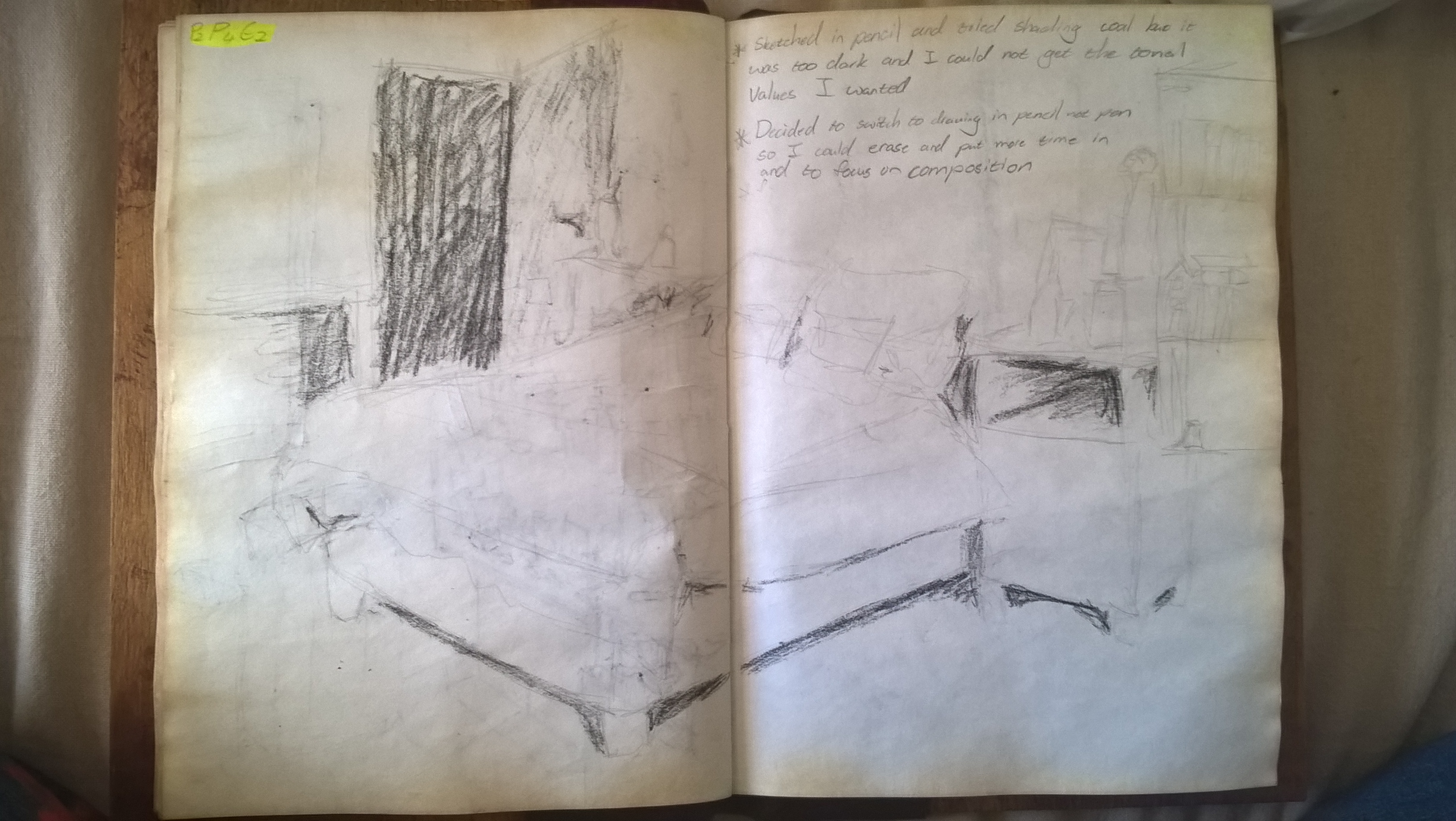
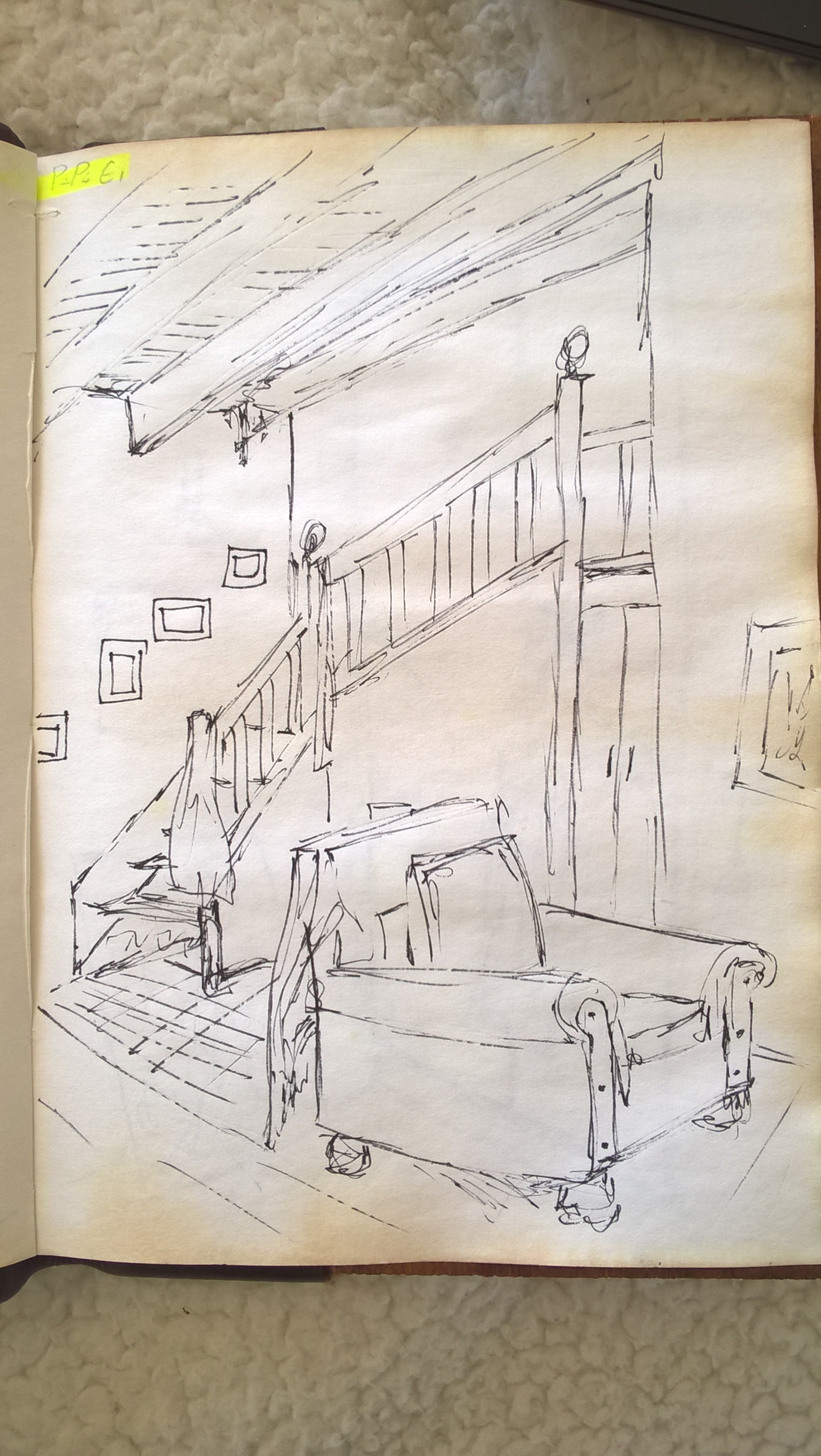
I decided to change from ink to pencil so that I can erase mistakes and spend more time on the drawing. At first I used coal but felt that I could not get the tonal range I wanted, This could be in part that I am not very experienced with the medium.
For my second drawing I just redrew the scene and shaded with pencil. I found this gave better mark making and tone.
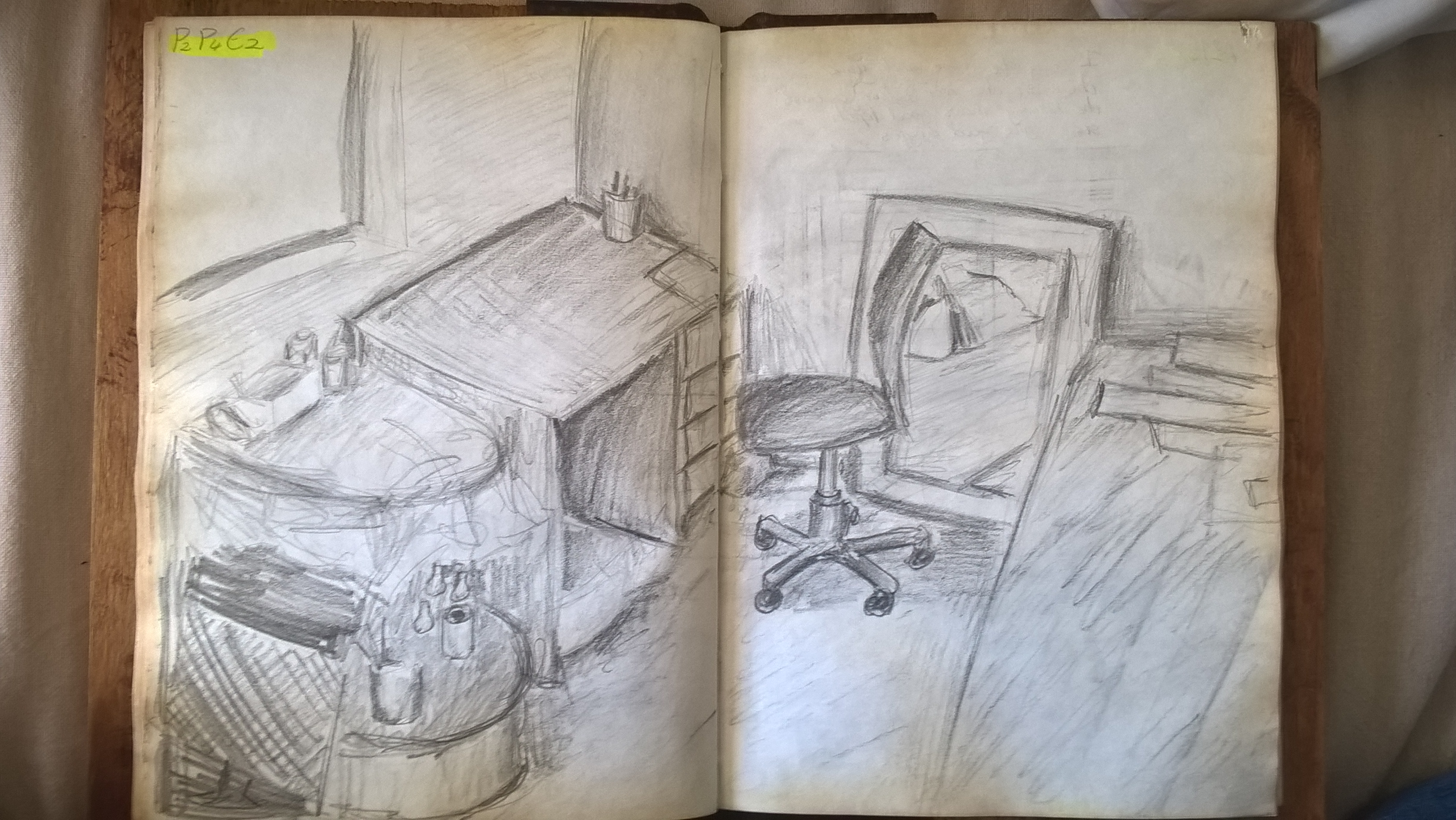
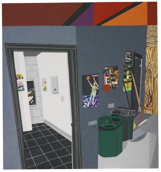
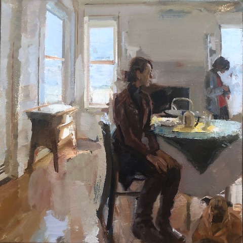
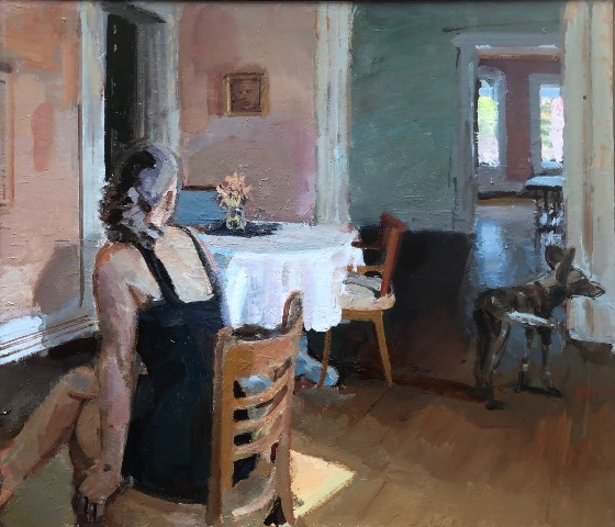
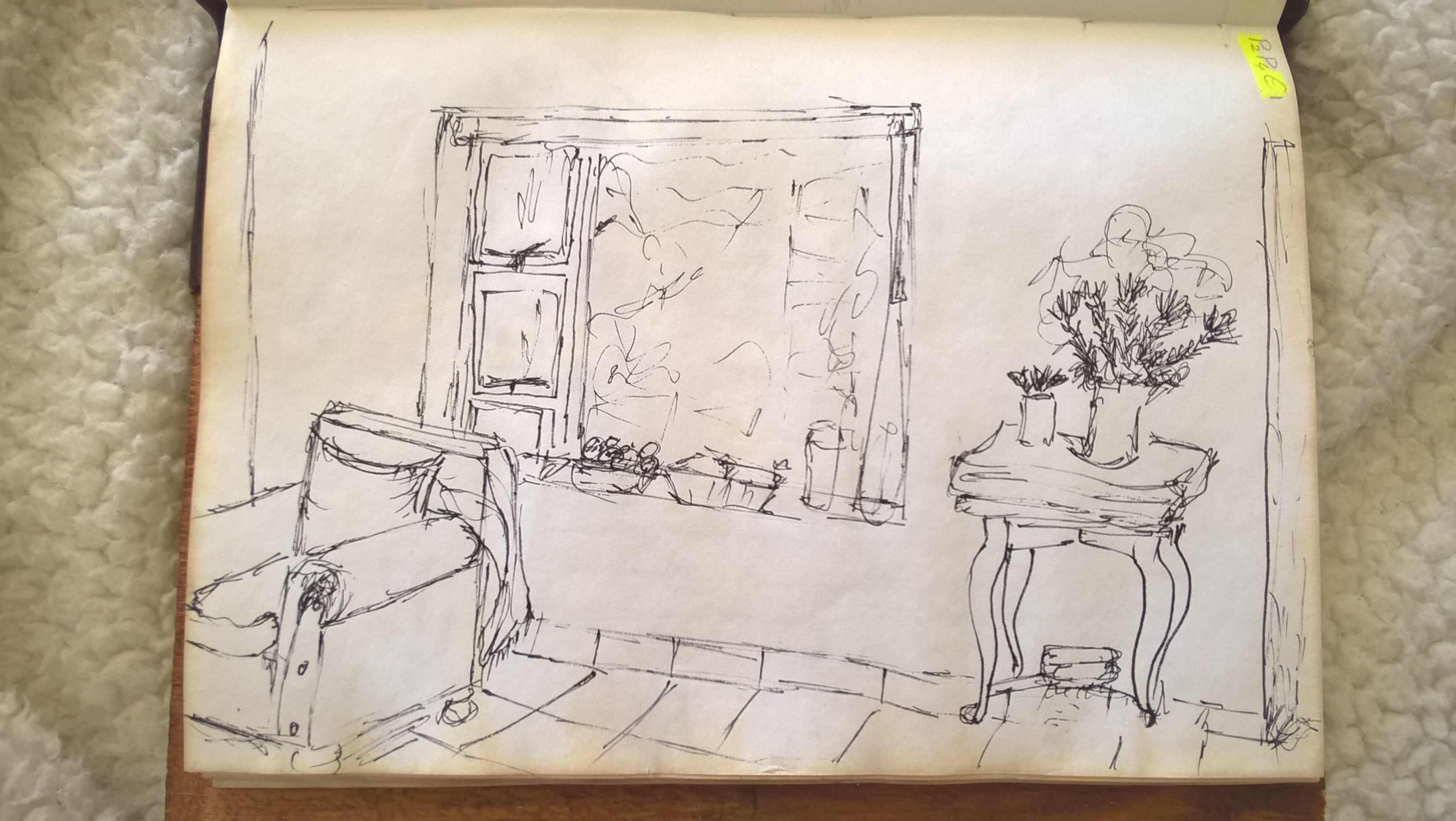
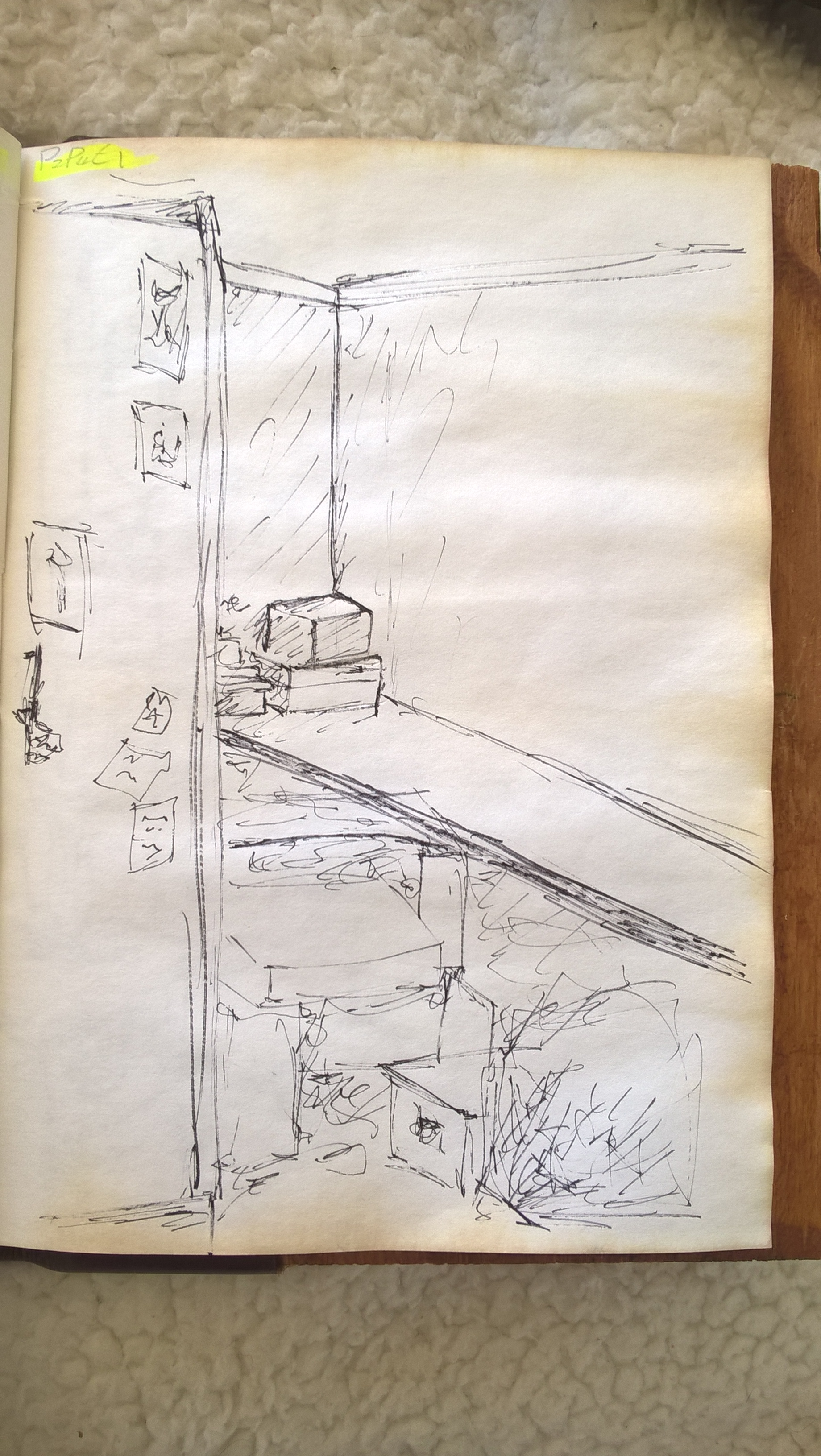
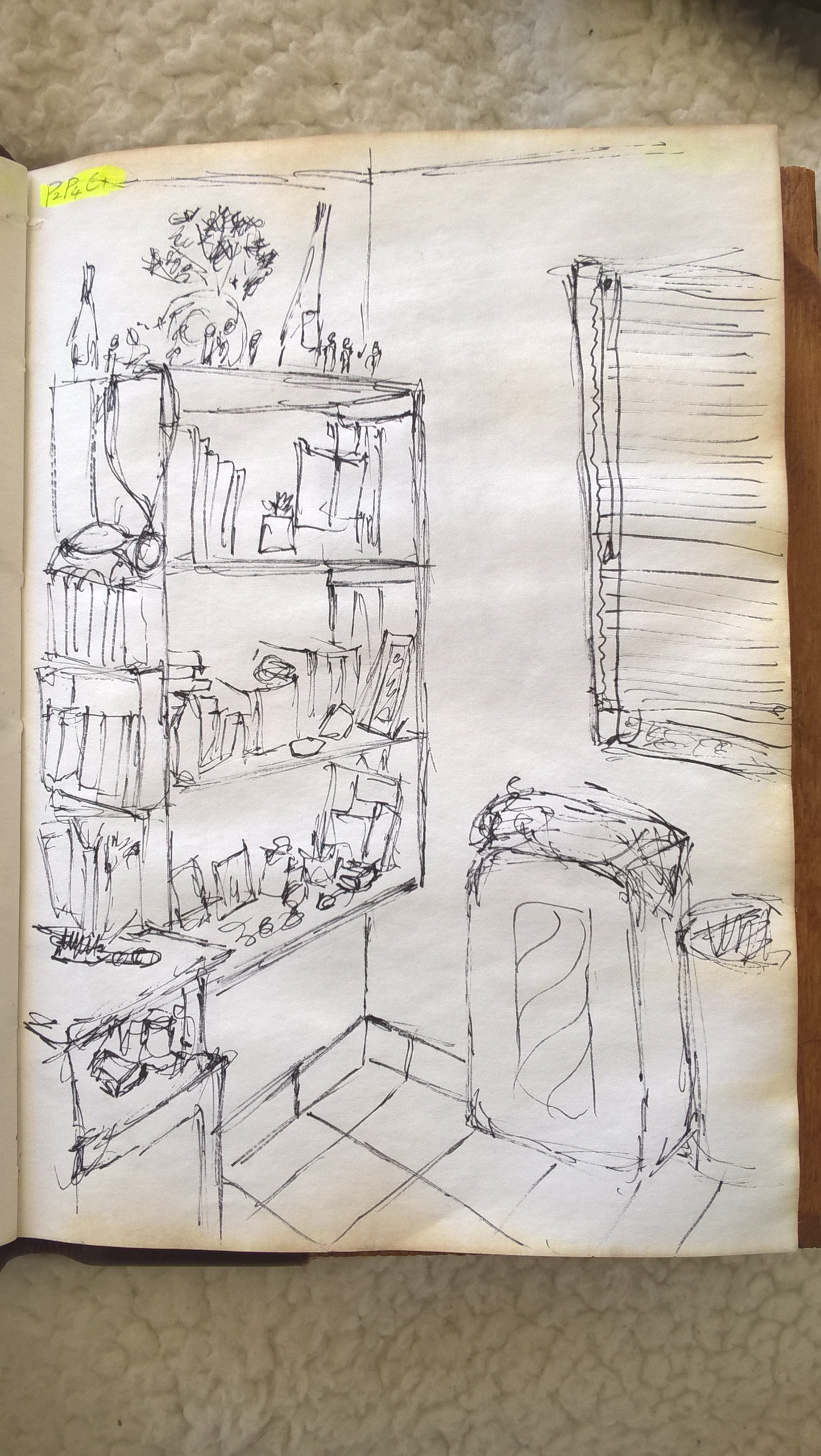
I went and drew all my favorite scenes in the house until I came to one that I liked enough to use for Exercise 3. In hindsight I think I should ave chosen the scene bellow because it is busier and more interesting, it is also a more personal and intimate space. I am still happy with the scene I ended up choosing though.
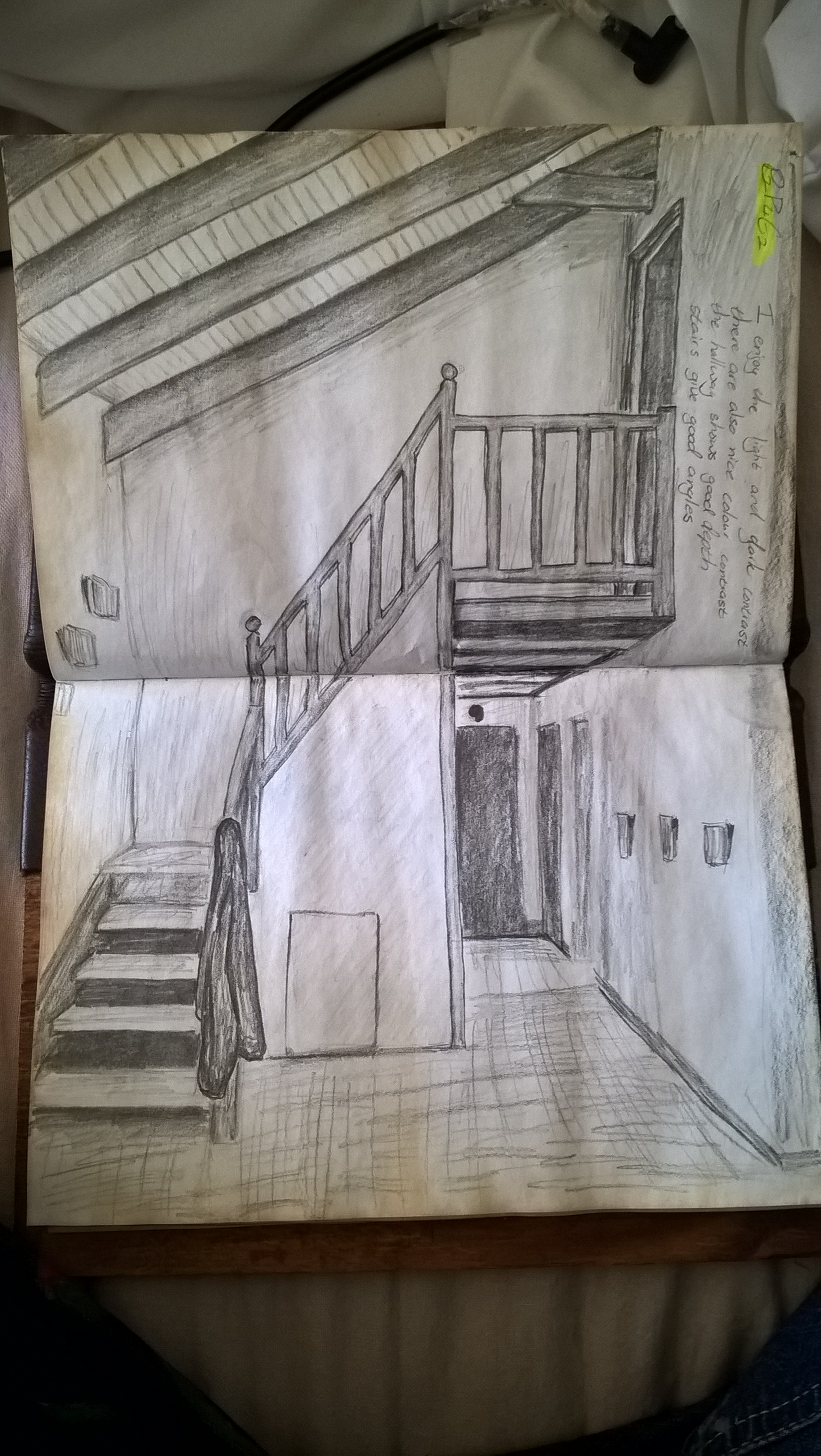
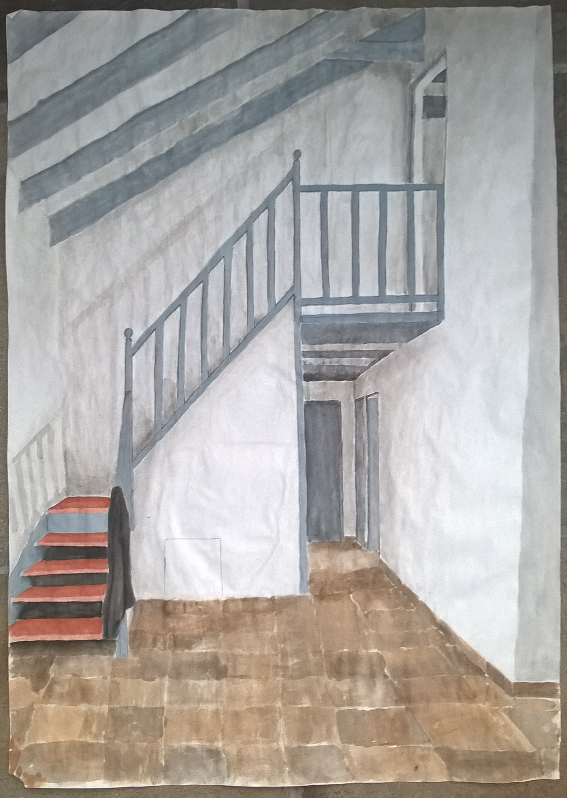
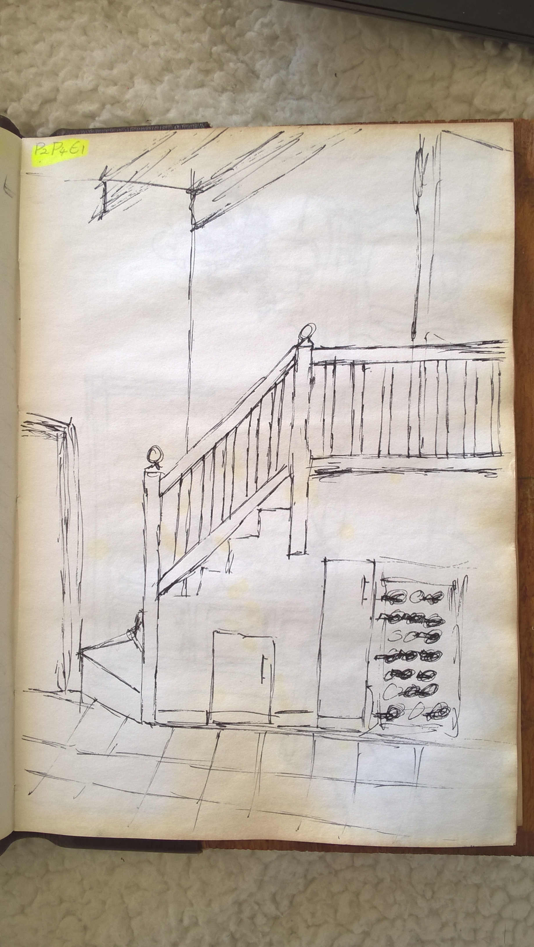
I chose this scene because I like the light and dark contrasts. There is also nice colour contrast with the warm brow of steps and the cool gray of the beams and railing. I also like the the straight and uniform lines broken only by the balls on the railing and the jacket hanging from the rails. This scene has a strong vertical plane. There is also a good sense of depth with the stairs and the hallway.
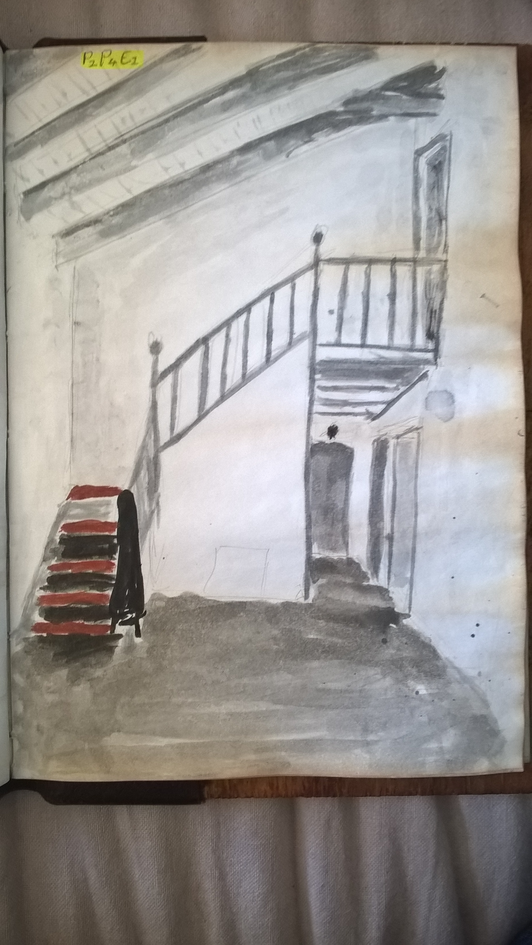
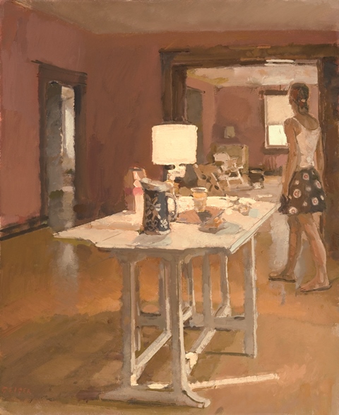
This is the rough colorization of the chosen scene.
Exercise 3: Material Differences
I decided to combine these two exercises into one post, I feel it’s easier that way.
I was glad that I could add a lot of detail working on this size paper but it is not fit to be used for watercolour. As you can see the paper warped dramatically. However, I still enjoyed doing it.
All other comentry on the scene was done on my prep drawings and I don’t feel the need to repeat it since it it has been done all in one post.
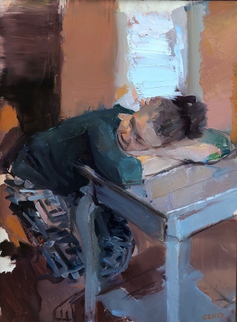
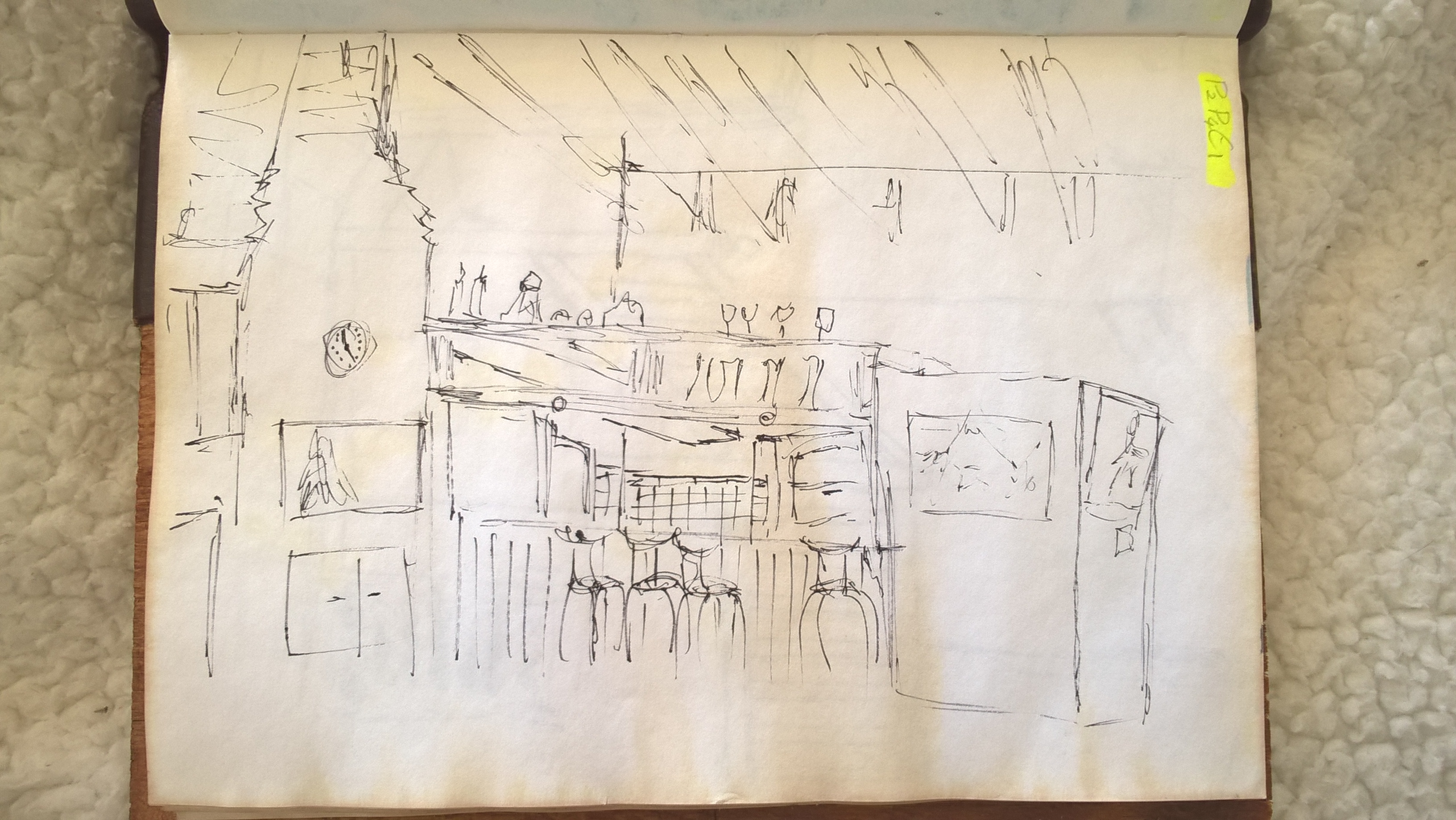
This exercise was difficult for me since I’m not used to drawing household scenes.
I decided to use a fine nib for my dip pen so I could get clean lines. I felt that using a pencil could make things too messy.
One issue with ink is that I couldn’t erase, although that did force me to quick sketches as the exercise said so that wasn’t too much of a problem. Another issue was that I found it difficult to shade which made my drawings less detailed perhaps.
Towards the end I started to get the hang of drawing inside scenes.
I decided on using blue because it is a calm colour and it is my favorite colour. The medium I used was watercolour because it is the one I am most familiar with. I wanted to try making different underlying colours in my different objects. But as you can see in my first prep drawing (i), I made those tones too strong. I was happy with the outcome of my second prep drawing and so immediately went on to my final.
i
ii
The skins of the fruit are shiny but not reflective. The bowl and the table are both reflective, the table more so, and so they reflect off of each other. I chose to use a table that is very reflective so as to make the artwork a but busier.
The fruit were lit up from behind and so they have a halo of light surrounding them which just separates them from the background. The bowl of fruit has the widest range of tones, giving them more detail and helping them to stand out as the main focus of the composition. In some areas of the apples I did not leave space for the lighter tones and so had to go back over with white paint, this shows a lack of planning.
The back ground has both light and dark tones but they are more muted and there is not a large variety.
I feel that the watercolour also worked tell because the smoothness and simplicity of the paint works well to portray the subjects which do not have very rough surface texture.
I did not do a very good job at keeping clean lines however and this is most evident in the background.
I preferred the texture of the apples in my first and second prep drawings. I was able to get a bit of the same texture in my final piece and I think it still came out good but it would have been better if i got the texture correct. The texture I preferred was that where the different tones did not blend together 100%. The apples in the front have a smoother gradient because started with them first and only got the hang of it when I got to the fruit in the back. This texture was about my preferred style of watercolour painting than about portraying the surface texture if the apples.
At the end of the day I am happy with what I made but perhaps I should have made a prep drawing in the same size paper that I would be working on in my final piece and should have then made more notes details how to get my desired style.
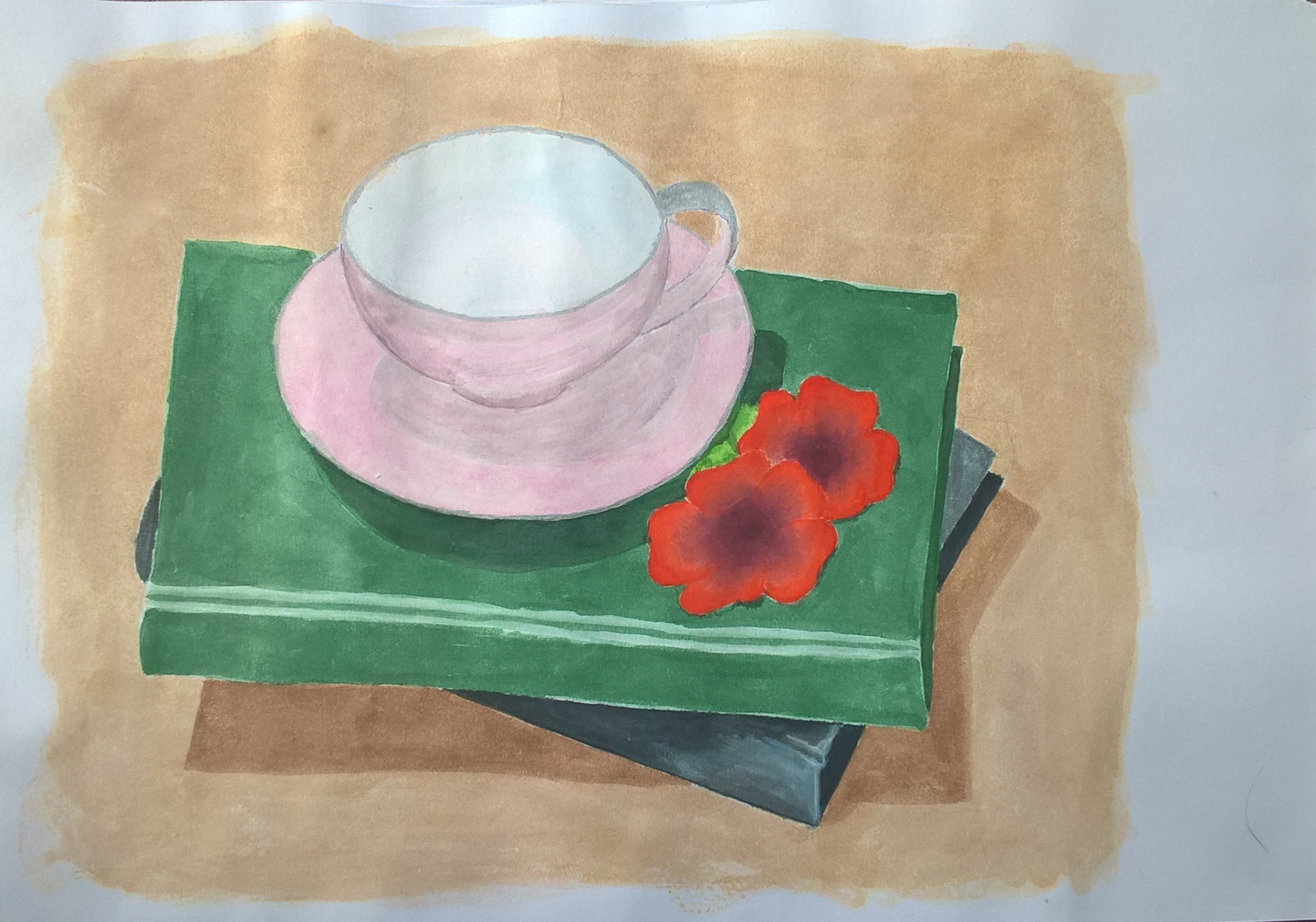
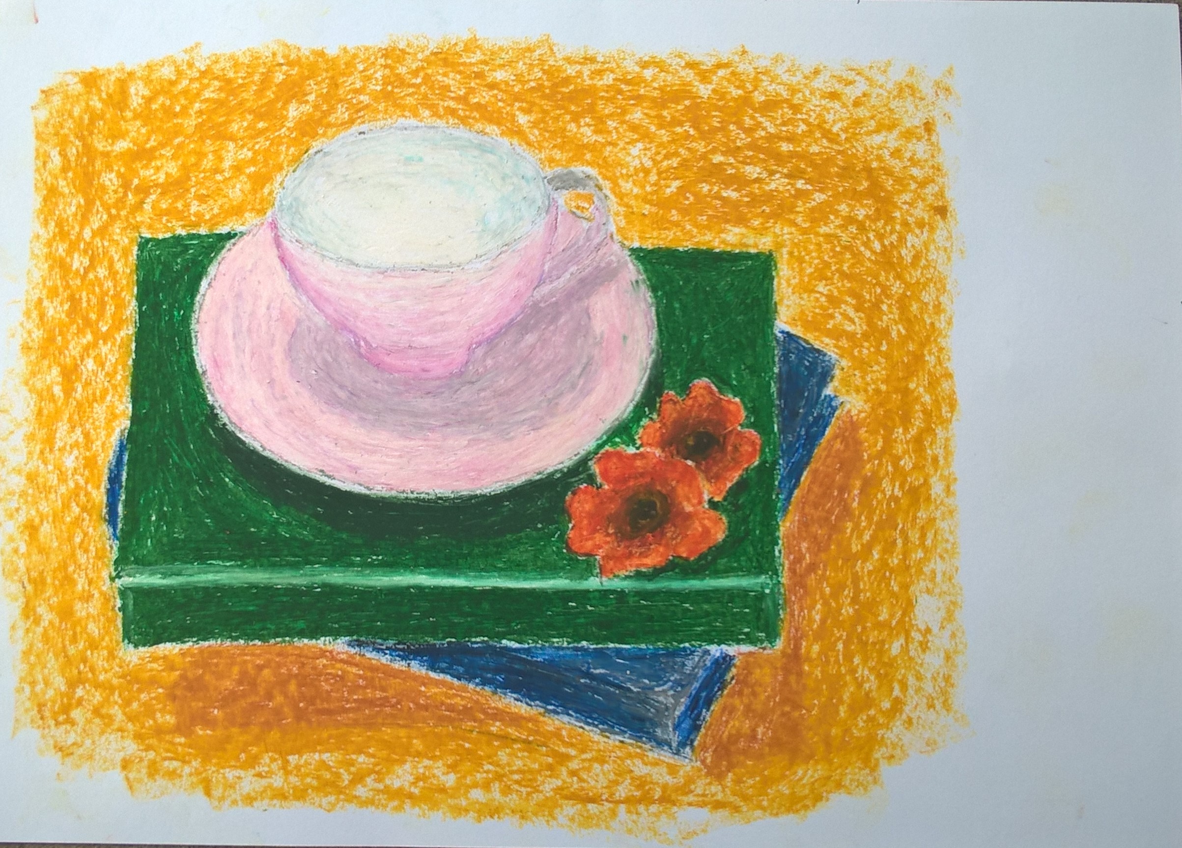
With all the media I used I struggled to get the soft pink tone of the cup.
I decided to start off with a medium that I was used to and so chose watercolour. The paper I used with the watercolour was also not watercolour paper so the colour became distorted as the paper got wet so I just had to wait for my layers to dry before carrying on. Making the shadows was also a bit difficult because I felt I would either change the colour completely or it would end up becoming rather muddy.
watercolour
The oil pastel was fun to work with and I liked the rich colours it made. It is the complete oposite of working with watercolour. Working in the tight spaces of the flowers was a bit difficult but I managed. It was also difficult to get a soft tone for the background since the oil pastels have such strong colours and I couldn’t find a close enough shade.
oil pastels
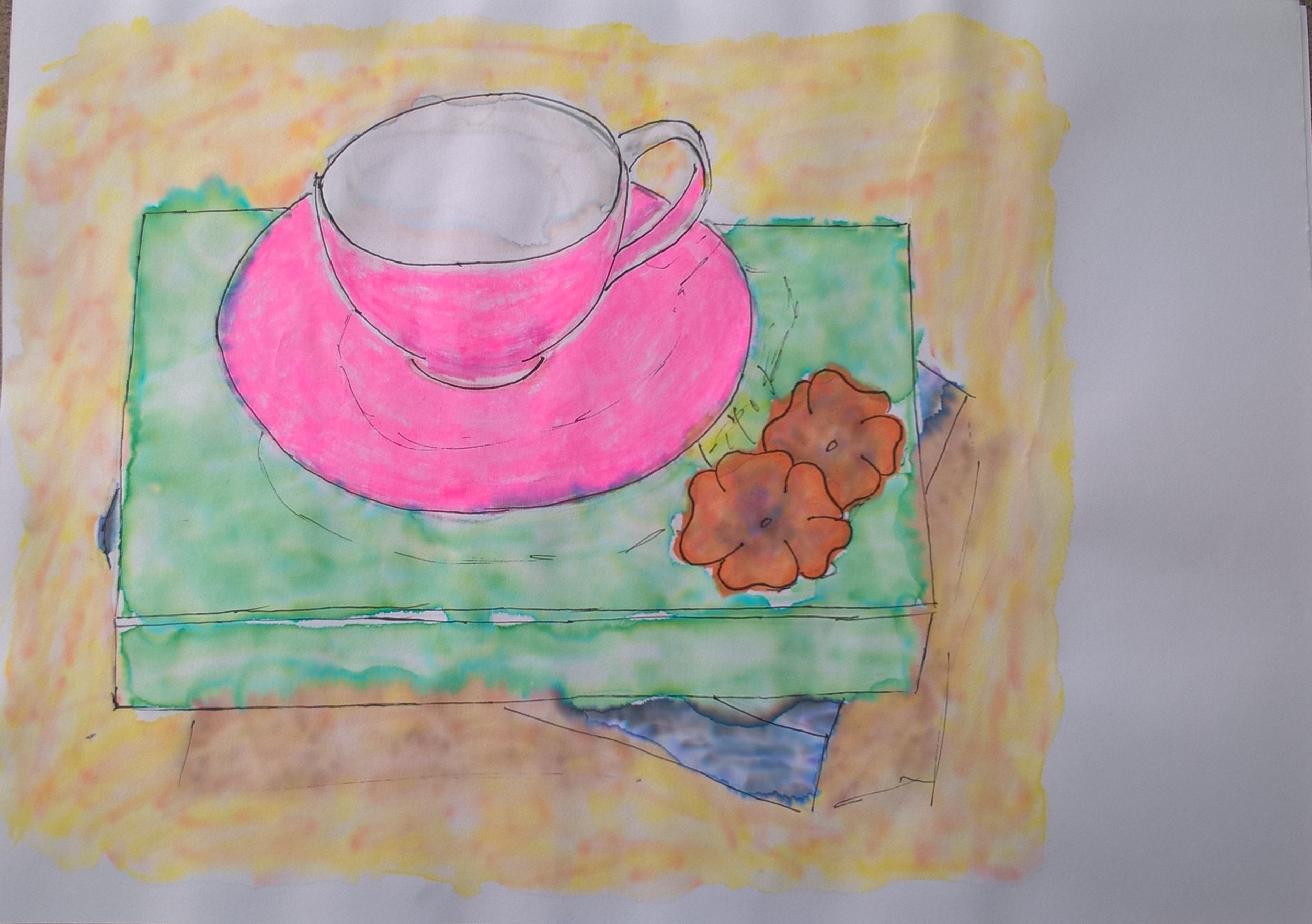
The first non traditional media I used was markers. I’d scribble woth my desired colours and then I went over with alcohol and that’s how I got the washed out effects. I layered the markers alcohol until I was happy with the result. For the cup I used a pink highlighter but it had no reaction to the alcohol. I then tried water to see if it would maybe react to that but I had to suck luck.
I liked how the borders of the objects seeped into one another, although it was not initially my intention. once everything was dry I decided to go over with a black pen and make rough outlines of the objects just to make them a bit more distinguishable. Creating shadows was also a bit difficult because it would just blend in to much. I also outlined he shadows but I now thing I perhaps should have not done so.
markers
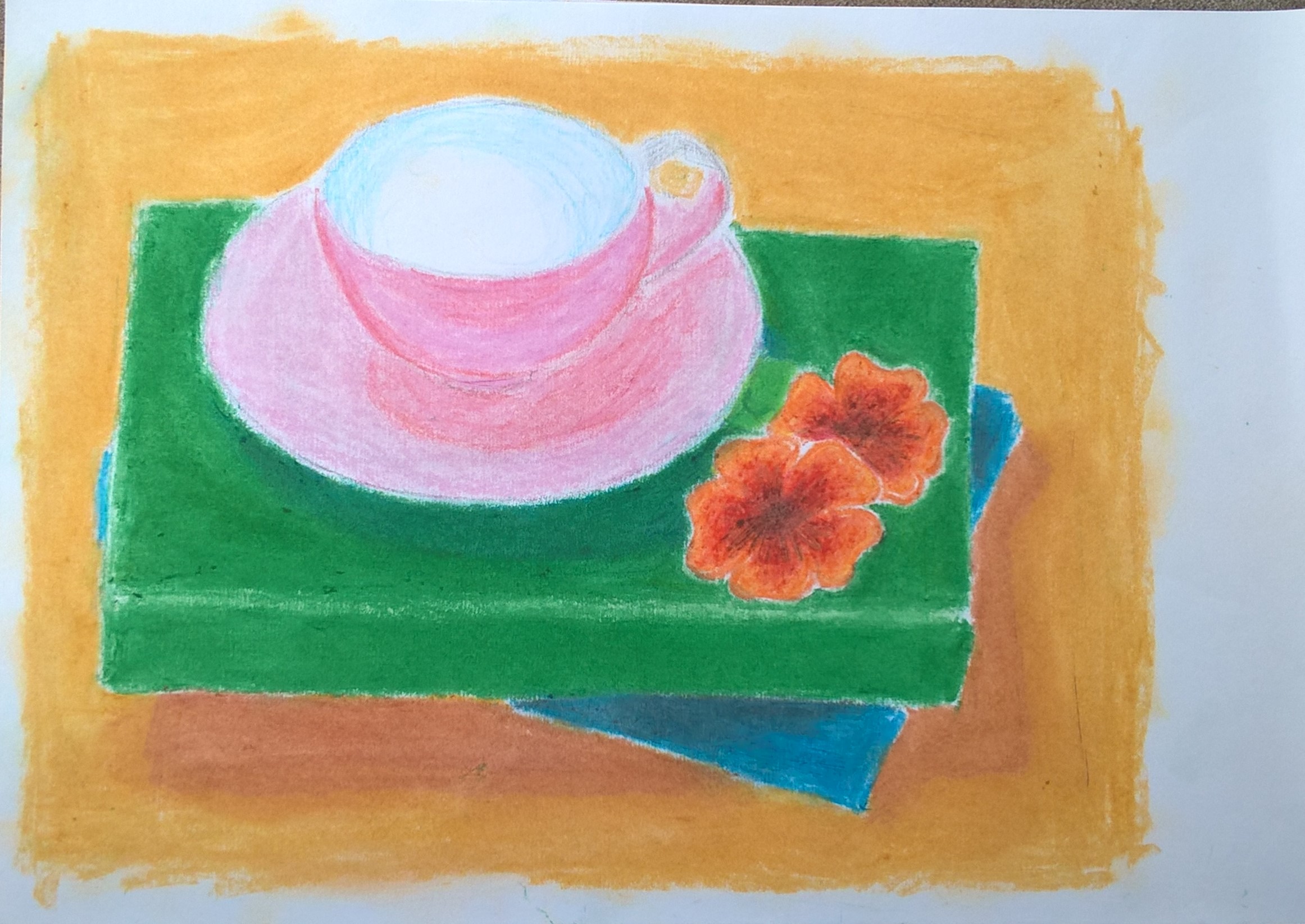
The last media I used was wax crayons. At first I didn’t really want to because I thought it would be a bit too similar to the oil pastels but then had the wonderful idea of melting the crayons. After colouring in an area I held it under my hairdryer but that didn’t really do much. I then started smudging it about with my fingers and liked the smooth texture it made so I carried on with that. I burned my finger but really enjoyed the outcome. I’m also happy with the veriety of colours i could make because I had very limited pallet.
This exercise was especially challenging since I’m not used to colouring. Since I was using dry media I found it difficult to find the right tones of colour because I could not mix the colours like paint. I was tempted to go over with water so i could mix and control the colours more but I felt it went against the point of the exercise which was to layer colour and work fast.
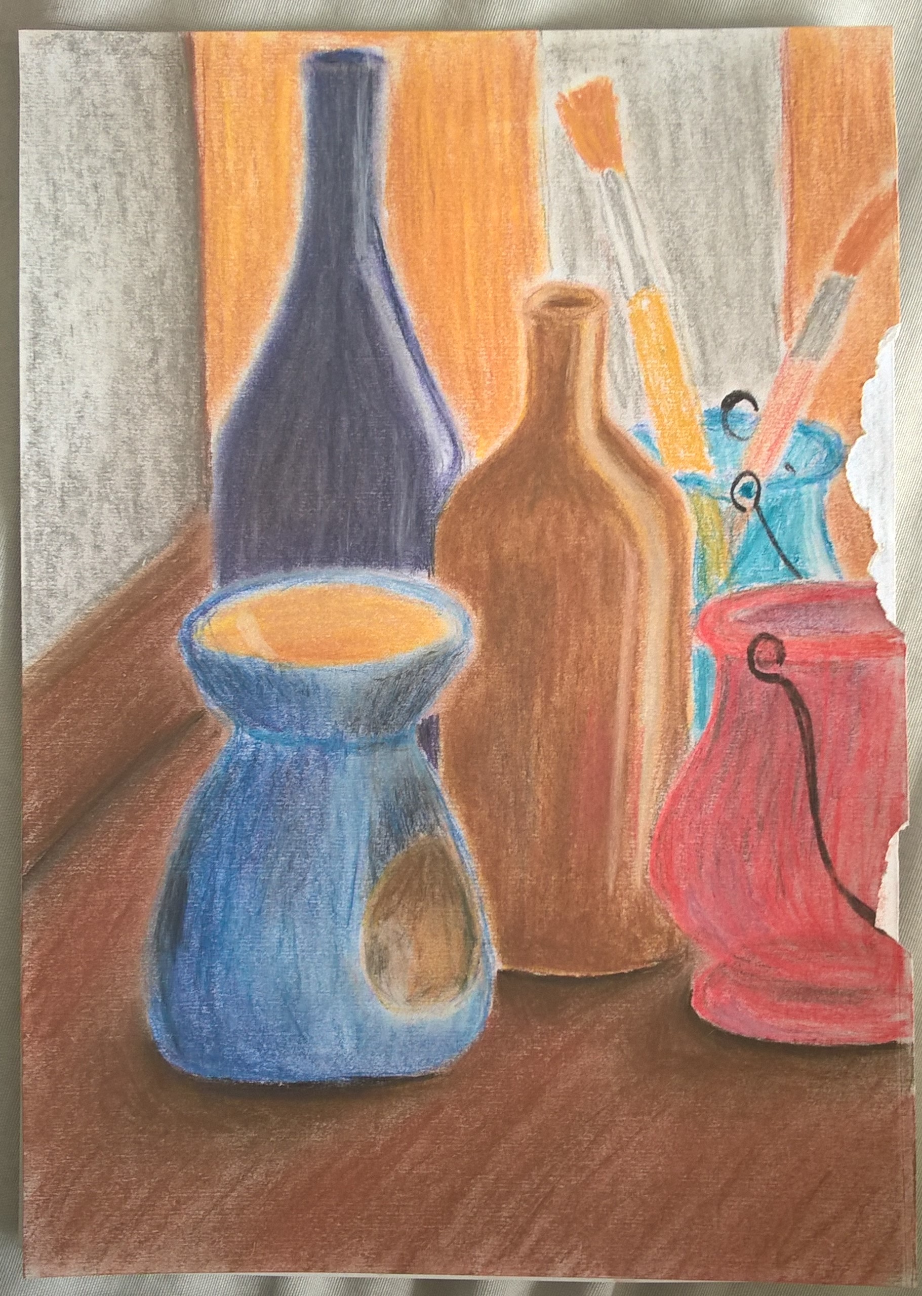
It was difficult for me to portray the transparency the blue and red lanterns and I felt that my colours were too bright and had difficulty dulling them down.
I also faced difficulty when it came to the edges of my objects. it was hard to get sharp edges and this may be from me using my fingers to blend the colours. In fear of blending my objects and colours together I ended up leaving an undesirable white ring around all my objects. In hindsight I may have been able to avoid these difficulties if I used a sharp edged blending tool instead of my fingers.
powder pastel
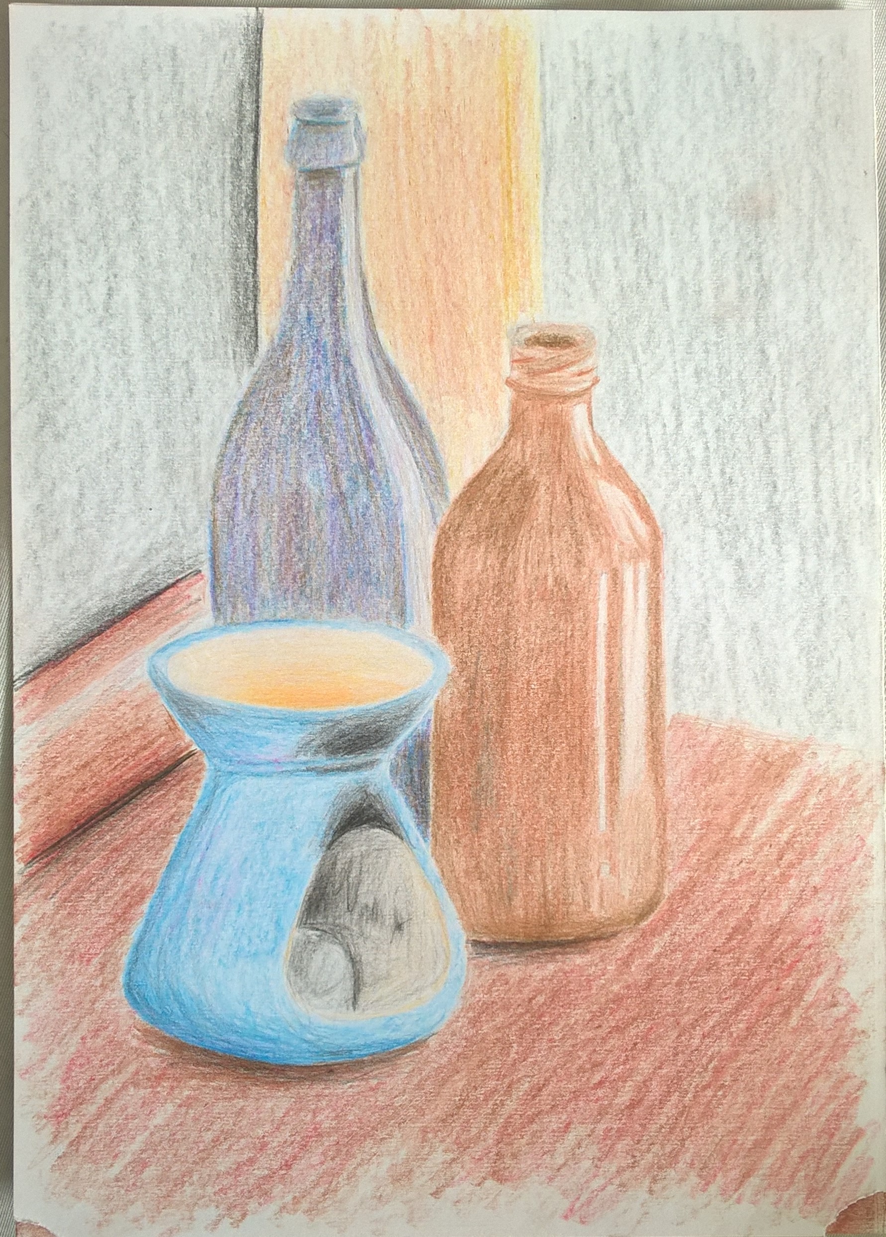
In my second drawing, I decided to do away with the two lanterns because I preferred the composition with just the three other objects. The pencils I used were watercolour and once more I felt like working over it with water but decided against it because it went against the point of the exercise. This one ended up looking rather washed out but it may be from my lack of colouring skill of maybe it’s just the natural effect of the pencil, although the pencils I used were good quality so I’m leaning more toward it being my fault.
Colour blending here was more difficult than in the last drawing because here I had no way of blending without water. I do however rather enjoy the random patches of colour especially with bottle in the back.