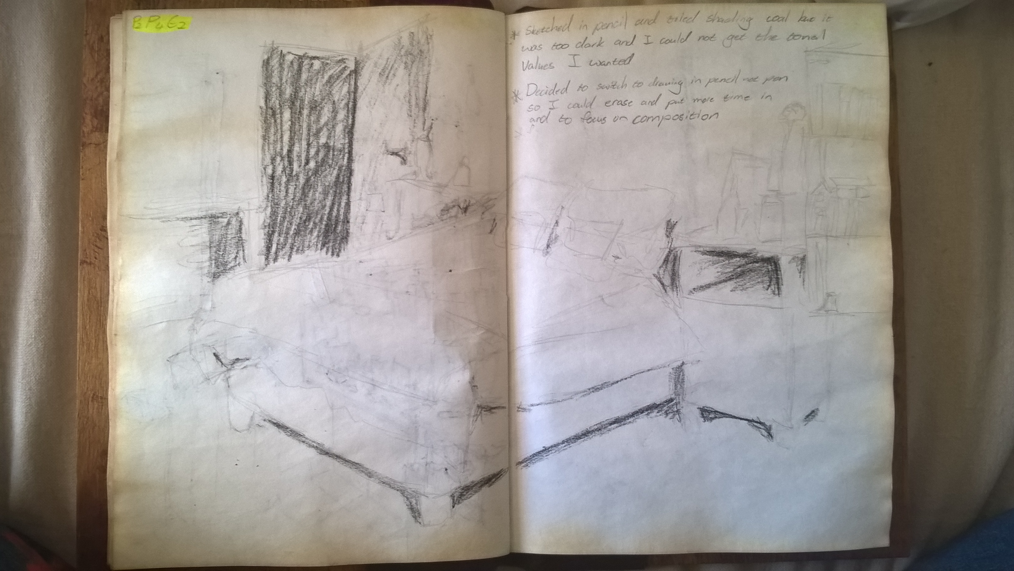
I decided to change from ink to pencil so that I can erase mistakes and spend more time on the drawing. At first I used coal but felt that I could not get the tonal range I wanted, This could be in part that I am not very experienced with the medium.
For my second drawing I just redrew the scene and shaded with pencil. I found this gave better mark making and tone.
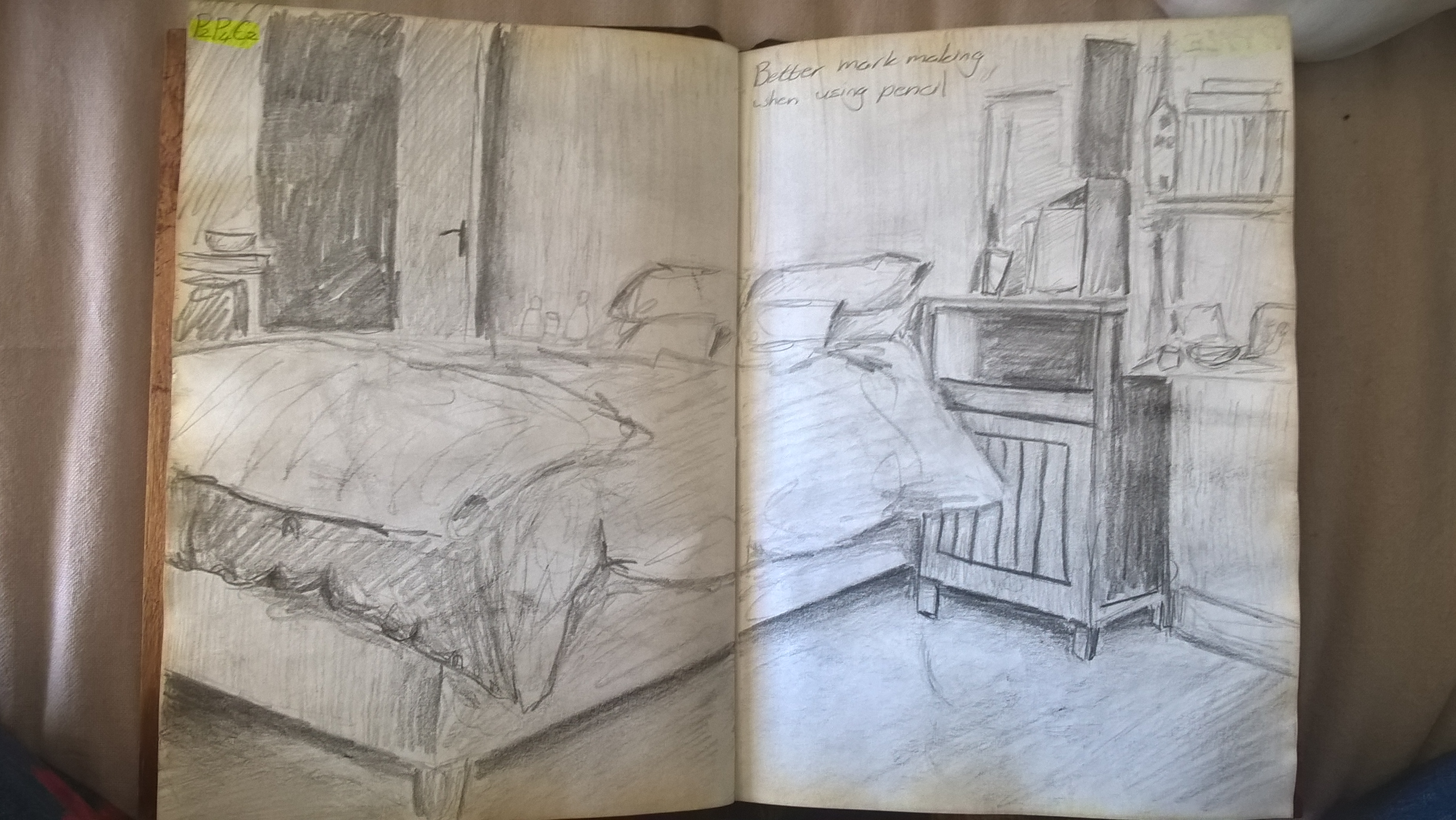
I went and drew all my favorite scenes in the house until I came to one that I liked enough to use for Exercise 3. In hindsight I think I should ave chosen the scene bellow because it is busier and more interesting, it is also a more personal and intimate space. I am still happy with the scene I ended up choosing though.

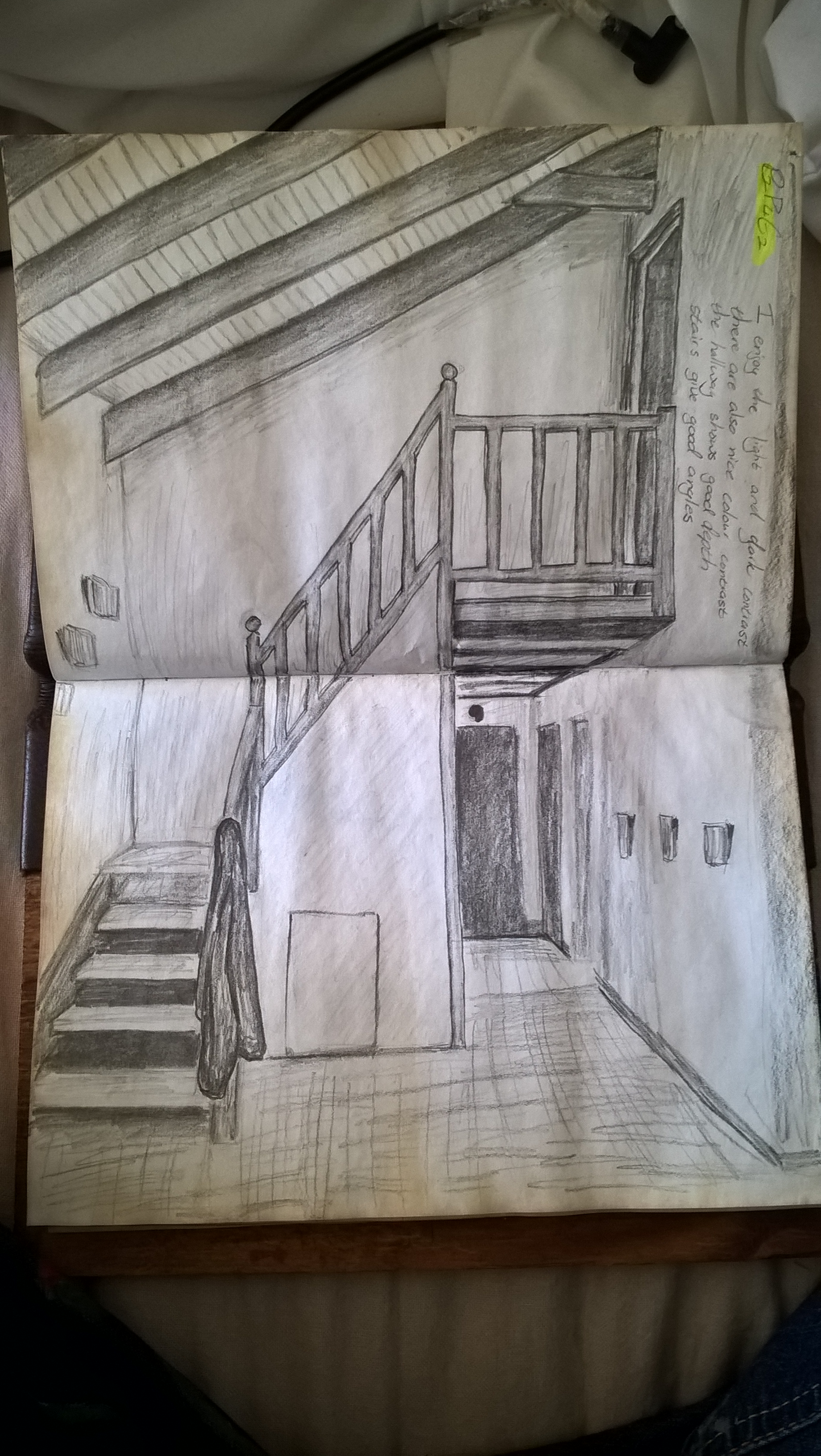
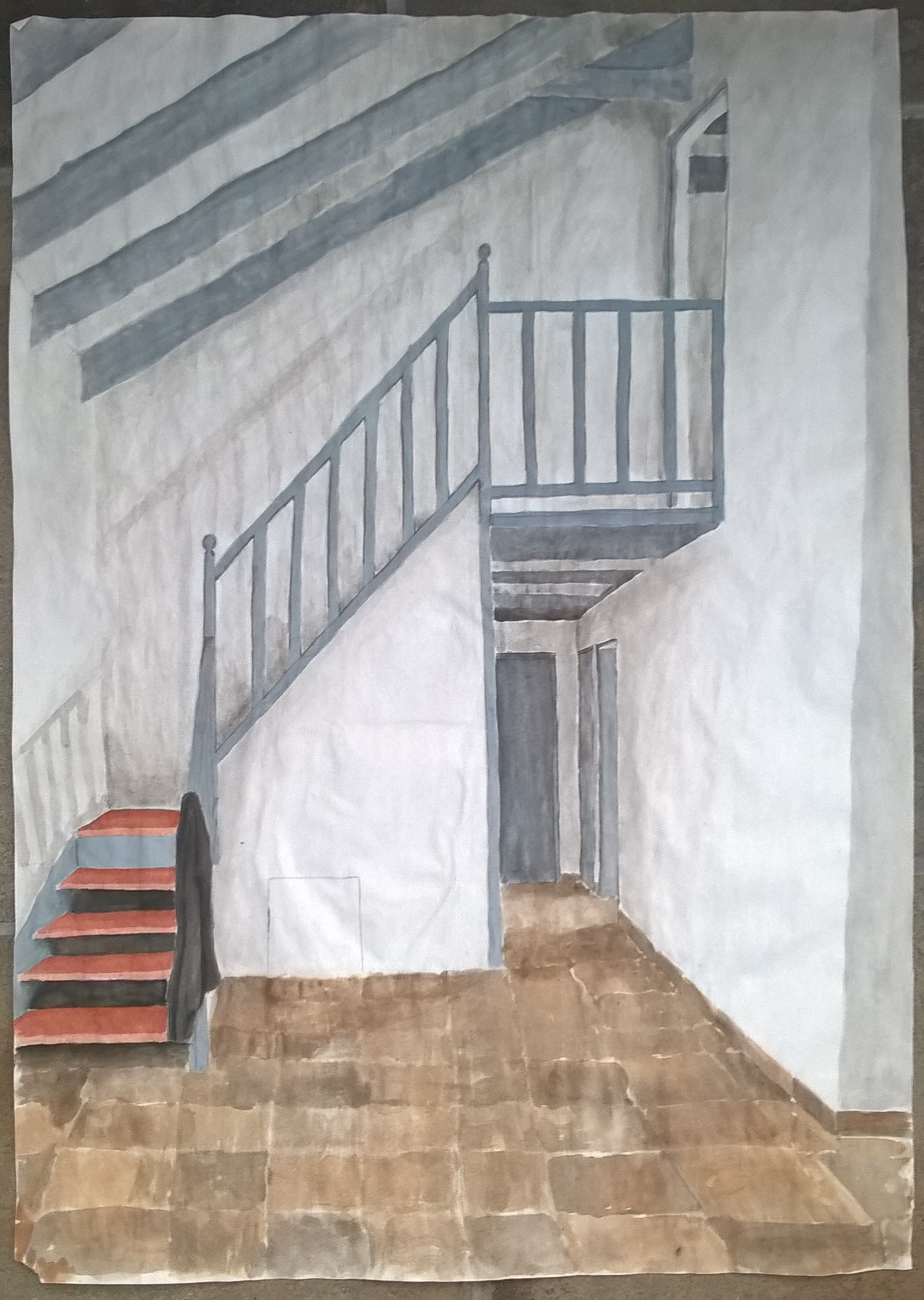
I chose this scene because I like the light and dark contrasts. There is also nice colour contrast with the warm brow of steps and the cool gray of the beams and railing. I also like the the straight and uniform lines broken only by the balls on the railing and the jacket hanging from the rails. This scene has a strong vertical plane. There is also a good sense of depth with the stairs and the hallway.
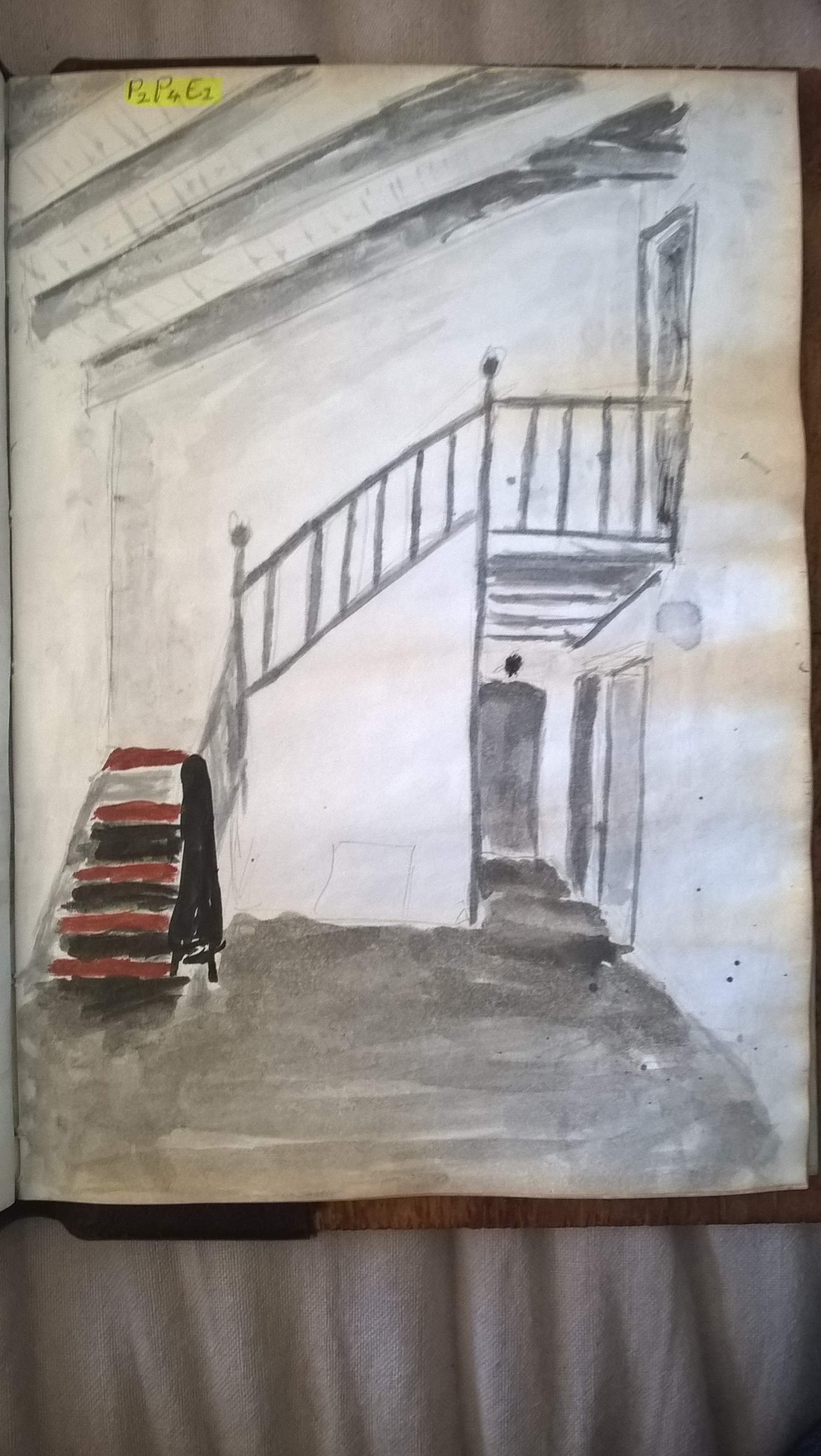
This is the rough colorization of the chosen scene.
Exercise 3: Material Differences
I decided to combine these two exercises into one post, I feel it’s easier that way.
I was glad that I could add a lot of detail working on this size paper but it is not fit to be used for watercolour. As you can see the paper warped dramatically. However, I still enjoyed doing it.
All other comentry on the scene was done on my prep drawings and I don’t feel the need to repeat it since it it has been done all in one post.
;:;
