I started off by doing life size sketch of my rock then made a larger scaled one and tested out possible colouring.
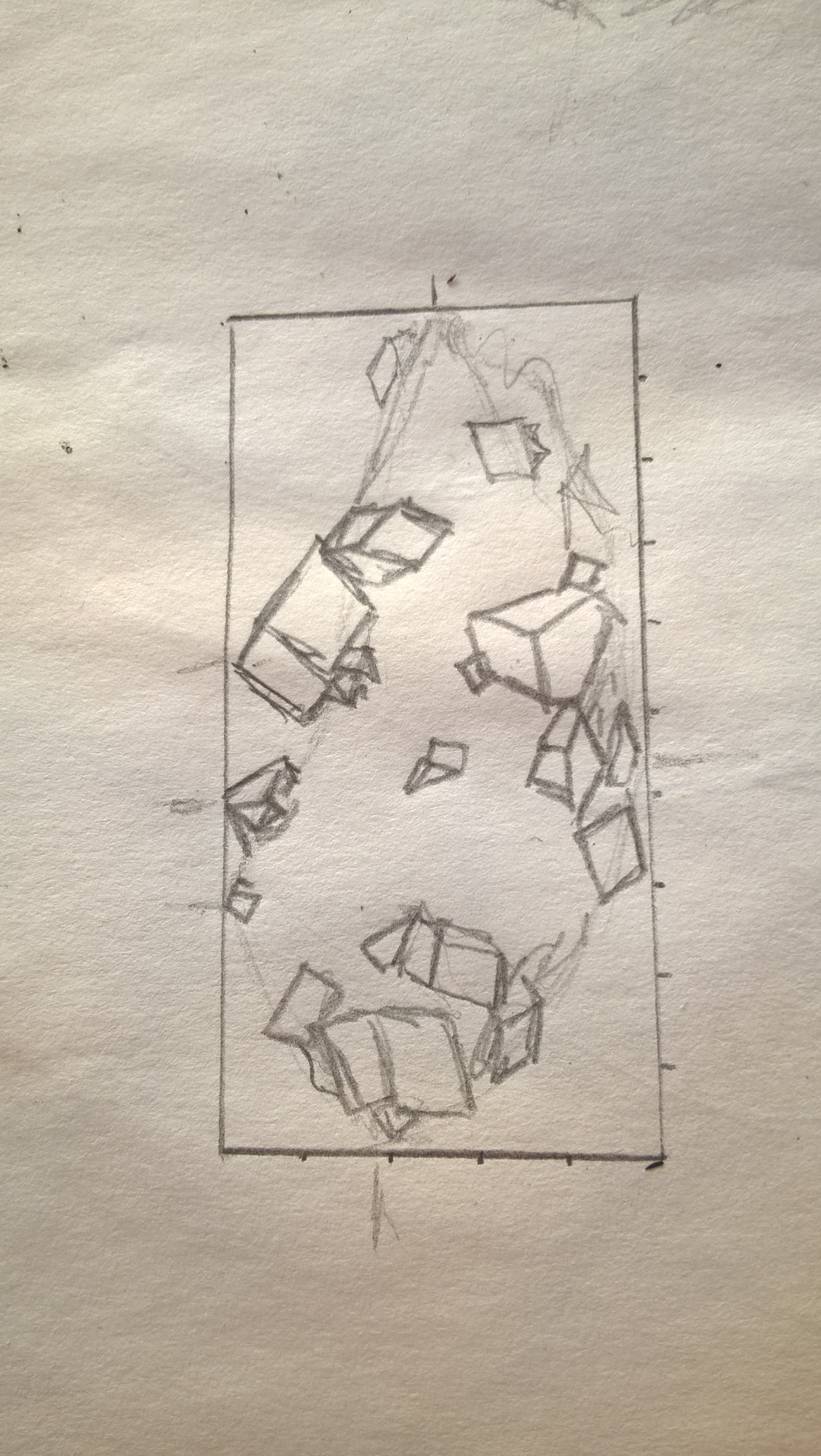
life size sketch 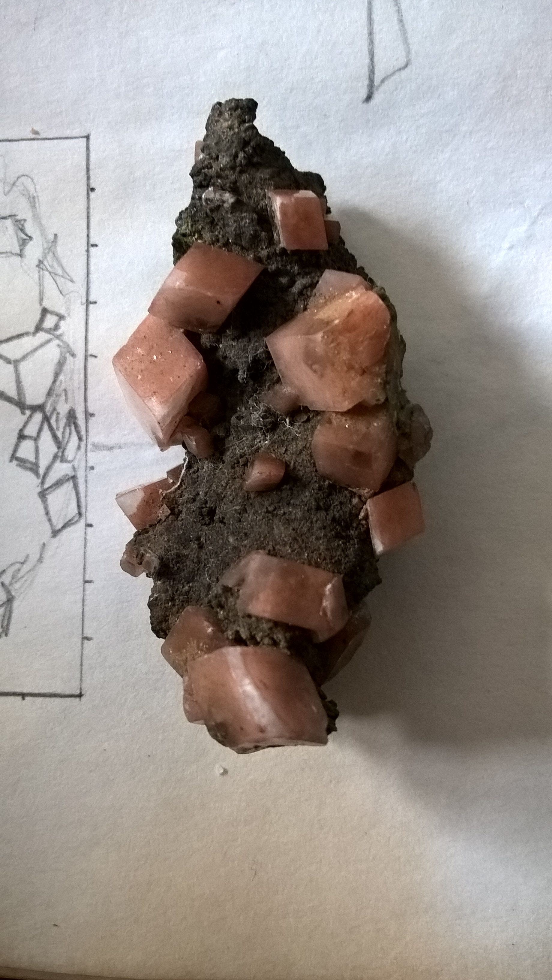
One main focus was to find a way to portray the colour and texture of the rock. I was also a bit nervous about adding colour since the exercise never exactly said we could use colour. In the end I felt that the tone in the small crystals would be portrayed better if done in colour and so I decided to continue with that while keeping the rock in fairly muted tones of black and white with small hits of its natural brown colour.
Sketch 1: here I made a larger scaled sketch of the life sized sketch. At the time I had thought of making the sketches by measuring dimensions from life and converting it according to scale but this turned out to be too much of a mission and so decided to free hand the rest. I coloured the rock with a mixture of oil pastels and wax crayons. I did the crystals with wax crayons because they had soft tones but in the end the lack hues and rough texture was what made me decide not to use them.
I then went and made sketches of one small area of the rock at a time instead of doing the entire thing.
Sketch 2: Here for the crystal areas I decided to use soft pastels. I also tested out using colours or shades of grey but preferred the effect of the colour and so stuck with that. For the rock I decided to try the oil pastels again but try to use colour instead. I did not like the outcome of using colour colour and so decided to rather stick to Black and while. However I was still not quite happy with the texture of the rock and so decided to carry on with the sketches.
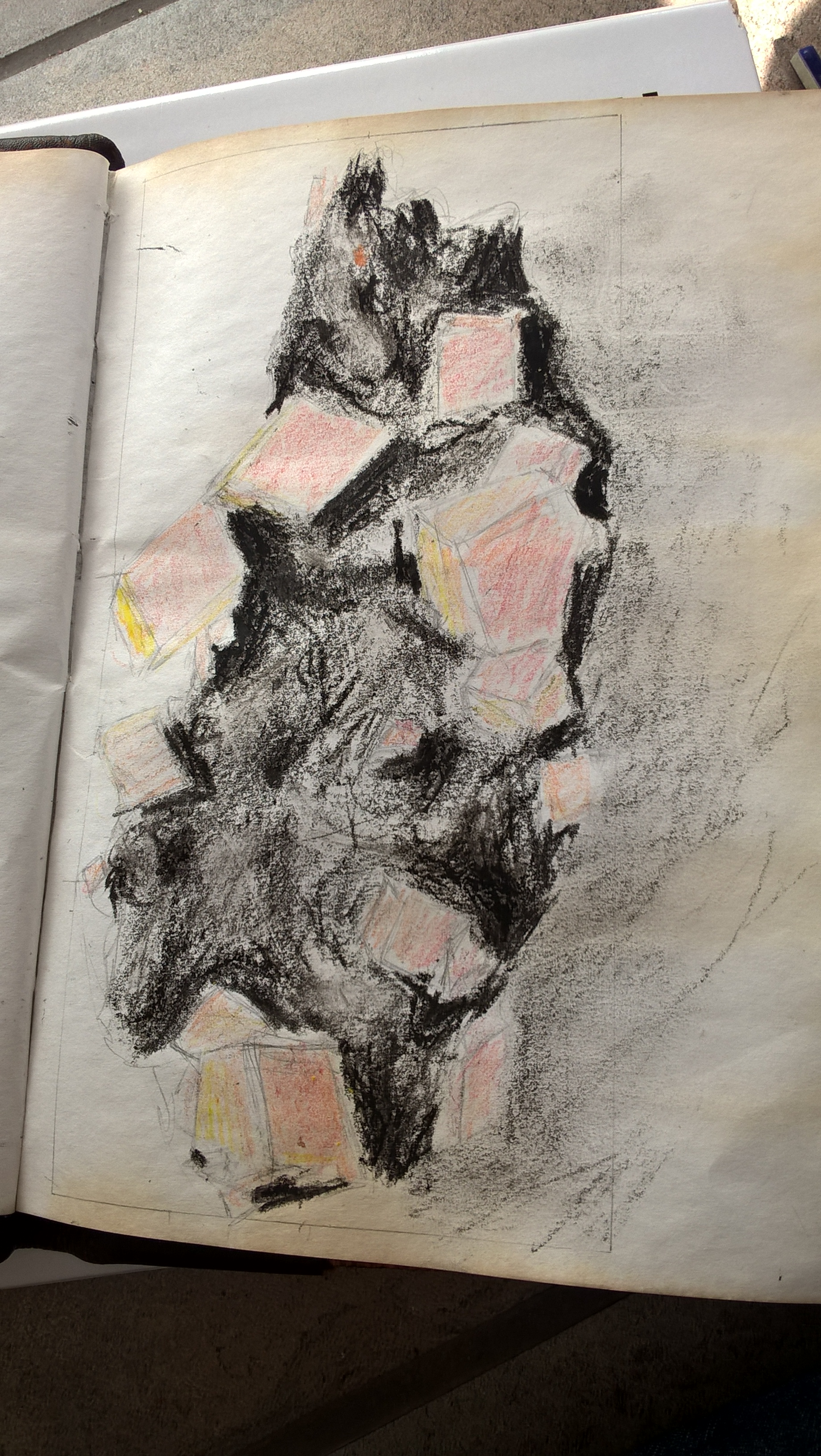
Sketch 3: here I added a cooler brown to the crystals which I feel gave it more translucent depth. I tried shading the rock with a ball point pen although I still felt it did not portray the texture correctly. I then tried shading over it with a pencil but that made no improvement.
I felt that ink would be my pest bet still so I did one last ink test but this time with my dip pen. In the test however it still wasn’t the correct texture but i knew that my dip pen and ink would give me the best results so I carried on with it in my final peace anyway.
sketch 1 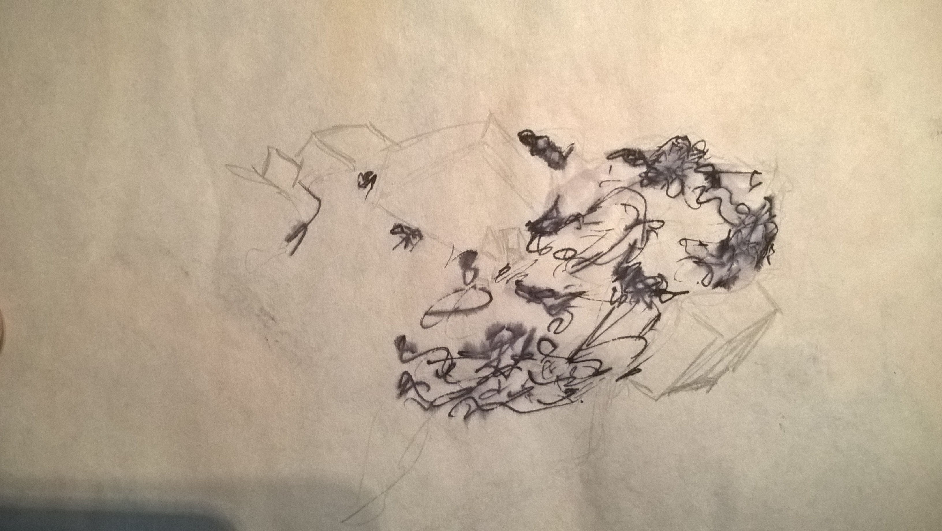
ink test 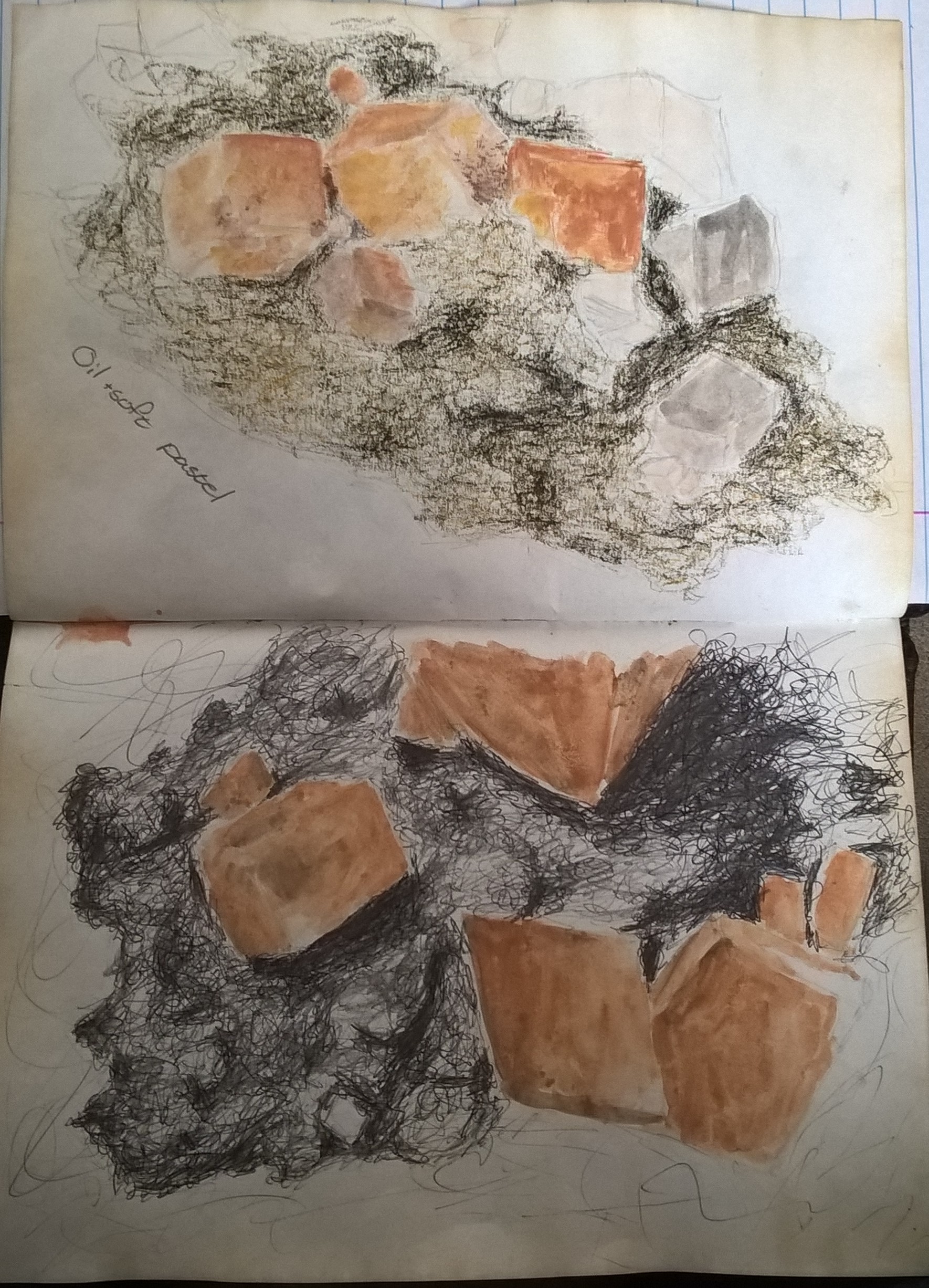
sketch 2(top), sketch 3(bottom)
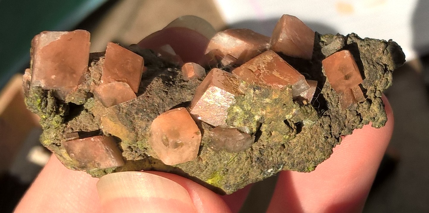
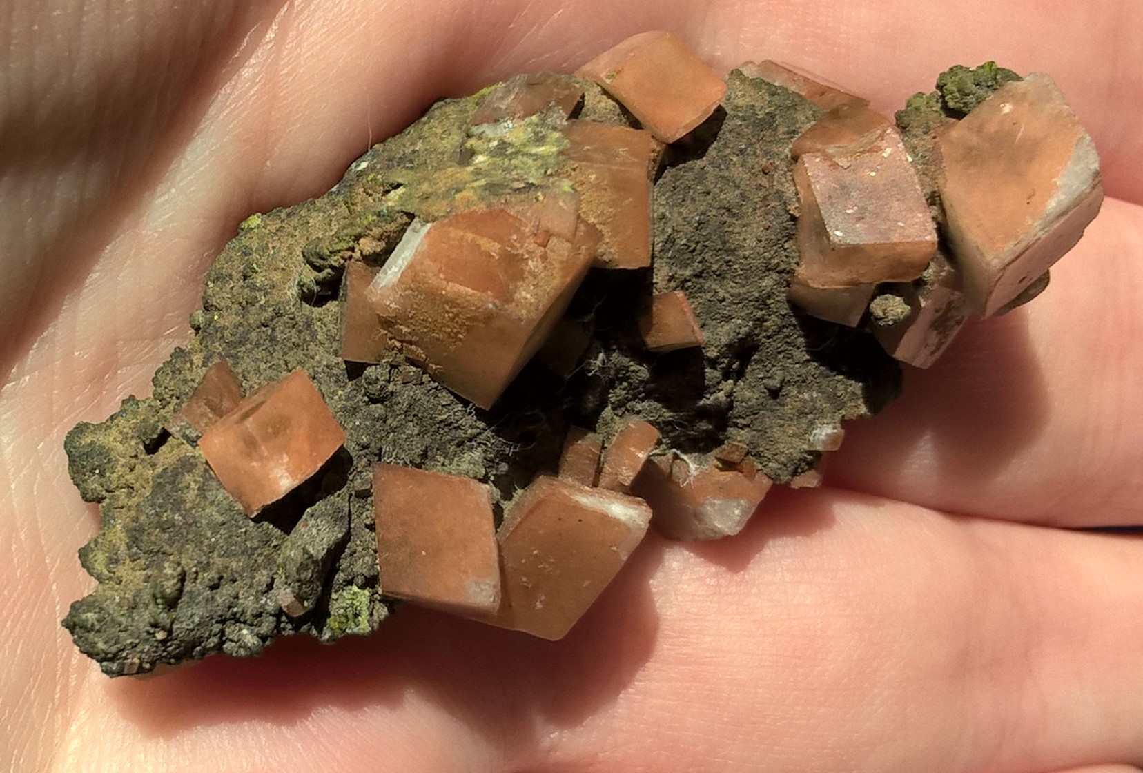
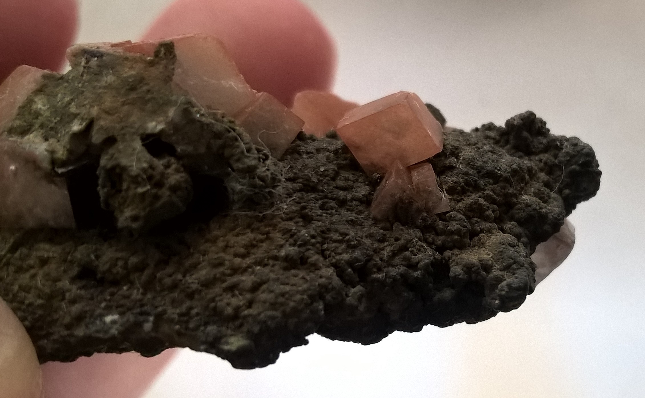
After finding an angle I liked, I took a photo reference and then picked one area of the rock to focus on and zoomed into that area of the picture.
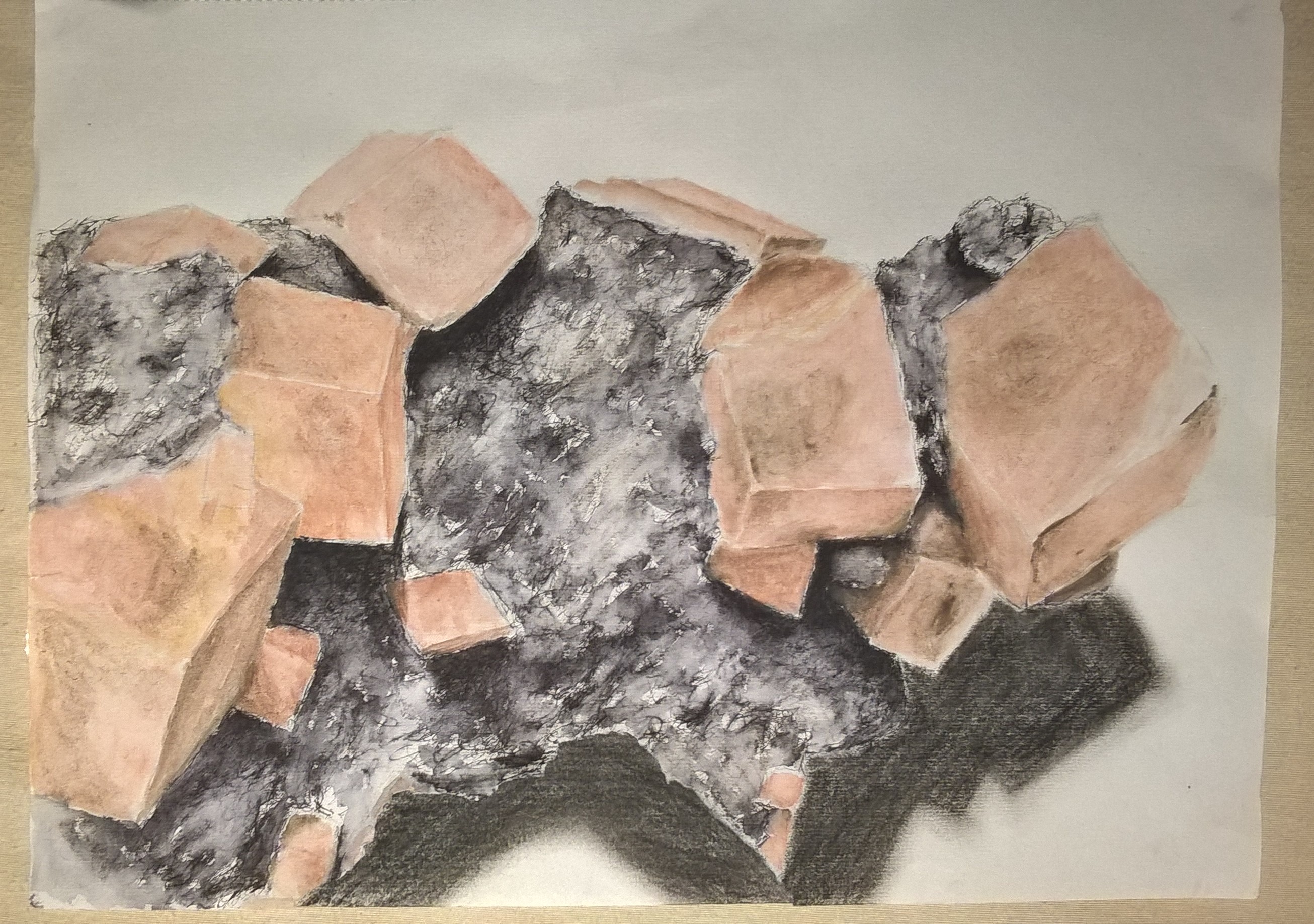
I am very happy with the outcome of the rock texture in my final piece. I went in with my finest dip pen nib and so could make very delicate lines. I struggled on fulling the darkest shadows though so I went in the a cool dark brown powder pastel and then tent over with a wet brush. I also lightened areas by going over with the wet brush and then dabbing tissue paper. I then went over the rest of the are with the wet brush to create my more mid ones and left clean white patches for highlight.
In my final piece the crystals are a lot lighter than those in the sketches but I felt the lighter crystals looked closer to the actual reference object I had although they appear darker in the reference pictures. I felt it to be challenging to define the corners of the crystals but I think I did a good job at it. Blending the stone into the crystals was also difficult. Overall I’m happy with the results.
In my practice sketches I neglected to take in account of the shadow and so it was very poorly done, with powder pastel, in my final piece.
Unfortunately part of my paper was eaten by my rabbit and instead of redoing the entire drawing I decided to try and incorporate it into the drawing and added another piece of paper behind it so i could full in the shadow.